Sem resumo de edição Etiquetas: editor de código 2017 Edição móvel Edição feita através do site móvel |
Sem resumo de edição Etiquetas: editor de código 2017 Edição móvel Edição feita através do site móvel |
||
| Linha 2: | Linha 2: | ||
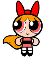
|Florzinha.gif|September 10, 1966-2007, 1998-2007 |
|Florzinha.gif|September 10, 1966-2007, 1998-2007 |
||
|images.png|2001-2007 |
|images.png|2001-2007 |
||
| − | |unnamedmamae1998.png|2002-2007 |
+ | |unnamedmamae1998.png|2002-2007, September 1, 2021-present |
| − | |Blossom.gif|2006-2007 (Anime Version) |
+ | |Blossom.gif|2006-2007, 2021-present (Anime Version) |
| − | |1517673253540.jpg|2007- |
+ | |1517673253540.jpg|2007-2021 |
| − | |20201127_202432.jpg|2015- |
+ | |20201127_202432.jpg|2015-2021 |
}} |
}} |
||
==Mônica== |
==Mônica== |
||
| Linha 21: | Linha 21: | ||
images.png |
images.png |
||
</gallery> |
</gallery> |
||
| − | ===2002–2007=== |
+ | ===2002–2007, 2021–present=== |
<gallery position="center"> |
<gallery position="center"> |
||
unnamedmamae1998.png |
unnamedmamae1998.png |
||
Blossom-pic.png |
Blossom-pic.png |
||
</gallery> |
</gallery> |
||
| − | ===2006–2007=== |
+ | ===2006–2007, 2021–present=== |
<gallery position="center"> |
<gallery position="center"> |
||
Blossom.gif |
Blossom.gif |
||
| Linha 33: | Linha 33: | ||
==Mamãe== |
==Mamãe== |
||
| − | === |
+ | ===2007–2021=== |
<gallery position="center" widths="185"> |
<gallery position="center" widths="185"> |
||
20201108 193420.jpg |
20201108 193420.jpg |
||
| Linha 58: | Linha 58: | ||
</gallery> |
</gallery> |
||
| − | Florzinha virou Mamãe |
+ | Florzinha virou Mamãe 7 de julho de 2007 |
| − | Mamãe’s new brand image was launched on |
+ | Mamãe’s new brand image was launched on July 7, 2007 to commemorate 39 years since its founding. This new logo signifies Mamãe’s "intention and commitment to share all the benefits from our technical know-how with our customers, not only with the aim to promote better health but also to bring about meaningful changes that will ultimately enrich their lives generally". |
While they have kept the original DNA helix to symbolize our commitment to “the scientific pursuit of health for a better life”, they have also added the representation of the helix as two people, embodying the company’s focus on people, caring and sharing. The green color, meanwhile, has been associated with Kalbe since its founding, and characterizes life, growth and innovation. |
While they have kept the original DNA helix to symbolize our commitment to “the scientific pursuit of health for a better life”, they have also added the representation of the helix as two people, embodying the company’s focus on people, caring and sharing. The green color, meanwhile, has been associated with Kalbe since its founding, and characterizes life, growth and innovation. |
||
[[Categoria:1966]] |
[[Categoria:1966]] |
||
[[Categoria:2007]] |
[[Categoria:2007]] |
||
| + | [[Categoria:2021]] |
||
| + | [[Categoria:2021 TV programs]] |
||
[[Categoria:2007 TV programs]] |
[[Categoria:2007 TV programs]] |
||
[[Categoria:1966 TV programs]] |
[[Categoria:1966 TV programs]] |
||
Edição das 18h29min de 30 de agosto de 2021
|
Índice | |||||
|---|---|---|---|---|---|
| September 10, 1966-2007, 1998-2007 | 2001-2007 | 2002-2007, September 1, 2021-present | 2006-2007, 2021-present (Anime Version) | 2007-2021 | 2015-2021 |
Mônica
July-September 1966
- Uma versão SVG destes logos é recomendada, mas não é requerida. Você pode ajudar Wiki Logopedia carregando-as aqui.
Florzinha (first era)
1966-2007, 1998-2007
Since Mônica virou Florzinha As Meninas Super poderosas 10 de setembro de 1966
2001–2007
2002–2007, 2021–present
2006–2007, 2021–present
Mamãe
2007–2021
Florzinha virou Mamãe 7 de julho de 2007
Mamãe’s new brand image was launched on July 7, 2007 to commemorate 39 years since its founding. This new logo signifies Mamãe’s "intention and commitment to share all the benefits from our technical know-how with our customers, not only with the aim to promote better health but also to bring about meaningful changes that will ultimately enrich their lives generally".
While they have kept the original DNA helix to symbolize our commitment to “the scientific pursuit of health for a better life”, they have also added the representation of the helix as two people, embodying the company’s focus on people, caring and sharing. The green color, meanwhile, has been associated with Kalbe since its founding, and characterizes life, growth and innovation.


