(Not done, there is Australian Broadcasting Corporation (aka ABC) and this TV channel) Tag: sourceedit |
No edit summary Tag: apiedit |
||
| Line 46: | Line 46: | ||
In February 2011, ABC1 launched a new look with a redesigned logo and a new tagline, ''Think Entertainment''. The aim of the rebrand was to communicate that ABC1 isn't only a source of news and current affairs, but also a channel for entertainment. |
In February 2011, ABC1 launched a new look with a redesigned logo and a new tagline, ''Think Entertainment''. The aim of the rebrand was to communicate that ABC1 isn't only a source of news and current affairs, but also a channel for entertainment. |
||
| − | ==ABC== |
+ | ==ABC (second era)== |
===2014–present=== |
===2014–present=== |
||
[[File:ABC 1975.svg|center|200px]] |
[[File:ABC 1975.svg|center|200px]] |
||
| Line 58: | Line 58: | ||
ABC TV_white logo 2014.png|White version with gradients on a blue gradient box |
ABC TV_white logo 2014.png|White version with gradients on a blue gradient box |
||
</gallery> |
</gallery> |
||
| + | |||
==Other== |
==Other== |
||
<span style="font-size:14px;font-weight:normal;line-height:22px;">For other related logos and images see: [[ABC (Australian TV channel)/Other]] </span> |
<span style="font-size:14px;font-weight:normal;line-height:22px;">For other related logos and images see: [[ABC (Australian TV channel)/Other]] </span> |
||
Revision as of 03:18, 7 November 2016
| 1956–1965 | |||
| 1956–1965 | 1965–1975 | 1975–2001 | 2001–2002 |
| 2002–2008 | 2008–2011 | 2011–2014 | 2014–present |
ABC TV
1956–1965
")
On the night ABN Channel 2 began transmission in Sydney, this was the first logo seen on-screen.
ABC (first era)

In 1965, ABC graphics designer, Bill Kennard, who had been experimenting with telerecording of the cathode ray oscilloscope displays, submitted a design which was part of the waveform from an oscilloscope. The letters A-B-C were added to the design and it was adopted as the ABC's official logo. Kennard was presented with £25 for his design.
1975–present

In 1975, the logo was modified with a thicker line to feature color in the logo. Starting in 1996, for television idents and, starting in 1999, signposts, this logo was modified into a variant of the 1965 ABC logo. This logo was used again in 2014.
2001-2002

With the introduction of digital TV in 2001, ABC TV modified its logo once again, this time giving the logo a 3D metal design, and losing the "over and under" design from the previous logo.
2002–2008
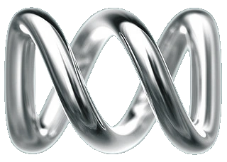
With the celebration of ABC in July 2002, ABC TV again modified the logo by reverting to the "over and under" design, but keeping the 3D silver color. The channel's idents featured elements - fire, leaf and ice, and the slogan was updated to Everyone's ABC. The idents also featured the silver ring that morphs into the ABC logo.
ABC1
2008–2011

In 2008, ABC TV was renamed to ABC1 to keep in line with the other digital channel ABC2.
2011–2014
In February 2011, ABC1 launched a new look with a redesigned logo and a new tagline, Think Entertainment. The aim of the rebrand was to communicate that ABC1 isn't only a source of news and current affairs, but also a channel for entertainment.
ABC (second era)
2014–present
The channel renamed itself simply ABC on 20 July 2014, bringing the 1975 Lissajous curve logo back. The change was accompanied with a new slogan: #ourABC. The logo came in a range of colours and also features gradients at the logo's overlap points, simulating a drop shadow.
Other
For other related logos and images see: ABC (Australian TV channel)/Other
Template:FreeTV Australia
