This page only shows primary logo variants.
For other related logos and images, see:
ABC (abbreviated from American Broadcasting Company ) is an American television network owned by The Walt Disney Company through its Walt Disney Television division. The fifth-oldest major broadcasting network in the world and the youngest of the Big Three television networks, ABC is nicknamed The Alphabet Network , as its initialism also represents the first three letters of the English alphabet, in order.
It was founded on January 1, 1927, as a radio service named NBC Blue Network
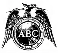
1945–1952 1952–1953 1953–1956 In 1953, the network introduced a new logo based on the seal of the Federal Communications Commission, with the letters "ABC" enclosed in a circular shield surmounted by the bald eagle.
1956–1962 In 1956, just before the television network began its first color broadcasts, the ABC logo consisted of a tiny lowercase "abc" in the center of a large lowercase letter a, a design known as the "ABC Circle A".
1962–present In the mid-1960's, graphic designer Paul Rand redesigned the ABC logo into its best-known (and current) form, with the lowercase letters "abc" enclosed in a single black circle. The new logo debuted on-air on October 19, 1962, but however didn't appear until the spring of 1963. The logo's simplicity made it easier to redesign and duplicate, which conferred a benefit for ABC. A color version of this logo was also developed around 1963, and animated as a brief 10-second intro to be shown before the then-small handful of network programs broadcast in color. The "a" was rendered in red, the "b" in blue, and the "c" in green, against the same single black circle. A variant of this color logo, with the colored letters against a white circle, was also commonly used throughout the 1960s.
1988–2007 The original Paul Rand logo was slightly modified in 1988. This version of the design was presumably meant to make the logo clearer at smaller sizes (as evidenced by the thinner strokes on the letters and the short ascender on the "b"), but was also frequently used at larger ones. Some ABC affiliates, along with the ABC Family cable channel continue to use the 1962 design in their logos. This logo was still used on the ABC Kids block on ABC until it got replaced with Litton's Weekend Adventure .
2007–2013 In time for the new television season in 2007, ABC rolled out a new identity package with a new tagline and a new interpretation of their logo. The new slogan, "Start here" (used until 2010), was presented at the upfronts in May. The slogan aimed to position ABC as a multi-platform brand, which can be watched on television, as well as on a computer or a mobile device.
In the new graphics package, the ABC logo would always appear in 3D as a shiny black disc. There were also multimedia icons developed were the ABC lettering was replaced symbols for mobile phones, computers, television screens and portable media players. The new design created by Troika Design Group was used from September 22, 2007 until May 29, 2013. Despite this, it still remains in use by plenty of ABC affiliates' logos.
2013–present In 2013, ABC modified their 2007 logo. This logo first appeared on the all access website, featured in trailers for 2013–2014 programs. The new logo first appeared on May 30. Designed by Loyalkaspar , it is inspired by Paul Rand 's original 1962 design.
External links
American Broadcasting Company
Part of The Walt Disney Company Predecessor companies American Broadcasting Companies | Capital Cities/ABC
United States broadcast television ABC (HD ) | ABC News | Localish
Owned Television Stations KABC-TV (Los Angeles, CA) | KFSN-TV (Fresno, CA) | KGO-TV (San Francisco–Oakland–San Jose, CA) | KTRK-TV (Houston, TX) | WABC-TV (New York City, NY) | WLS-TV (Chicago, IL) | WPVI-TV (Philadelphia, PA) | WTVD (Raleigh–Durham–Fayetteville, NC)
Radio networks ABC Audio | ABC News Now | ABC News Radio
Note: All stations listed by market size -- largest to smallest -- with call letters at the time they were sold.
AM Stations New York City: WABC 770 • WQEW 1560 (now WFME ) | Los Angeles: KABC 790 | Chicago: WLS 890 • WRDZ 1300 • WPJX 1500 | San Francisco: KSFO 560 • KGO 810 • KMKY 1310 | Dallas-Fort Worth: KMKI 620 (now KTNO ) • WBAP 820 | Houston: KMIC 1590 | Washington, DC: WMAL 630 | Atlanta: WDWD 590 | Philadelphia: WWJZ 640 | Boston: WMKI 1260 (now WBIX ) | Miami-Fort Lauderdale: WMYM 990 | Detroit: WJR 760 • WFDF 1 910 • WXYZ 1270 (now WXYT ) | Seattle: KKDZ 1250 | Phoenix: KMIK 1580 (now KHEP ) | Minneapolis-St. Paul: KDIZ 1440 (now KYCR ) | Denver: KDDZ 1690 (now KDMT ) | Tampa-St. Petersburg: WWMI 1380 | St. Louis: WSDZ 1260 | Portland, OR: KDZR 1690 | Charlotte: WGFY 1480 | San Antonio: KRDY 1160 | Pittsburgh: WWCS 2 540 • WDDZ 1250 (now WPGP ) • KQV 1410 | Sacramento: KIID 1470 | Salt Lake City: KWDZ 3 910 | Orlando: WDYZ 990 | Cleveland: WWMK 1260 (now WCCR ) | Kansas City, MO: KPHN 1190 (now KDMR ) | Milwaukee: WKSH 1640 (now WSJP ) | Providence: WDDZ 550 (now WSJW ) | Norfolk: WRJR 1010 (now WPMH ) • WHKT 1650 | Greensboro: WCOG 1320 | West Palm Beach: WMNE 1600 (now WPOM ) | Jacksonville: WBWL 600 (now WBOB ) | New Orleans: WBYU 3 1450 | Hartford: WDZK 1550 (now WSDK ) | Richmond: WDZY 1290 | Louisville: WDRD 680 (now WHBE ) | Tulsa: KMUS 1380 | Albany, NY: WDDY 1460 (now WOPG ) | Albuquerque: KALY 1240 (now KDSK ) | Toledo, OH: WFRO 1,3 900 | Wichita: KQAM 1480
FM Stations New York: WPLJ 95.5 | Los Angeles: KLOS 95.5 | Chicago: WLS 94.7 | Dallas-Fort Worth: KSCS 96.3 • KTYS 96.7 (now KTCK ) | Houston: KHMX 96.5 | Washington, DC: WJZW 105.9 (now WMAL ) • WRQX 107.3 | Atlanta: WKHX 101.5 • WYAY 106.7 | Detroit: WDRQ 93.1 • WDVD 96.3 • WRIF 101.1 | Minneapolis-St. Paul: KQRS 92.3 • KXXR 93.7 • WGVX 4 105.1 | Pittsburgh: WDVE 102.5 | Indianapolis: WRDZ 98.3 (now WZRL ) | Little Rock: KDIS 99.5
Radio Networks American Contemporary Network | American Information Network | American Entertainment Network | American FM Network | ABC Rock Radio Network | ABC Direction Radio Network | ABC Talk Radio | Country Coast-to-Coast | ESPN Radio | Jack FM | Kool Gold | Radio Disney | Real Country | Rejoice! Musical Soul Food | Stardust | Starstation | The Classic Rock Experience | The Christmas Channel | The Touch | The True Oldies Channel | Today's Best Hits | Unforgettable Memories | Urban Advantage Network | Z-Rock
WFDF was originally in the Flint radio market before moving to Farmington Hills in the Detroit radio market in 2006. As a result of the station's move to Detroit, WFRO in the Toledo market as well as another station in Northern Michigan (also on 900) were taken off the air to allow WFDF to increase its broadcast power.
Disney/ABC never owned the station, but operated it under a Local Marketing Agreement. Birach Broadcasting has since taken complete, outright control of the station.
These stations are either silent or completely off the air at this time.
WGVX also simulcasts on 105.3 and 105.7 .
Sources: ABC Radio , Cumulus Media , Cumulus Media Networks , Radio Disney and Westwood One on Wikipedia
Television production ABC News Studios | ABC Signature
Other assets ABCtek
Defunct ABC1 | ABC Circle Films | ABC Digital Originals | ABC Films | ABC Kane Productions | ABC Kids | ABC Media Group | ABC Motion Pictures | ABC News Now (network) | ABC Pictures Corporation | ABC Productions | ABC Studios | ABC Video | Creative Wonders | Live Well Network | The Baseball Network | ABC First Look | ABC Mobile | ABC Media Productions
Predecessors: Laugh-O-Gram Studios | 21st Century Fox | Capital Cities/ABC Inc. | News Corporation
Disney Entertainment The Walt Disney Studios :Walt Disney Pictures | Walt Disney Animation Studios | Disneynature | Pixar Animation Studios | Marvel Studios | Lucasfilm | 20th Century Studios | Searchlight Pictures | Walt Disney Studios Motion Pictures (Searchlight Pictures (distribution unit) | Buena Vista International (Walt Disney Japan (Japan) | Star Distribution (Latin America)Disney Music Group (Walt Disney Records | Hollywood Records (Marvel Music ) | Disney Music Publishing | Buena Vista Records | S-Curve Records ) | Disney Theatrical Group | Disney Theatrical Productions (Disney on Broadway | Disney on Ice | Disney Live! ) | New Regency 26 (Regency Enterprises )
Disney General Entertainment Content :Disney Streaming Disney+ (Star ) | Hulu (United States) | Disney+ Hotstar (India, Indonesia, Malaysia & Thailand) | Star+ (Latin America) | DisneyNow (United States) | FX Now (United States)
U.S. television networks: Disney Branded Television: Disney Channel | Disney XD | Disney Junior ABC Entertainment :ABC (ABC News (News Now ))ABC Family Worldwide :Freeform FX Networks :FX | On Hulu | FX Movie Channel | FXX National Geographic Partners :National Geographic 5 | National Geographic Wild | Nat Geo Mundo
Walt Disney Television :ABC Entertainment (Greengrass Productions ) | ABC News Studios | ABC News Productions | Disney Television Studios (ABC Signature | 20th Television | 20th Television Animation | Searchlight Television )Disney Branded Television :Disney Europe Animation | Disney Television Animation | It's a Laugh Productions | Disney Channel Original Movies | Disney Junior Originals | Walt Disney Television Alternative
Other assets: Disney+ Original (Disney+ Premier Access ) | Disney Original Documentary | Freeform Originals | FXP | Hotstar Originals | Hotstar Specials | Hulu Originals | Onyx Collective | Star Original (Disney+ Star Anime Series ) | Star Original Productions | Star+ Original
Distribution assets: Disney Entertainment (Disney Entertainment Distribution | Disney Platform Distribution ) | Buena Vista Home Entertainment (Disney Banner | Marvel Banner | Lucasfilm Banner | 20th Century Studios and Searchlight Banner | MovieNEX)
American Broadcasting Company
Part of The Walt Disney Company Predecessor companies American Broadcasting Companies | Capital Cities/ABC
United States broadcast television ABC (HD ) | ABC News | Localish
Owned Television Stations KABC-TV (Los Angeles, CA) | KFSN-TV (Fresno, CA) | KGO-TV (San Francisco–Oakland–San Jose, CA) | KTRK-TV (Houston, TX) | WABC-TV (New York City, NY) | WLS-TV (Chicago, IL) | WPVI-TV (Philadelphia, PA) | WTVD (Raleigh–Durham–Fayetteville, NC)
Radio networks ABC Audio | ABC News Now | ABC News Radio
Note: All stations listed by market size -- largest to smallest -- with call letters at the time they were sold.
AM Stations New York City: WABC 770 • WQEW 1560 (now WFME ) | Los Angeles: KABC 790 | Chicago: WLS 890 • WRDZ 1300 • WPJX 1500 | San Francisco: KSFO 560 • KGO 810 • KMKY 1310 | Dallas-Fort Worth: KMKI 620 (now KTNO ) • WBAP 820 | Houston: KMIC 1590 | Washington, DC: WMAL 630 | Atlanta: WDWD 590 | Philadelphia: WWJZ 640 | Boston: WMKI 1260 (now WBIX ) | Miami-Fort Lauderdale: WMYM 990 | Detroit: WJR 760 • WFDF 1 910 • WXYZ 1270 (now WXYT ) | Seattle: KKDZ 1250 | Phoenix: KMIK 1580 (now KHEP ) | Minneapolis-St. Paul: KDIZ 1440 (now KYCR ) | Denver: KDDZ 1690 (now KDMT ) | Tampa-St. Petersburg: WWMI 1380 | St. Louis: WSDZ 1260 | Portland, OR: KDZR 1690 | Charlotte: WGFY 1480 | San Antonio: KRDY 1160 | Pittsburgh: WWCS 2 540 • WDDZ 1250 (now WPGP ) • KQV 1410 | Sacramento: KIID 1470 | Salt Lake City: KWDZ 3 910 | Orlando: WDYZ 990 | Cleveland: WWMK 1260 (now WCCR ) | Kansas City, MO: KPHN 1190 (now KDMR ) | Milwaukee: WKSH 1640 (now WSJP ) | Providence: WDDZ 550 (now WSJW ) | Norfolk: WRJR 1010 (now WPMH ) • WHKT 1650 | Greensboro: WCOG 1320 | West Palm Beach: WMNE 1600 (now WPOM ) | Jacksonville: WBWL 600 (now WBOB ) | New Orleans: WBYU 3 1450 | Hartford: WDZK 1550 (now WSDK ) | Richmond: WDZY 1290 | Louisville: WDRD 680 (now WHBE ) | Tulsa: KMUS 1380 | Albany, NY: WDDY 1460 (now WOPG ) | Albuquerque: KALY 1240 (now KDSK ) | Toledo, OH: WFRO 1,3 900 | Wichita: KQAM 1480
FM Stations New York: WPLJ 95.5 | Los Angeles: KLOS 95.5 | Chicago: WLS 94.7 | Dallas-Fort Worth: KSCS 96.3 • KTYS 96.7 (now KTCK ) | Houston: KHMX 96.5 | Washington, DC: WJZW 105.9 (now WMAL ) • WRQX 107.3 | Atlanta: WKHX 101.5 • WYAY 106.7 | Detroit: WDRQ 93.1 • WDVD 96.3 • WRIF 101.1 | Minneapolis-St. Paul: KQRS 92.3 • KXXR 93.7 • WGVX 4 105.1 | Pittsburgh: WDVE 102.5 | Indianapolis: WRDZ 98.3 (now WZRL ) | Little Rock: KDIS 99.5
Radio Networks American Contemporary Network | American Information Network | American Entertainment Network | American FM Network | ABC Rock Radio Network | ABC Direction Radio Network | ABC Talk Radio | Country Coast-to-Coast | ESPN Radio | Jack FM | Kool Gold | Radio Disney | Real Country | Rejoice! Musical Soul Food | Stardust | Starstation | The Classic Rock Experience | The Christmas Channel | The Touch | The True Oldies Channel | Today's Best Hits | Unforgettable Memories | Urban Advantage Network | Z-Rock
WFDF was originally in the Flint radio market before moving to Farmington Hills in the Detroit radio market in 2006. As a result of the station's move to Detroit, WFRO in the Toledo market as well as another station in Northern Michigan (also on 900) were taken off the air to allow WFDF to increase its broadcast power.
Disney/ABC never owned the station, but operated it under a Local Marketing Agreement. Birach Broadcasting has since taken complete, outright control of the station.
These stations are either silent or completely off the air at this time.
WGVX also simulcasts on 105.3 and 105.7 .
Sources: ABC Radio , Cumulus Media , Cumulus Media Networks , Radio Disney and Westwood One on Wikipedia
Television production ABC News Studios | ABC Signature
Other assets ABCtek
Defunct ABC1 | ABC Circle Films | ABC Digital Originals | ABC Films | ABC Kane Productions | ABC Kids | ABC Media Group | ABC Motion Pictures | ABC News Now (network) | ABC Pictures Corporation | ABC Productions | ABC Studios | ABC Video | Creative Wonders | Live Well Network | The Baseball Network | ABC First Look | ABC Mobile | ABC Media Productions
Radio networks: ABC Audio | ABC News Radio | ABC News Now | ESPN Radio | ESPN Xtra
Broadcasting assets: Radio stations Radio Disney stations:Rádio Disney Brasil 8 | Radio Disney Peru
ABC Owned Television Stations :KABC-TV | KFSN-TV | KGO-TV | KTRK-TV | WABC-TV | WLS-TV | WPVI-TV | WTVD
International channels: Disney Channel Africa | Albania | Bulgaria | Canada (French )12 | Czech Republic | France | Germany | Greece | Hungary | India | Israel | Japan | Latin America | Middle East | Netherlands & Flanders | Poland | Portugal | Romania & Moldova | Scandinavia | Spain
Disney Junior Africa | Canada 12 | France | India | Israel | Latin America | Middle East | Netherlands & Flanders | Poland | Portugal | Romania | Spain
Disney XD Canada 12 | Netherlands and Flanders | Poland
National Geographic Latin America Africa | Asia | Canada | Europe | India | Middle East ) | Nat Geo Music | Nat Geo People (HD )
Star Channel Mundo ) | Balkans (Crime | Life | Movies ) | Belgium | Bulgaria (Crime | Life ) | Finland | Latin America | Middle East (Action | Films | Life | Movies | Series | World ) | Netherlands | Portugal (Comedy | Crime | Life | Movies ) | Serbia | Spain
FX Baltics (Life ) | CIS (Life ) | Greece (Life ) | Latin America | Turkey | Poland (Comedy ) | Canada
Cinecanal Latin America | Brazil
Other channels 24Kitchen | BabyTV | Dlife | Now | RTL Zwei | TV Chile 17 (Canal 24 Horas ) | ABC Spark
International branches Canada | Japan | India | Asia Pacific (Australia/New Zealand | China | Hong Kong | Taiwan | Korea | Southeast Asia (Malaysia | Philippines | Thailand | Indonesia ) ) | EMEA (UK & Ireland | Middle East & North Africa | Africa | France | Benelux | Germany, Switzerland & Austria (Germany | Switzerland | Austria ) | Italy | Spain and Portugal (Portugal ) | Nordic & Baltic (Nordic ) | Israel | Turkey | Greece | Hungary | Poland | Bulgaria ) | Latin America (Mexico | Brazil | Colombia | Peru | Argentina (Patagonik Film Group ) | Chile ) | CIS
Part of The Walt Disney Company
Part of Disney India (The Walt Disney Company )
Television channels: Hindi: Entertainment: Star Plus | Star Bharat | Star Utsav | Movies: Star Gold | Star Gold 2 | Star Gold Select | Star Utsav Movies | Youth entertainment/music: Bindass 1
English: Entertainment: Disney International HD 1 | Movies: Star Movies | Star Movies Select | Knowledge and infotainment: National Geographic | Nat Geo Wild | Lifestyle: Star Life | Kids: Disney Channel 1 | Hungama 1 | Super Hungama 1 | Disney Junior 1 | BabyTV
Regional-language TV channels: Entertainment channels: Tamil: Star Vijay | Telugu: Star Maa | Kannada: Star Suvarna | Malayalam: Asianet and Asianet Plus | Bengali: Star Jalsha | Marathi: Star Pravah | Odia: Star Kiran Movie channels: Tamil: Vijay Super | Telugu: Star Maa Movies and Star Maa Gold | Kannada: Star Suvarna Plus | Malayalam: Asianet Movies | Bengali: Jalsha Movies | Marathi: Pravah Picture Music channels: Tamil: Vijay Music | Telugu: Star Maa Music
Star Sports :English: Star Sports 1 | Star Sports 2 | Star Sports 3 | Hindi: Star Sports 1 Hindi | Star Sports First Regional languages: Star Sports 1 Tamil , Telugu , Kannada , Bangla and Marathi Star Sports Select :Star Sports Select 1 , Star Sports Select 2
Planned channels: National channels: 'Kids:' Hungama 1 Regional languages: 'Bengali:' Jalsha Josh
International channels: United Kingdom and Europe: Utsav Plus , Utsav Gold and Utsav Bharat Middle East and Southeast Asia: Vijay TV , Asianet Middle East Africa: Star Life , Star Select
Other assets: Video-on-demand service: Disney+ Hotstar (Originals | Specials ) | Film production: Star Studios (Other ) Satellite TV, broadband and OTT: Tata Play 2 (Tata Play+ | HD | + HD | UHD 4K | Binge/Binge+ | Fiber )
Former channels and properties:
Indian channels: Defunct: Life OK /Star One | Star Movies Action | FX | Fox Crime | Channel V | ESPN | Movies OK | Nat Geo Tamil and Nat Geo Telugu | ESPN Star Sports | UTV World Movies 1 | UTV Stars | Bindass Play 1 | UTV Action Telugu 1 | Star World | Star World Premiere HD | UTV HD 1 | UTV Movies 1 | UTV Action 1 | UMP Movies 1 Divested: News network 3 (Star News | Star Ananda | Star Majha ) | Star CJ Alive 4 | MTV (India) 5 | Bloomberg UTV/UTVi 1 International channels discontinued in India: Nat Geo Music | Nat Geo People | BabyTV (SD only) Unlaunched: Star Sports 1 Gujarati | Star Sports 1 Malayalam
Non-Indian channels: Star China Media 6 (Star Sports (China) | Xing Kong | Channel V (China) | Fortune Star ) | Antv 7 | Film Indonesia | MTV Asia 5 | Star World Asia 8 , Star Movies8 (Asia , Philippines and Taiwan ) | Viva Cinema 9 | Channel V (Korea)
Notes: 1 Originally owned, sold or discontinued by The Walt Disney Company India before its acquisition of Star.2 Joint venture with Tata Group .3 Sold to ABP Group .4 Sold to CJ ENM .5 Joint venture between Star and Viacom . Dissolved in 1994 with the launch of Channel V and Channel V India .6 Sold to China Media Capital.7 Sold to Visi Media Asia , which had owned 80% of the channel (Star formerly owned 20%).8 Rebranded from Star to Fox channels in 2017. Defunct since 1 October 2021.9 Relaunched as Pinoy Box Office, later known as PBO .
Other assets: Disney+ Hotstar | UTV Software Communications (UTV Motion Pictures )
Defunct assets: UTV Indiagames | UTV Ignition Games
Other assets: A+E Networks 4 (assets ) | Disney Advertising Sales
Disney Experiences Parks and resorts: Disneyland Resort (Disneyland Park | Disney California Adventure ) | Walt Disney World (Magic Kingdom | EPCOT | Disney's Hollywood Studios | Disney's Animal Kingdom | Disney's Typhoon Lagoon | Disney's Blizzard Beach ) | Tokyo Disney Resort 25 (Tokyo Disneyland | Tokyo DisneySea ) | Disneyland Paris (Disneyland Park | Walt Disney Studios Park ) | Hong Kong Disneyland | Shanghai Disney Resort (Shanghai Disneyland )
Consumer products: Disney Publishing Worldwide (Disney Comics | Disney English | Disney Press | Disney–Lucasfilm Press | Marvel Comics ) | The Muppets Studio | Disney Interactive | Gamestar | Disney Games | Disney Mobile | Disney PhotoPass | Disney Store (online )
Other assets: Disney Cruise Line | Disney Vacation Club | Adventures by Disney | Storyliving by Disney | Walt Disney Imagineering
Other assets:20th Century Games | DGamer | CDVU+ | Disney Institute | Disney Research | Disney DVD (Disney's Fast Play ) | Disney Movie Insiders | Disney Blu-ray (Disney Blu-ray 3D ) | Disney's Fastpass | Lucasfilm Games | Industrial Light and Magic | Skywalker Sound | Disney Classics | Disney D23 | Disney Studios Australia | Disney Interactive | Movies Anywhere | National Geographic Partners (73%) | Reedy Creek Energy Services |
Former assets: Miramax | Dimension Films | Dimension Home Entertainment | Dimension Television | Dimension Extreme Films | Miramax Family Films | Miramax Books | Miramax/Dimension Films | Anaheim Ducks | Baby Einstein | Oxygen (TV network) | E! | DIC Entertainment | DIC Home Entertainment | Creative Wonders 8 | Hyperion Books | GMTV | Fox Sports Networks | Endemol Shine Group | Super RTL 19 | TeleColombia 21 | TOGGO Plus 19 | Xee 24 1UP.com | 20th Century Fox Consumer Products | 20th Century Fox Games | 20th Century Fox International Television | 20th Century Fox Records | 20th Century Fox Selections | 20th Television | 20th Century Fox Television Distribution | 20th Century Fox Video | 20th Century Pictures | 20th Digital Studio | 7 dni TV | ABC Circle Films | ABC Films | ABC Kane Productions | ABC Kids | ABC Motion Pictures | ABC News Now | ABC Pictures Corporation | ABC Productions | ABC Studios | ABC Video | ABC1 | ABC Quick Cut | ABC Mobile | ABC Media Productions | Avalanche Software | BAMTech Media (75%) | Black Rock Studio | Blip | Blue Sky Studios | Boyz/Girlz Channel | Buena Vista Games | Buena Vista International | Buena Vista International Television | Buena Vista Pictures Distribution | Buena Vista Original Productions | Buena Vista Productions | Buena Vista Television | Cannell Distribution | Capital Disney 12 | Caravan Pictures | CBS/Fox Children's Video 21 | CBS/Fox Video 21 | Channel V | Circle 7 Animation | Club Penguin | Club Penguin Island | Créativité & Développement 2 | CrossGen | Das Vierte | DePatie-Freleng Enterprises | Disney Channel (Australia and New Zealand | Hong Kong | Indonesia | Italy | Malaysia | Philippines | Russia | Southeast Asia | South Korea | Taiwan | Thailand | Turkey | UK and Ireland | Ukraine | Vietnam ) | Disney Channel Discovery | Disney Cinema | Disney Cinemagic | Disney Consumer Products | Disney Consumer Products and Interactive Media | Disney Deluxe | Disney Digital 3D | Disney Digital Network | Disney Drive-In | Disney in English | Disney Enhanced Home Theater Mix | Disney Family Movies | Disney Interactive Studios | Disney Junior (Australia and New Zealand | Asia | Cambodia | Germany | Hong Kong | Hungary | Indonesia | Italy | Philippines | Scandinavia | Singapore | South Korea | Thailand | UK and Ireland | Vietnam ) | Disney Media & Entertainment Distribution | Disney Second Screen | Disney Videos | Disney XD (Australia and New Zealand | Croatia | France | Germany | Israel | Italy | Japan | Latin America | Middle East & North Africa | Scandinavia | Slovenia | Spain | South Africa | Southeast Asia | UK and Ireland ) | Disney XD Originals | Disney Xtreme Digital | Disneyland, Inc. | Disneyland Records | Disney Vacation Connection | DisneyLink | DisneyLife | DisneyQuest | DisneyToon Studios | DXP | ESPN 3D | ESPN America | ESPN Classic (UK) | ESPN Deportes Radio | ESPN Full Court | ESPN GamePlan | Four Star-Excelsior Releasing | Four Star International | Fox (Africa | Asia | Germany | Hungary | Italy | Japan | Norway | UK and Ireland ) | Fox 2000 Pictures | Fox 21 | Fox App (Latin America) | Fox Animation | Fox Atomic | Fox Circle Productions | Fox Classics (Japan) | Fox Comedy (Italy) | Star Crime (India | Italy | MENA | Turkey) | Fox Digital Entertainment | Fox Entertainment Group | Fox Europe | Fox Faith | Fox Family | Fox Filipino 14 | Fox Film Corporation | Fox Hills Video | Fox International Productions | Fox Kids (United States) | Fox Kids (Finland) | Fox Kids Worldwide | Fox Lab | Fox Life (Africa | Asia | Italy | Spain ) | Fox Music | Fox Movies (Asia (Action | Family ) | Philippines | Japan | Family Movies (MENA) ) | Fox Networks Group | Fox Next | Fox-Paramount Home Entertainment 3 | Fox+ (Asia | Europe) | Fox Reality Channel | Fox Records 7 | Fox Retro | Fox Rewayat | Fox Soccer | Fox Sports (Asia (2 | 3 ) | Chile | Peru ) | Fox Sports and Entertainment | Fox Television Studios | Fox Video | Fox West Pictures | Fox World | FoxConnect | Foxnet | Foxstar Productions | Fuel TV | FX (Asia | India | Italy | MENA ) | FX+ | FXM (Latin America) | Gaumont Buena Vista International | Go.com | Gold Key Entertainment | Heron Communications | Heron Home Entertainment | Hi-Tops Video | Hollywood BASIC | Hollywood Pictures | Hollywood Pictures Home Entertainment | IGN | IGN Entertainment | Jetix | Jetix Animation Concepts | Jumbo Pictures | Junction Point Studios | Kaboose (Funschool | Kids Domain | Zeeks Key DVD | Key Video 18 | Leap Off Productions | Live Well Network | Lucasfilm Television | Lyric Street Records | Magnetic Video | Malibu Comics | Mammoth Records | Marvel Entertainment | Marvel Toys | Media Home Entertainment | Metromedia Producers | Movistar Disney 9 | MTM Enterprises | MTM Home Video | MTM International | MTM Music Group | MTM Television Distribution | Mundo Fox | Nat Geo Kids | Nat Geo People (Asia | Germany | Italy ) | National Geographic (Italy) | National Geographic Wild (Australia | Italy | Latin America ) | Nat Geo &YO | New World Animation | New World Entertainment | New World International | New World Pictures | New World Pictures International | New World Television | New World Television Distribution | New World/Genesis Distribution | The Nostalgia Merchant | Palomar Pictures International 2 | Paramount Comics 3 | Paramount Toys 3 | Pixar Canada | Playdom | Playhouse Video | Playmation | Premium Large Format | Propaganda Games | Radio Disney (Radio Disney Country | Radio Disney Junior ) | Regency Television 27 | Rhodes Productions | Saban Entertainment 2 | Saban Interactive 2 | Saban International 2 | Satellite News Channel 7 | Selmur Pictures | Selmur Productions | Semiorka (49%) | SIP Animation 2 | Sky Cinema Disney 8 | Sky Movies Disney 11 | Soapnet | Speed | SpotMixer (One True Media | Vlix ) 23 | Star Chinese Channel | Star Chinese Movies (Legend ) | Star Entertainment Channel | Star Movies (China | Taiwan: Gold | HD ) | Star World | Star Comics | Star Life | Star Premium (Latin America: Star Action | Star Cinema | Star Classics | Star Comedy | Star Fun | Star Hits | Star Series , Brazil: Star Hits | Star Hits 2 ) | Storer Programs Incorporated | Touchstone Home Entertainment | Touchstone Pictures | Touchstone Television | Touchstone Television (2020) | TeamXbox | The Cannell Studios | The Disney Afternoon Toon Disney (International ) | Toon Disney's Big Movie Show Toontown Online | UTV Ignition Games | UTV World Movies | Valleycrest Productions | Vault Disney | VeneVista Video | Viajar | Victory Television | Vista-United Telecommunications | Voyage | Walt Disney Classics | Walt Disney Direct-to-Consumer and International | Walt Disney Home Video International | Walt Disney Parks and Resorts | Walt Disney Television | Walt Disney Video Premiere | YourTV | Zoog Disney
Notes
1 Disney manages film catalog created for ABC ; remainder of library controlled by Bristol-Myers Squibb .2 Disney manages certain film and television rights, rest of the Saban catalog is currently owned by Hasbro .3 Joint venture with Paramount Pictures .4 Joint venture with Hearst Communications , which owns 20% of ESPN and 50% of A&E Networks.5 Co-owned with Westinghouse Broadcasting (aka Group W)6 Joint venture with Rádio Holding Participações Ltda.7 Joint venture with Electronic Arts .8 Joint venture with Sky Limited .9 Joint venture with Telefónica .10 Owned by Corus Entertainment .11 Joint venture with Sky Network Television .12 Joint venture with Global Group .13 Joint venture with Apollo Global Management .14 Joint venture with GMA Network Inc. 15 Joint venture with CJ ENM .16 Owned by Televisión Nacional de Chile , but distributed by Disney in Latin America.17 Co-owned with NBCUniversal 18 Co-owned with Paramount Global .19 Co-owned with Mediengruppe RTL Deutschland (RTL Group )20 Joint venture with TV Globo .21 Sold to Paramount International Networks .22 Co-owned with TDC Group .23 Acquired by its subsidiary Disney Interactive .24 Sold to Nordic Entertainment Group .25 Owned by The Oriental Land Company under license from Disney.26 Co-owned with Arnon Milchan.
Template:Television Networks US

