Stevefan1234 (talk | contribs) No edit summary Tag: rte-wysiwyg |
No edit summary |
||
| (28 intermediate revisions by 14 users not shown) | |||
| Line 1: | Line 1: | ||
| + | {{ImageTOC |
||
| + | |Multi1.png|1976–1983 |
||
| + | |Multi2.png|1983–1987 |
||
| + | |Acer_1987.svg|1987–2001 |
||
| + | |Acer_Logo.svg|2001–2011 |
||
| + | |Acer_2011.svg|2011–present |
||
| + | }} |
||
==Multitech== |
==Multitech== |
||
===1976–1983=== |
===1976–1983=== |
||
| − | [[File:Multi1.png|center]] |
+ | [[File:Multi1.png|center|200px]] |
===1983–1987=== |
===1983–1987=== |
||
| − | [[File:Multi2.png|center]] |
+ | [[File:Multi2.png|center|200px]] |
==Acer== |
==Acer== |
||
===1987–2001=== |
===1987–2001=== |
||
[[File:Acer_1987.svg|250px|center]] |
[[File:Acer_1987.svg|250px|center]] |
||
| − | The company was renamed '''Acer''' in 1987. Some products have still used this logo for a short time after the introduction of the 2001 Acer logo. |
+ | The company was renamed '''Acer''' in 1987. The logo consists of a red and indigo logo with a diamond to the right and the A and R capitalised. Some products have still used this logo for a short time after the introduction of the 2001 Acer logo. |
<gallery spacing="small" gallery="gallery" position="center" hideaddbutton="true" widths="200" captionalign="center" captionsize="small" bordersize="none" bordercolor="transparent"> |
<gallery spacing="small" gallery="gallery" position="center" hideaddbutton="true" widths="200" captionalign="center" captionsize="small" bordersize="none" bordercolor="transparent"> |
||
Acer_Logo_1987.svg|The color of the logo was changed to black during the mid 1990's. |
Acer_Logo_1987.svg|The color of the logo was changed to black during the mid 1990's. |
||
| Line 16: | Line 23: | ||
===2001–2011=== |
===2001–2011=== |
||
[[File:Acer_Logo.svg|center|250px]] |
[[File:Acer_Logo.svg|center|250px]] |
||
| + | On March 8, 2001, a new logo was introduced, in which the Acer diamond was dropped. It was created by [[Landor Associates]]. The new logo came out following the spin-off of Acer's contract manufacturing business to focus on its brand business. |
||
===2011–present=== |
===2011–present=== |
||
[[File:Acer_2011.svg|center|250px]] |
[[File:Acer_2011.svg|center|250px]] |
||
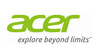
| + | The 2001 logo was modified in 2011. The logo uses a different typeface with more rounded corners, and the "e" became more bolder. The new logo also uses a different shade of green, which has been dubbed "Acer Green". Flipping the current logo horizontally transforms the logo from Acer to 1976, the year the company (then known as Multitech International) was founded. |
||
| − | The 2001 logo was modified in 2011. |
||
| + | <gallery spacing="small" gallery="gallery" position="center" hideaddbutton="true" widths="200" captionalign="center" captionsize="small" bordersize="none" bordercolor="transparent"> |
||
| − | The color scheme was changed to yellow-green as well as the text, and the "e" become more bolder. This logo almost look the same as the 2001 logo. |
||
| + | Acer Logo New.jpg|Logo with tagline "''explore beyond limits''" |
||
| − | |||
| + | </gallery> |
||
| − | [[File:Acer_Logo_New.jpg|center]] |
||
| − | |||
| − | In 2011 with a slogan "Explore Behind Limits" |
||
| − | |||
| − | ==See also== |
||
| − | *[[eMachines]] |
||
| − | *[[Gateway Inc.]] |
||
| − | *[[Packard Bell]] |
||
==External links== |
==External links== |
||
*[http://www.acer.com/ Acer] |
*[http://www.acer.com/ Acer] |
||
| + | |||
| + | {{Acer}} |
||
[[Category:Acer]] |
[[Category:Acer]] |
||
[[Category:Computer]] |
[[Category:Computer]] |
||
| Line 43: | Line 46: | ||
[[Category:1987]] |
[[Category:1987]] |
||
[[Category:Open Handset Alliance]] |
[[Category:Open Handset Alliance]] |
||
| + | [[Category:Mobile phone manufacturers]] |
||
| + | [[Category:Computer companies]] |
||
Revision as of 15:53, 22 June 2020
| 1976–1983 | 1983–1987 | 1987–2001 | 2001–2011 | 2011–present |
Multitech
1976–1983
1983–1987
Acer
1987–2001
The company was renamed Acer in 1987. The logo consists of a red and indigo logo with a diamond to the right and the A and R capitalised. Some products have still used this logo for a short time after the introduction of the 2001 Acer logo.
2001–2011
On March 8, 2001, a new logo was introduced, in which the Acer diamond was dropped. It was created by Landor Associates. The new logo came out following the spin-off of Acer's contract manufacturing business to focus on its brand business.
2011–present
The 2001 logo was modified in 2011. The logo uses a different typeface with more rounded corners, and the "e" became more bolder. The new logo also uses a different shade of green, which has been dubbed "Acer Green". Flipping the current logo horizontally transforms the logo from Acer to 1976, the year the company (then known as Multitech International) was founded.
External links
Acer
|
|---|
| Brands: AU Optronics | ALi Corporation | Acerpure | Aspire | ConceptD | Extensa | Nitro | Predator | Swift | TravelMate | Veriton | Packard Bell Former/defunct: Notes: 1Spun off to become a separate company in 2001. |


