(Editing a gallery) |
(Editing a gallery) |
||
| Line 131: | Line 131: | ||
BBC East 2002.jpg|BBC One East logo |
BBC East 2002.jpg|BBC One East logo |
||
BBC East Midlands 2002.jpg|BBC One East Midlands logo |
BBC East Midlands 2002.jpg|BBC One East Midlands logo |
||
| + | BBC London 2002 a.jpg|BBC One LDN logo (2002-04) |
||
BBC London 2002 b.jpg|BBC One London logo (2004-06) |
BBC London 2002 b.jpg|BBC One London logo (2004-06) |
||
BBC Midlands 2002.jpg|BBC One Midlands logo |
BBC Midlands 2002.jpg|BBC One Midlands logo |
||
| Line 137: | Line 138: | ||
BBC South 2002.jpg|BBC One South logo |
BBC South 2002.jpg|BBC One South logo |
||
BBC South East 2002.jpg|BBC One South East logo |
BBC South East 2002.jpg|BBC One South East logo |
||
| + | BBC South West 2002.jpg|BBC One South West logo |
||
BBC West 2002.jpg|BBC One West logo |
BBC West 2002.jpg|BBC One West logo |
||
| + | BBC Yorks & Lincs 2002.jpg|BBC One Yorks & Lincs logo |
||
| + | BBC Yorkshire 2002 a.jpg|BBC One North logo (2002) |
||
| + | BBC Yorkshire 2002 b.jpg|BBC One Yorkshire logo (2002-06) |
||
</gallery> |
</gallery> |
||
Revision as of 04:35, 23 May 2014
Template:ImageTOC-16
- TV Ark
- The TV Room
- TV Live
- Wikipedia:History of BBC television idents
- BBC Press Office - History of the BBC ONE Idents
BBC Television Service
1936-1953

1953-1960

The first proper logo for the BBC Television Service was unveiled on December 2, 1953, consisting of this elaborate mechanical device designed by Abram Games. For obvious reasons, it came to be nicknamed the "Bat's Wings".
BBC TV
1960-1963

By October 1960, the "Bat's Wings" had been superseded by the BBC tv blocks. Here, they are contained within a circle with a map of the UK behind them, divided into the BBC's seven broadcast regions of the time (North of England, English Midlands, West of England, London, Wales, Scotland and Northern Ireland).
")
1963-1964
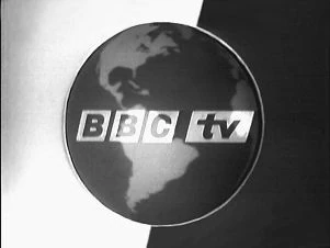
BBC tv adopted its most famous symbol, the globe, on September 30, 1963. At the same time, the BBC tv blocks were modified, becoming slanted to match the angle of the letters.
1964-1966

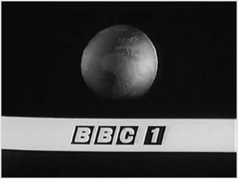
With the launch of BBC Two on April 20, 1964, the BBC tv service was renamed BBC One, and this second globe logo was introduced - which makes no reference to the new name. An earlier version exists with BBC tv service info.
")
BBC1
1966-1968

The third globe logo - known as the "watch-strap" globe for obvious reasons - was the first to feature the BBC One name.
1968-1969
The last globe logo before the introduction of colour, sometimes known as the "floating" globe.
1969-1972
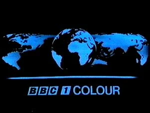
Colour was introduced to BBC1 on November 15, 1969, and with it came one of the channel's most famous logos. Designed by Murray Andrew, the "mirror globe" was a mechanical globe with a concave mirror behind it. It was filmed in black and white, the blue colour for the continents and "BBC1 COLOUR" legend being added electronically before airing. The word 'COLOUR' was in Helvetica.
The inclusion of the word "colour" could be viewed as a subtle reminder to buy a colour TV set, as most viewers would have still been watching in black and white at this time.
1972-1974
Subtle changes were made to the logo in 1972, with "COLOUR" now in an italic serif font and the corners of the BBC1 blocks rounded.
1974-1981

With colour TV sets becoming more and more common, more significant changes were made to the "mirror globe" at the end of 1974. The background was now dark blue and the continents yellow, and the "BBC1 COLOUR" legend was replaced with "BBC1" in Futura Bold font.
1981-1985

In September 1981, the "mirror globe" was modified once again, with the continents now pale green and the bold "BBC1" legend replaced with a twin-stripe version that had been used on programme slides and promotional trailers since the mid-1970s.
Much tweaking was made to this logo during its first nine months on air as a result of problems arising with the colour scheme and the size and position of the globe and legend.
1985-1991
A new era replaced the previous era above at 7pm on 18 February 1985. This era was known as COW (Computer Originated World).
1991–1997
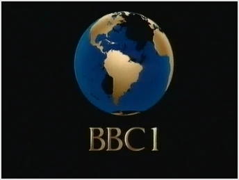
BBC One
1997–2002
BBC1 was renamed as BBC One. The BBC One ident received a facelift as a balloon created by Lambie-Nairn on 4 October 1997.
2002–2006

On March 29, 2002, BBC One introduced a new look which saw the globe motif disappear from its idents after almost 40 years. Instead the idents featured people in various form of dance and movement. The logo was also altered to match the one already used by BBC Two. Lambie-Nairn were also behind this new look.
- "The new channel idents explore the universal theme of rhythm, dance and movement through different activities, moods and world cultures. From the power and grace of a Brazilian dance to the raw energy of a festival, from the high elegance of ballet to the speed and agility of basketball players, the idents bring a new feel to BBC ONE. (...)
- Lorraine Heggessey, Controller of BBC ONE, said: 'We aim to capture the essence of the new spirit that is alive on BBC ONE, and reflect it in the new channel’s new identity. Whatever your age, wherever you live and whoever you are, rhythm and movement are common to everyone. BBC ONE should have that same universal appeal.' " - BBC press release
Initially, eight idents could be seen on screen. They were all short in the United Kingdom. Further idents were added over the upcoming years.
")
")
")
")
")
")
")
2006-present

On 7 October 2006, BBC One introduced a new identity.
The font used for the "one" wordmark was specially made for BBC One by Fontsmith.
The short idents began on 2 May 2009.
Unfortunately, moon and window idents had been withdrawn; they returned later in the year.
")
")
