Philip2011 (talk | contribs) (Added previous logos and descriptions) |
Philip2011 (talk | contribs) (Fixed the font size to be the same as the BBC logo.) |
||
| Line 12: | Line 12: | ||
==1997-2001== |
==1997-2001== |
||
| − | <p style="text-align: center;">[[File: |
+ | <p style="text-align: center;">[[File:Radio3smallfixed.png]]</p> |
Introduced in October 1997 which saw all departments, brands, and channels of the BBC using the same logo typeface and layout, with a view on saving costs with colour logos. The personality of the brand was conveyed in other means. This version includes the frequency, but the logo was also used without it. |
Introduced in October 1997 which saw all departments, brands, and channels of the BBC using the same logo typeface and layout, with a view on saving costs with colour logos. The personality of the brand was conveyed in other means. This version includes the frequency, but the logo was also used without it. |
||
Revision as of 16:48, 22 April 2011
1975-1991
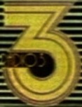
New BBC Radio logos were introduced in 1975, with the numeral of the station and the word 'Radio' inside of it. However Radio 3 included the full station name instead. This example was taken from a BBC promotion where the logo was overlaid onto a radio set, hence the lines behind the logo.
1991-1995
File:3654135109 64ca931f6a.jpg
In 1991 a shift to corporate identity began, and BBC Radio received new logos. Seen here on a badge is the Radio 3 logo, the only high quality image of the logo existing, from Radiothings.com.
1995-1997
In 1995, BBC Radio 1 received a new logo, but still using the same logo template as before. At the same time, the other four stations had their logos refreshed slightly to be more simpler. The numerals were made clearer, the word of the number of the station was removed, the colours of the logos were adjusted to be slightly darker, and finally the frequency and 'FM' text in the bottom right of the logos were removed.
1997-2001
Introduced in October 1997 which saw all departments, brands, and channels of the BBC using the same logo typeface and layout, with a view on saving costs with colour logos. The personality of the brand was conveyed in other means. This version includes the frequency, but the logo was also used without it.
2001-2007
File:BBC Radio 3smallforwiki.png
However BBC Radio decided to break away from this style and introduced new logos for its national stations in 2001, with the rest of the BBC would soon follow suit. This Radio 3 logo portrays the art aspect of the station.
2007-

In 2007 BBC Radio decided to create a more unified look for its stations by putting the numeral in a circle, with the 'BBC Radio' logo to the top left of this. Here is Radio 3's version, the top part of the '3' is a bass clef.
