Vilhelm.andersen.79 (talk | contribs) m (The old 1916 logo is now in use again. The 2012 logo has retired) |
No edit summary |
||
| (3 intermediate revisions by one other user not shown) | |||
| Line 1: | Line 1: | ||
| − | == 1916-2012 |
+ | == 1916-2012 == |
| + | ===1916-1926=== |
||
| − | [[File:BT-logo-551E440BE2-seeklogo com.gif|centre|thumb|189x189px]] |
||
| ⚫ | |||
| − | <gallery spacing="small" captionalign="center" position="center" widths="50" bordersize="none" bordercolor="transparent" hideaddbutton="true"> |
||
| ⚫ | |||
| ⚫ | |||
| − | Bt gl logo.jpg| |
||
| ⚫ | |||
| + | ===1926-1940s=== |
||
| − | This logo was used by BT from 31 August 1916 to 28 March 2012 and the logo had gone under various minor updates such as in the 1920s, it was straightly modified with the emblem being remodified as well as the "B.T." wordmark becoming thinner, and then in the 1960s, the emblem was removed from the logo by leaving it only with the "B.T." wordmark and the final update of the 1916 logo came into force in the 1990s by showing the logo making the dots turn into squared dots instead of rounded dots, and finally on 29 March 2012, this logo was discontinued after 95 years of usage. |
||
| + | [[File:BT_1920s.jpg|center|270px]] |
||
| + | On August 31, 1926, in order to celebrate its 10th birthday, the logo was straightly modified with the emblem being remodified as well as the "B.T." wordmark becoming thinner. |
||
| + | ===1940s-1967=== |
||
| + | [[File:BT_1940s.jpg|center|270px]] |
||
| + | In the 1940s, the whole logo turned red. |
||
| + | |||
| + | ===1926-1994=== |
||
| + | [[File:BT_1960s.svg|center|270px]] |
||
| + | Starting in 1967, the emblem was removed from the logo by leaving it only with the "B.T." wordmark. |
||
| + | |||
| + | ===1994-2012=== |
||
| + | [[File:BT_classic.svg|center|270px]] |
||
| + | The final update of the 1916 logo came into force in 1994 by showing the logo making the dots turn into squared dots instead of rounded dots, and finally on 29 March 2012, this logo was discontinued after 95 years of usage. |
||
| + | <gallery bordersize="medium" bordercolor="transparent" captionalign="center" position="center" widths="174"> |
||
| + | BT_with_red_rectangle.svg|Alternative version with the wordmark put inside the red rectangle. |
||
| + | </gallery> |
||
== 2012-2018 == |
== 2012-2018 == |
||
| + | [[File:BT_2012.svg|center|300px]] |
||
| − | [[File:6231972-bt-logo.jpg|centre|thumb|220x220px]]<gallery spacing="small" captionalign="center" position="center" widths="50" bordersize="none" bordercolor="transparent" hideaddbutton="true"> |
||
| ⚫ | On 29 March 2012, BT introduced a new logo for the first time of 95 years as the dots were removed away from the logo and the serifs were dropped from the wordmark which changes its typeface, thus the wordmark is now put inside a red rectangle. <gallery captionalign="center" widths="152" position="center" bordercolor="transparent"> |
||
| − | Bt logo 2012.png |
||
| + | BT_2012_3D.svg|3D version. |
||
| − | Bt-logo-flat.png |
||
| + | </gallery> |
||
| − | Bt.png |
||
| + | ==2018-present== |
||
| − | 553612 415288798498344 1534789352 n.jpg |
||
| + | [[File:BT_logo.svg|center|270px]] |
||
| − | BT nyt logo.jpg |
||
| + | On June 6, 2018, BT introduced back its classic 1994 logo with some minor changes. This logo was unveiled along with major revamp of its website. |
||
| ⚫ | |||
| + | |||
| + | ==External links== |
||
| + | *[http://www.bt.dk/ BT] |
||
[[Category:Newspapers in Denmark]] |
[[Category:Newspapers in Denmark]] |
||
[[Category:Newspapers]] |
[[Category:Newspapers]] |
||
| Line 21: | Line 38: | ||
[[Category:1916]] |
[[Category:1916]] |
||
[[Category:2012]] |
[[Category:2012]] |
||
| + | [[Category:2018]] |
||
Revision as of 05:48, 1 March 2019
1916-2012
1916-1926
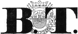
BT was founded in August 31, 1916 by Henry Hellesen. Its first logo consisted of the "B.T." wordmark which uses the typeface which has its inspiration of Latin American stamps.
1926-1940s
On August 31, 1926, in order to celebrate its 10th birthday, the logo was straightly modified with the emblem being remodified as well as the "B.T." wordmark becoming thinner.
1940s-1967
In the 1940s, the whole logo turned red.
1926-1994
Starting in 1967, the emblem was removed from the logo by leaving it only with the "B.T." wordmark.
1994-2012
The final update of the 1916 logo came into force in 1994 by showing the logo making the dots turn into squared dots instead of rounded dots, and finally on 29 March 2012, this logo was discontinued after 95 years of usage.
2012-2018
On 29 March 2012, BT introduced a new logo for the first time of 95 years as the dots were removed away from the logo and the serifs were dropped from the wordmark which changes its typeface, thus the wordmark is now put inside a red rectangle.
2018-present
On June 6, 2018, BT introduced back its classic 1994 logo with some minor changes. This logo was unveiled along with major revamp of its website.


