This page only shows primary logo variants. For other related logos and images, see:
|
| 1985–1991 | 1991–1997 | 1997–2002 | 2002–2005 | 2005–2007 | 2007–2016 | 2016–present |
Children's BBC
1985–1991
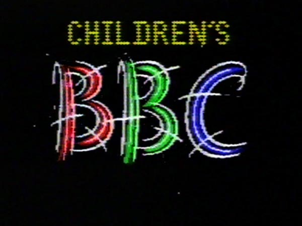
CBBC launched on 9 September 1985. The first logo used consisted of the word "Children's" above a sprawled version of the BBC text used on air. This logo was created using a BBC Microcomputer.
1991–1997
| SVG NEEDED |
In 1991, Children's BBC introduced a new logo for the first time since their launch in 1985. This followed the corporate look of the BBC's channels, but the logo was introduced in September.
1991–1994

1994–1997

CBBC
1997–2002

On Saturday 4 October 1997, a new corporate logo was introduced across the BBC. This logo was first shown on BBC One. The name was also shortened from Children's BBC to CBBC.
2002–2005
On 11 February 2002, CBBC launched a channel version and introduced a new logo, consisting of a green bug with a C in purple. The logo was designed by Lambie-Nairn just like CBeebies and BBC Kids from Canada which resembles its logo.
The idents are similar to the CBeebies and BBC Kids idents from the same year.
2005–2007
A three-dimensional version of the 'bug' logo was introduced in October 2005. The package was created through a collaboration between Red Bee Media and The Hive.
2007–2016
A new look was introduced on 3 September 2007. The new look was created by Red Bee Media, who made the brand identity accompanying the new logo and Fallon, who designed the trails used leading up to the new look's debut.
In 2010, CBBC updated their idents so that the logo appeared in 3D.
HD simulcasts for both CBBC & CBeebies launched on 10 December 2013.
2016–present
This new look was created by Red Bee Media and took effect on Monday 14 March 2016. The new logo also came with a redesigned studio. This comes more than two months after BBC Three's rebrand (which shared the same bandwidth) and one month after its subsequent move to online-only. This allowed CBBC to extend its broadcast hours. While the BBC admits the new look doesn't overtly suggest the name, nor doesn't it have the traditional look of a children's TV channel, they state this new symbol is a “colourful and versatile identity that is box fresh and fit for purpose in a mercurial and constantly shifting media landscape”.