1886-1887
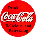
Coca-Cola was invented by John S. Pemberton in 1886.
1887-1890, 1891-1900
In 1887, the familiar Spencerian script was first used. Compared to todays version, the script varied depending on its application, the word Trademark also commonly appeared in the bottom of the first 'C swirl'.
1890-1891
For one year, the Coca-Cola logo significantly changed to a more elaborate design before returning to the familiar script the next year.
1900-1941
By the turn of the century, the script began to be standardised, by the 1940s the script finally took the form of which it will be most familiar.
1941-1958
By now, the word Trademark was removed and the logo had evolved to its most familiar design.
1958-1969
File:Coca-Cola Fishtail logo.png
The script was placed in an Arciform shape in the 1950s and 1960s. The shape was also known as the Fishtail.
1969-1985
In 1969, the script was acommpanied by the famous 'Dynamic Ribbon, or 'White Swirl' for the first time, the two were combined in a new logo called the Arden Square. In 1971, the 'Hilltop' advert was broadcast on Television, this brought along with it, the famous 'It's the Real Thing' slogan. From 1985 the script was only used on packaging in a very small size, the 'Coke' logo took pride of place until 1987.
Lippincott & Marguiles takes credit for being the agency behind this change.
1985-1987
In the United States of America, the formula for Coca-Cola was changed in response to Pepsi gaining more sales at the time. There was a large outcry and customers were boycotting Coca-Cola until eventually Coca-Cola returned to the original formula, albeit with can sugar replaced by a cheaper alternative. During the 'New Coke' period, the logo above would be far more prominent than the traditional script when placed on the packaging for Cans and Bottles. A legacy from this period is the continuned used of the bold 'Coke' logo in some countries today, albeit modified.
1987-2003
In 1987, the tradtitional branding returned after the failure of 'New Coke'. The branding however now varied from country to country. The United States of America, for example, had 'Classic' in small writing underneath the script to different it from 'New Coke'. The 'Coke' symbol was changed at this time, as can be seen in the image above, this would continue to be used until the early 2000s in conjunction with the bold 1985 'Coke' logo depending on the country.
In creating this brand refresh, Landor created 800 different designs that combined "Coca-Cola" or "Coke" with the curve. In the chosen solution, the curve had been integrated with the Spencerian script by going through it the second 'O' in Coca-Cola. An additional silver ribbon was added to the curve, and the Spencerian script was redrawn to be slightly straightened-up.
1993-2003
During the 1990s it was common for the Coca-Cola script to be in a circle (and sometimes still is) and the circle itself to have a green banner above it reading 'Always'. The two main advertising campaigns emphasised this, the Polar Bears and the Christmas Trucks. Thus the main slogan of the decade was 'Always Coca-Cola'. During this period, most of the branding from 1987 would be used, the circular icon normally being for corporate uses only, such as vending machines and memorabilia. However, the bottle symbol was, again depending on country, used more often on packaging.
2003-2007
File:300px-Coca Cola liter bottle label.svg.png
By 2003, the packaging differed widely all over the world. This branding was an attempt to bring all the different countries branding into line with one design which included the addition of yellow to the ribbon. This succeeded although some countries still used elements of the 1987 and 1990s branding. During this period, the two 'Coke' logos in use were modernised.
2007-Present
File:746px-Coca-Cola logo svg.png
A simplified design, created with Turner Duckworth, was introduced in 2007. By now the Coca-Cola logo was surrounded by various elements from three different branding eras, 1980s, 1990s and 2000s. The Coca-Cola Company therefore believed a complete overhaul was needed and it was decided to strip the branding back to basics with just the script and the 'Dynamic Ribbon'.
In 2009 the United States of America removed the 'Classic' wordmark from beneath the main script logo because it was no longer needed to distiguish it from the former 'New Coke'.
See also


