No edit summary |
mNo edit summary |
||
| (One intermediate revision by one other user not shown) | |||
| Line 1: | Line 1: | ||
{{Primary Logos|Wrappers}} |
{{Primary Logos|Wrappers}} |
||
| − | ==1903–1928 (primary), |
+ | ==1903–1928 (primary), 1928–present (secondary)== |
| − | [[File:Crayola-1903-Logo.png|center| |
+ | [[File:Crayola-1903-Logo.png|center|300px]] |
This logo is still used on some tins. The logo is the "CRAYOLA" text all in a bold uppercase font, with the "C" and the "A" being bigger than the rest of the logo. "TRADE" and "MARK is above and below the logo respectively. All of this is encased in a fancy-looking frame. |
This logo is still used on some tins. The logo is the "CRAYOLA" text all in a bold uppercase font, with the "C" and the "A" being bigger than the rest of the logo. "TRADE" and "MARK is above and below the logo respectively. All of this is encased in a fancy-looking frame. |
||
==1928–1930== |
==1928–1930== |
||
| − | [[File:Crayola.PNG|centre| |
+ | [[File:Crayola.PNG|centre|300px]] |
| + | In 1928, the logo became a much simpler "CRAYOLA" font. |
||
== 1930–1941 == |
== 1930–1941 == |
||
| − | [[File:Crayola 1930 to 1934 logo.png|center| |
+ | [[File:Crayola 1930 to 1934 logo.png|center|300px]] |
| + | In 1930, the logo's font changed again. |
||
==1939–1944== |
==1939–1944== |
||
| − | [[File:Crayola_1940.png|center| |
+ | [[File:Crayola_1940.png|center|300px]] |
| + | In 1939, the logo's font changed yet again. |
||
== 1941-1945 == |
== 1941-1945 == |
||
| − | [[File:Crayola1935logos.jpg|center| |
+ | [[File:Crayola1935logos.jpg|center|300px]] |
| + | In 1941, the logo's font changed to one similar to the 1930 logo, but more stretched. |
||
==1944–1967 (primary), 1967–1972 (secondary)== |
==1944–1967 (primary), 1967–1972 (secondary)== |
||
| − | [[File:Crayola 1944.png|center| |
+ | [[File:Crayola 1944.png|center|300px]] |
{{Better logo needed}} |
{{Better logo needed}} |
||
| Line 24: | Line 28: | ||
==1967–1983 (primary), 1983–1989 (secondary)== |
==1967–1983 (primary), 1983–1989 (secondary)== |
||
| ⚫ | |||
| − | |||
| − | |||
| ⚫ | |||
In 1967, Crayola changed its font, and the 'rayola' part changed to lowercase. This logo has never been used on crayon wrappers until 1972. |
In 1967, Crayola changed its font, and the 'rayola' part changed to lowercase. This logo has never been used on crayon wrappers until 1972. |
||
==1972–1997== |
==1972–1997== |
||
| − | [[File:Crayola 1992.svg|center| |
+ | [[File:Crayola 1992.svg|center|300px]] |
In the late 1980s, Crayola changed font again and blacked the logo, while created in '72. This logo stopped being used on boxes and advertisements in 1997 but remained on the products themselves until 1999. The next logo, which is a color version of this logo, is from 1997. This Crayola logo still exists on some crayon wrappers in the 1997 box, so big crayons, and kids first crayons. This also still exists on some older Crayola crayon boxes. This logo stopped being used on Crayon wrappers in 2006. |
In the late 1980s, Crayola changed font again and blacked the logo, while created in '72. This logo stopped being used on boxes and advertisements in 1997 but remained on the products themselves until 1999. The next logo, which is a color version of this logo, is from 1997. This Crayola logo still exists on some crayon wrappers in the 1997 box, so big crayons, and kids first crayons. This also still exists on some older Crayola crayon boxes. This logo stopped being used on Crayon wrappers in 2006. |
||
==1997–present== |
==1997–present== |
||
| − | [[File:Crayola logo 3.gif|center| |
+ | [[File:Crayola logo 3.gif|center|300px]] |
In 1997, they have made a forever new life for Crayola with the more effective and useful and strong cardboard boxes with a nice smooth texture and tough to rip and more environmental friendly unlike the previous logo and they also have added in a rainbow in the Crayola logo so the Crayola logo is now not just the green word Crayola anymore like in the previous logos! And this is the most friendliest Crayola logo and clear and effective and environmental friendly Crayola logo. |
In 1997, they have made a forever new life for Crayola with the more effective and useful and strong cardboard boxes with a nice smooth texture and tough to rip and more environmental friendly unlike the previous logo and they also have added in a rainbow in the Crayola logo so the Crayola logo is now not just the green word Crayola anymore like in the previous logos! And this is the most friendliest Crayola logo and clear and effective and environmental friendly Crayola logo. |
||
| − | === |
+ | === 2002–2006 === |
| − | [[File:Crayola_2002_(Wordmark).svg|center| |
+ | [[File:Crayola_2002_(Wordmark).svg|center|300px]] |
In 2002, the first secondary version of the 1997 logo was introduced but did not had the friendly rainbow like in the main version of the 1997 Crayola logo so in 2006 they changed the secondary version of the 1997 logo with a yellow oval with a green outline and a rainbow to make it better and this secondary version of the current 1997 logo is most like the old Crayola logos from the old pre-1996 days. |
In 2002, the first secondary version of the 1997 logo was introduced but did not had the friendly rainbow like in the main version of the 1997 Crayola logo so in 2006 they changed the secondary version of the 1997 logo with a yellow oval with a green outline and a rainbow to make it better and this secondary version of the current 1997 logo is most like the old Crayola logos from the old pre-1996 days. |
||
| − | === |
+ | ===2006–present=== |
| − | [[File: |
+ | [[File:Crayola current logo.png|center|250px]] |
In 2006, the secondary version of the 1997 logo has remade with 3D texture and with a rainbow in it just like the main version of the 1997 logo and this secondary version of the 1997 logo is better than the 2002 secondary version of the 1997 logo because the 2002 version looks like the old Crayola logo from the old pre-1996 days. The reason for this is possibly due to the 1997 logo frowning. And also, a year later, Binney & Smith was renamed Crayola LLC. |
In 2006, the secondary version of the 1997 logo has remade with 3D texture and with a rainbow in it just like the main version of the 1997 logo and this secondary version of the 1997 logo is better than the 2002 secondary version of the 1997 logo because the 2002 version looks like the old Crayola logo from the old pre-1996 days. The reason for this is possibly due to the 1997 logo frowning. And also, a year later, Binney & Smith was renamed Crayola LLC. |
||
Revision as of 02:09, 12 May 2020
This page only shows primary logo variants. For other related logos and images, see:
|
1903–1928 (primary), 1928–present (secondary)
This logo is still used on some tins. The logo is the "CRAYOLA" text all in a bold uppercase font, with the "C" and the "A" being bigger than the rest of the logo. "TRADE" and "MARK is above and below the logo respectively. All of this is encased in a fancy-looking frame.
1928–1930
In 1928, the logo became a much simpler "CRAYOLA" font.
1930–1941
In 1930, the logo's font changed again.
1939–1944
In 1939, the logo's font changed yet again.
1941-1945

In 1941, the logo's font changed to one similar to the 1930 logo, but more stretched.
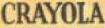
1944–1967 (primary), 1967–1972 (secondary)
| BETTER LOGO NEEDED |
This logo uses the same font as the 1939 logo, but the colors are different.
1967–1983 (primary), 1983–1989 (secondary)
In 1967, Crayola changed its font, and the 'rayola' part changed to lowercase. This logo has never been used on crayon wrappers until 1972.
1972–1997

In the late 1980s, Crayola changed font again and blacked the logo, while created in '72. This logo stopped being used on boxes and advertisements in 1997 but remained on the products themselves until 1999. The next logo, which is a color version of this logo, is from 1997. This Crayola logo still exists on some crayon wrappers in the 1997 box, so big crayons, and kids first crayons. This also still exists on some older Crayola crayon boxes. This logo stopped being used on Crayon wrappers in 2006.
1997–present
In 1997, they have made a forever new life for Crayola with the more effective and useful and strong cardboard boxes with a nice smooth texture and tough to rip and more environmental friendly unlike the previous logo and they also have added in a rainbow in the Crayola logo so the Crayola logo is now not just the green word Crayola anymore like in the previous logos! And this is the most friendliest Crayola logo and clear and effective and environmental friendly Crayola logo.
2002–2006

In 2002, the first secondary version of the 1997 logo was introduced but did not had the friendly rainbow like in the main version of the 1997 Crayola logo so in 2006 they changed the secondary version of the 1997 logo with a yellow oval with a green outline and a rainbow to make it better and this secondary version of the current 1997 logo is most like the old Crayola logos from the old pre-1996 days.
2006–present
In 2006, the secondary version of the 1997 logo has remade with 3D texture and with a rainbow in it just like the main version of the 1997 logo and this secondary version of the 1997 logo is better than the 2002 secondary version of the 1997 logo because the 2002 version looks like the old Crayola logo from the old pre-1996 days. The reason for this is possibly due to the 1997 logo frowning. And also, a year later, Binney & Smith was renamed Crayola LLC.
Crayola
|
|---|
| Part of Hallmark
Brands Other Brands Former/Defunct 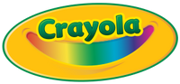 |