ScrewAttack Entertainment LLC, is a company that creates video game entertainment, including original content, on their website. Owned by "Stuttering Craig" Skistimas, ScrewAttack.com has been operational since 5 January 2006.
The site features various original content as well as a variety of third party content from partners. The name and logo is derived from the Metroid video game series, in which the player can employ a "screw attack" function.
2006 (Launch)
ScrewAttack's first logo featured a probably-copied image of headphones with a transparent lighting bolt above the text "SCREWATTACK.COM" under the unofficial slogan "Game on!".
This logo is very rare, this was only used in ScrewAttack's launch for the first six months in 2006, and was then changed to an CGI version of the logo. A prototype logo has a normal S and the slogan "Where Gamers go to be Heard". Another prototype has the rare slogan, but the usual S.
2006-2011
The "headphones" logo was revamped in mid-2006, now being used in CGI animation instead of a copied image used in the rare launch logo. Originally the logo was in a scheme of red and yellow, however this was later changed to the website's best-known scheme of blue and silver. The headphones were eventually omitted by the end of 2007.
2007-2011
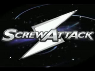
This logo features an icon of an "lighting bolt" with the transparent text "ScrewAttack". This became their main logo after ScrewAttack omitted their original "headphones" logo by late 2007. The logo retains the blue and silver scheme used in the "headphones" logo. It also happens to be the website's best known logo, having been used for five years before being overhauled with a new look in September 2011.
2011-2017
On September 2011, ScrewAttack was given an overhauled new look, with the "lighting bolt" icon now being transparent, and the name all being in uppercase text. The logo also retains the blue and silver scheme.
2017-Present
On March 1st, ScrewAttack unveiled its new logo since 2011, changing the font while moving the lightning bolt to the left while adding two hexagons layered in its back. The letter font is now white with black blotches added for detail.


