No edit summary Tag: apiedit |
(Undo revision 1008185 by Lisa seid bauza (talk)) Tag: rte-wysiwyg |
||
| Line 34: | Line 34: | ||
==DIC Entertainment== |
==DIC Entertainment== |
||
| + | ===1987–2001, 2003–2005=== |
||
| − | ===1987–1995=== |
||
This 1987 logo was one of the best known DIC logos. The CGI effects were made at [[PDI]], and the other material was designed by Homer & Associates. First, the logo started off with a kid sleeping in his bed with his dog on it. Then the camera zoomed in to a window and a star appeared. Finally, the text turned in a 90 degree angle and the kid said the company's name. Also, the star stopped spinning and recedes into a spherical dot for the I. Today, this logo is still known and very popular today, from any other DIC history. The font of this logo is a heavily-modified version of Gill Sans Ultra Bold. |
This 1987 logo was one of the best known DIC logos. The CGI effects were made at [[PDI]], and the other material was designed by Homer & Associates. First, the logo started off with a kid sleeping in his bed with his dog on it. Then the camera zoomed in to a window and a star appeared. Finally, the text turned in a 90 degree angle and the kid said the company's name. Also, the star stopped spinning and recedes into a spherical dot for the I. Today, this logo is still known and very popular today, from any other DIC history. The font of this logo is a heavily-modified version of Gill Sans Ultra Bold. |
||
| Line 51: | Line 51: | ||
</gallery> |
</gallery> |
||
|-| |
|-| |
||
| + | 1990–2001= |
||
| − | 1990–1995= |
||
In the 1990, the starfield was changed, along with the dot which the glow effect was removed. A different kid said the company name as well. |
In the 1990, the starfield was changed, along with the dot which the glow effect was removed. A different kid said the company name as well. |
||
<gallery spacing="small" widths="160" bordersize="none" bordercolor="transparent" hideaddbutton="true" captionsize="small" position="center" captionalign="center"> |
<gallery spacing="small" widths="160" bordersize="none" bordercolor="transparent" hideaddbutton="true" captionsize="small" position="center" captionalign="center"> |
||
| Line 67: | Line 67: | ||
DIC Presents 1990s.png |
DIC Presents 1990s.png |
||
</gallery> |
</gallery> |
||
| + | |-| |
||
| + | 2003–2005= |
||
| + | [[File:dic2000.jpg|200px|center]] |
||
| + | </tabber> |
||
| − | === |
+ | ===2001–2008=== |
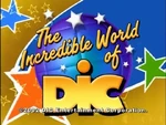
| − | This period brought the '''Incredible World of DIC''' branding to the big and small screen. It was first used a standard logo |
+ | This period brought the '''Incredible World of DIC''' branding to the big and small screen. It was first used a standard logo in 1995. It was first seen on TV in 2001. |
<gallery spacing="small" widths="150" bordersize="none" bordercolor="transparent" hideaddbutton="true" captionsize="small" position="center" captionalign="center" orientation="none"> |
<gallery spacing="small" widths="150" bordersize="none" bordercolor="transparent" hideaddbutton="true" captionsize="small" position="center" captionalign="center" orientation="none"> |
||
| − | dic2001.jpg|Standard version and seen on TV from |
+ | dic2001.jpg|Standard version and seen on TV from 2001. This version was used until 2008. |
File:D0a0d1eb957b5930ace39c0fe3e1a3ab.jpg|Version of the logo with the copyright stamp. As seen on ''[[Liberty's Kids]].'' |
File:D0a0d1eb957b5930ace39c0fe3e1a3ab.jpg|Version of the logo with the copyright stamp. As seen on ''[[Liberty's Kids]].'' |
||
NCdicEntertainment.jpg |
NCdicEntertainment.jpg |
||
Revision as of 07:40, 30 July 2017
| This article is currently protected. Please discuss any changes on the talk page; you may submit an edit request to ask an administrator to make an edit. You may also request that this page be unprotected. |
DIC Enterprises
1983–1986
The original variant had dots and a character passing the logo and dots the "i".
1984–1987
DIC Entertainment
1987–2001, 2003–2005
This 1987 logo was one of the best known DIC logos. The CGI effects were made at PDI, and the other material was designed by Homer & Associates. First, the logo started off with a kid sleeping in his bed with his dog on it. Then the camera zoomed in to a window and a star appeared. Finally, the text turned in a 90 degree angle and the kid said the company's name. Also, the star stopped spinning and recedes into a spherical dot for the I. Today, this logo is still known and very popular today, from any other DIC history. The font of this logo is a heavily-modified version of Gill Sans Ultra Bold.
In the 1990, the starfield was changed, along with the dot which the glow effect was removed. A different kid said the company name as well.
2001–2008
This period brought the Incredible World of DIC branding to the big and small screen. It was first used a standard logo in 1995. It was first seen on TV in 2001.
In-Credit Disclaimers
Videos

