Brewster-Fan (talk | contribs) |
No edit summary |
||
| Line 122: | Line 122: | ||
[[Category:France 4]] |
[[Category:France 4]] |
||
[[Category:Ongoing series]] |
[[Category:Ongoing series]] |
||
| − | [[Category:Long running television series]] |
||
[[Category:TV Cultura]] |
[[Category:TV Cultura]] |
||
[[Category:HBO Max]] |
[[Category:HBO Max]] |
||
Revision as of 22:38, 24 August 2020
Doctor Who is a British science-fiction drama series produced by the BBC from November 23, 1963 to December 6, 1989, and again since March 26, 2005, with a television movie in 1996. It depicts the adventures of a time-travelling humanoid alien known simply as "the Doctor", who, as of 2017, has been portrayed by fourteen different actors (excluding spinoffs that included other Doctors, such as Dr. Who and the Daleks and Doctor Who Unbound, a Big Finish audio series).
A video compilation of all the title sequences up to 2018 was posted by the BBC here.
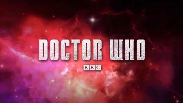
1963–1967, 2013
| BETTER LOGO NEEDED |
The original Doctor Who title sequence, for the original Doctor (played by William Hartnell), designed by Bernard Lodge, used a distorting visual effect known as "howlaround", caused by pointing a TV camera at its own monitor. This effect had been accidentally created by Norman Taylor, at the time a technical operations manager at the BBC.
For the 50th anniversary episode The Day of the Doctor, this title sequence was recreated in high definition, with the BBC logo being added under the Doctor Who logo. Titles used from episodes An Unearthly Child to The Moonbase.
1967–1970
In March 1967, four months after Patrick Troughton succeeded William Hartnell as the Doctor, the decision was taken to refresh the titles. These retained the "howlaround" effect but additionally featured the Doctor's face, a practice that continued until the show was brought back in 2005, when this practice was stopped. It returned, however, in 2012, when Matt Smith's face was shown during the title sequence. The series logo was also refreshed, being rendered in Times New Roman font. Titles used from episodes The Macra Terror to The War Games.
1970–1973
January 1970 saw the introduction of colour to the show, as well as the third Doctor: Jon Pertwee. Accordingly, Bernard Lodge refreshed the titles again, retaining the "howlaround" effect once more and introducing a specifically-designed series logo. Titles used from episodes Spearhead from Space to The Green Death.
1973–1980
A completely new title sequence, once again designed by Bernard Lodge, was introduced in December 1973. This made use of a technique known as "slit-scan", first used in the film 2001: A Space Odyssey. Here, multiple exposures of light refracting in polythene plastic were filmed through different-shaped slits in black card on a rostrum camera, thus creating time-tunnel effects.
To go with this sequence was another specifically-designed series logo, in the shape of a diamond. When Tom Baker took over as the Doctor in December 1974, the sequence was revised, with the "slit-scan" technique being further applied to an image of the Doctor's time machine, the TARDIS. Jon Pertwee titles used from episodes The Time Warrior to Planet of the Spiders. Tom Baker titles used from episodes Robot to The Horns of Nimon.
1980–1987
1980–1984
In 1980, the diamond logo was replaced by a neon sign-style logo. The theme of the title sequence this time was space, rather than a time tunnel theme, this time by Sid Sutton. Peter Howell also did a new rendition of the Doctor Who theme. Titles used from episodes The Leisure Hive to The Caves of Androzani.
1984–1987
When Colin Baker was introduced as the sixth incarnation of the Doctor, the production team decided a new logo and title sequence was needed. It was more colourful, trying to fit into Colin's colourful outfit as the 6th Doctor and is slightly curved. After an 18-month "hiatus" during Colin's run, a new rendition of the Doctor Who theme was made by Dominic Glynn to accompany the "Trial of a Time Lord" series of episodes. Titles used from The Twin Dilemma to The Ultimate Foe.
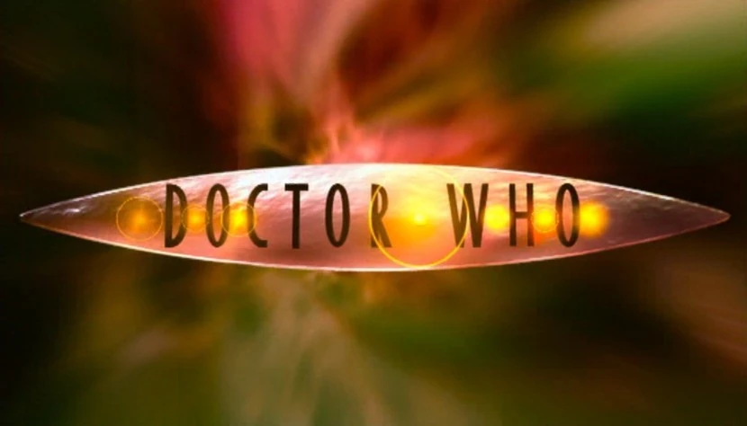
1987–1989, 1993
When Sylvester McCoy was introduced as the seventh incarnation of the Doctor, a new title sequence, and a new rendition of the show's theme song were introduced. The logo comprises the word 'Doctor' in a gold script font and "WHO" using a purple, thick-set sans-serif font, with a red glow effect. The title sequence was the first to be made in CGI for Doctor Who. It was also the first time we saw the TARDIS in the title sequence since the Tom Baker title sequence. Titles used from episodes Time and the Rani to Survival and later Dimensions in Time.
1996
When the 1996 TV movie was released, it used a remastered version of the 1970 logo used during the time of Jon Pertwee as the Third Doctor, which is coincidental because Pertwee died in 1996, the year the TV movie aired. The only changes were to the letters C, T, R, and W, as well as slightly increasing the letter spacing. As the last logo used before the show's relaunch in 2005, it became used for most pieces of Doctor Who media and merchandising relating to the classic series, continuing after the relaunch to distinguish merchandise from the new series (which used their respective logos below). This lasted until 2018, when all Doctor Who media in both the classic and revived series began to use the latest logo, marking the end of this logo's continual 20-year usage. The first releases to switch to the new branding were the official magazine, Big Finish Production's monthly audio releases, and The Collection: Season 12 Blu-ray of Tom Baker's first season.
2005–2010
2005–2006
The metallic shield logo was used for the first two revived series (the Ninth Doctor's only series, and the Tenth's first series). This version was only seen on-screen, as promotional material and merchandising used the coloured 2006 logo below. Titles used from episodes Rose to Doomsday.
2006–2010
In 2006, during the tenure of the Tenth Doctor played by David Tennant, the on-screen logo was altered to include white glows and a brighter color scheme, matching the one used for merchandising. Despite the logo being replaced by a new one in 2010, it was still used in the Doctor Who DVD Files partwork up until its final issue in 2014. Titles used from The Runaway Bride to The End of Time.
2010–2018
2010–2012
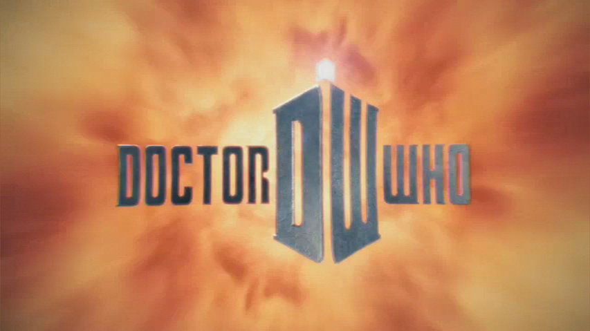
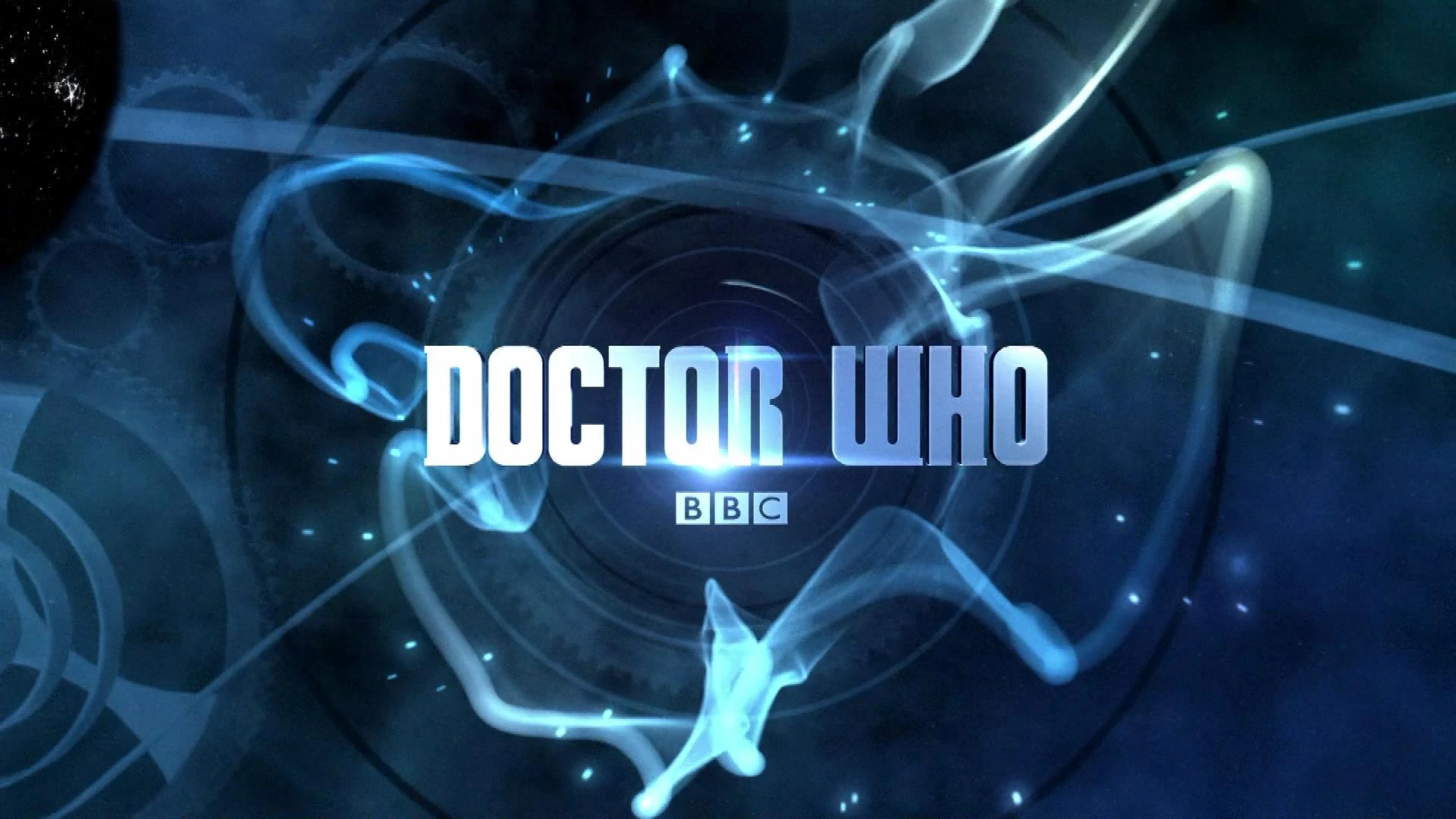
When Steven Moffat started as showrunner, and the Eleventh Doctor played by Matt Smith began his tenure, a new logo was introduced, comprised of two main parts: the main logo and the "DW" icon. In the title sequence, the icon rotated and turned into the TARDIS, which then flew down the time vortex. The "DW" icon was used in isolation in other media, such as advertising and books. In 2011, the Doctor Who logo in the titles was slightly altered, and the BBC logo was added in the bottom right corner. Titles used from The Eleventh Hour to Pond Life.

Asylum of the Daleks

Dinosaurs on a Spaceship

A town called Mercy

The Power of Three

The Angels Take Manhattan
2012
For each episode of Series 7 in 2012, the logo is retextured with a theme based on that particular episode. The font is identical to the previous logo, however the shaped "DW" icon in the middle of the title has been removed from the on-screen logo, featuring afterwards. Titles used from episodes Asylum of the Daleks to The Angels Take Manhattan.
2012–2013
For the second half of Series 7 the title sequence was redesigned, using close-up and space-themed imagery and restoring the Doctor's face to the title sequence. The previous logo's wordmark was kept, but was thickened slightly. It removed the shaped "DW" iconic (however it remained in use separately in promotion and merchandising until 2018). For the 2012 Christmas special, The Snowmen, the title was textured with a snow theme, in the same vein as the first half of Series 7's variant titles. The rest of the second half of the series from The Bells of Saint John to The Time of the Doctor instead had a silver-white metallic texture. Titles used from episodes The Snowmen to The Time of the Doctor.
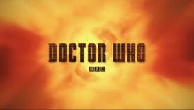
2014–2018
This is the final iteration of the 2010 logo, used for the entirety of Peter Capaldi's era as the Twelfth Doctor (from Deep Breath to Twice Upon a Time). The custom typeface remains the same, however the "slits" in the letters have been widened, giving the text a bolder appearance.
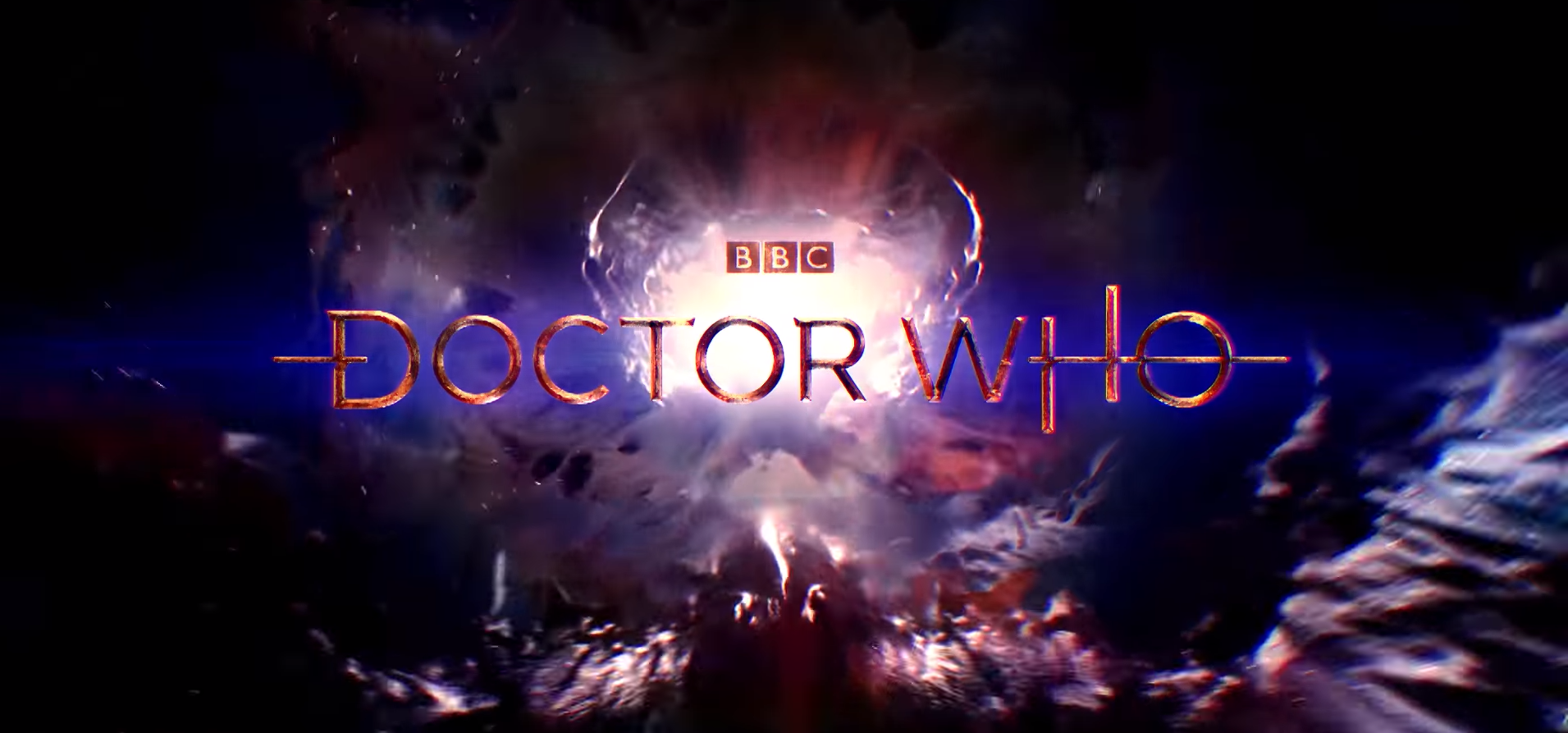
2018–present
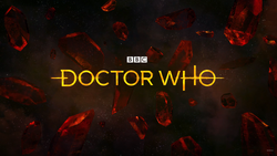
The latest logo was introduced on February 20th, 2018, ending the usage of the 2010 logo which went through many modifications throughout the years. This logo uses a modified version of the Gotham typeface, adding angled serifs to some of the letters alongside a stroke and some distortion through the center of the logo (shown in the reveal video to be the flight path of the TARDIS).
It was first revealed at the BBC Worldwide Showcase, with the new logo debuting on-screen in Jodie Whittaker's first series as the Thirteenth Doctor in October 2018, beginning with the second episode The Ghost Monument. The title sequence is reminiscent of the first three sequences' "howlaround" effects, albeit with the Doctor's face not making an appearance, and beveled metallic text added for the credits. Titles used from The Ghost Monument onward.

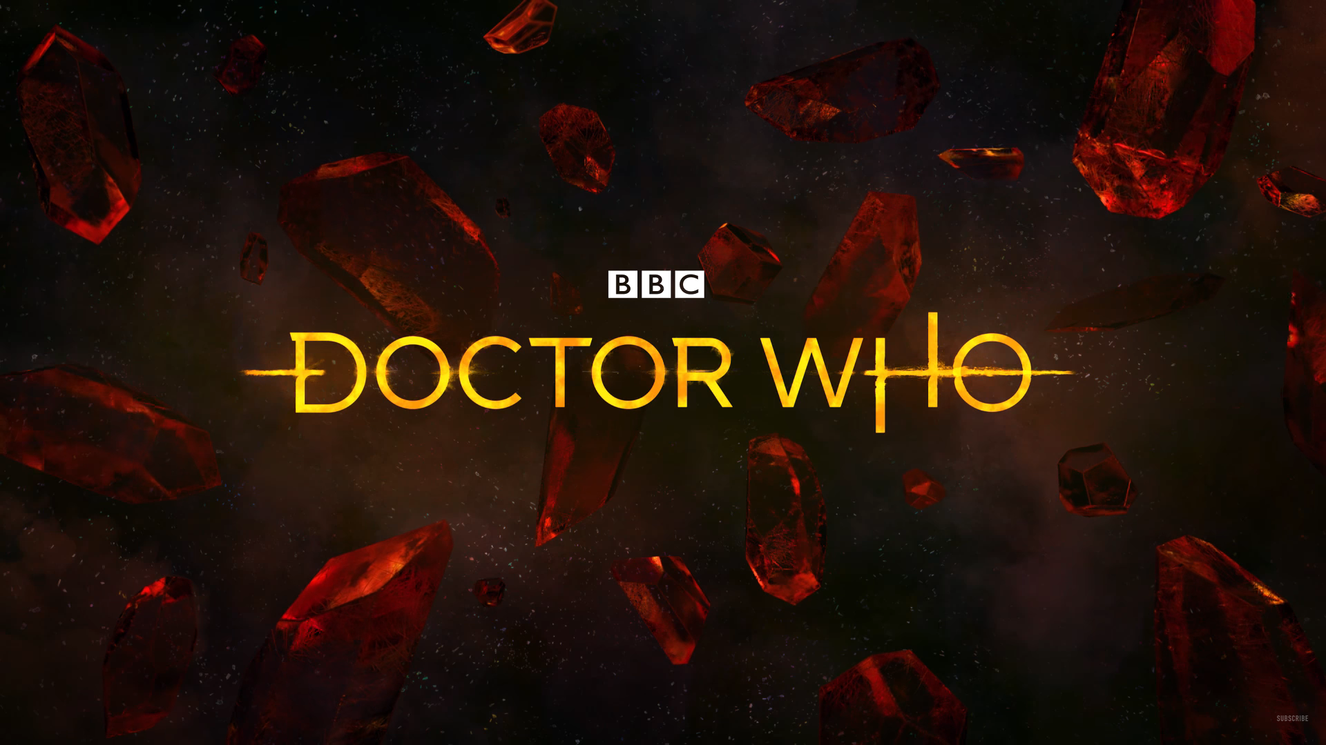
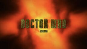
The logo, as seen in the Offical Reveal Video


Single color variant, primarily used for DVDs and books. Changes include a lack of distortion through the center of the logo and the strokes on either side terminate instead of fading away, as well as the enlarged BBC logo.
See also
Template:Other

Syfy programming
|
|---|
| Current programming: Chucky | Resident Alien | Reginald the Vampire | The Ark | SurrealEstate Upcoming programming: Past miniseries: Former programming: |
BBC America programming
|
|---|
| Current programming: Doctor Who | Extra Gear | The Graham Norton Show | Mud, Sweat and Gears | Ramsay's Kitchen Nightmares | Star Trek: The Original Series | Star Trek: The Next Generation | Star Trek: Voyager | Top Gear America | UK PD | The Watch | Wonderstruck Former programming: |