FOROtv is a news television channel owned by Televisa located in Mexico City. Founded on August 31, 1950 and began broadcasting the next day, it is the first and the oldest TV Channel in Mexico and Latin America, as a XHTV (VHF Channel 4) signal founded by Rómulo O'Farril and Guillermo Ochoa Millán. A successor of the prototype TV station "XE1GC" in 1946 by Guillermo González Camarena, XHTV broadcasted as a normal free-to-air television channel for sixty years.
XHTV (Canal 4)
1950-Late-1950s
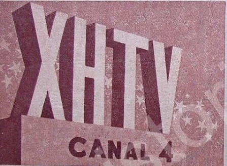
The first Spanish-speaking television channel was introduced with a structure as letters "XHTV" (meaning XH Televisión), and below the letters it showed as "CANAL 4".
Late-1950s-1968
Template:Missing former logo
1968-1970
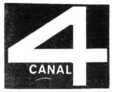
The logo was introduced as a black square with a number four, and below it the word "CANAL" was on the left.
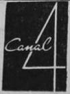
1970-1972
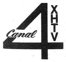
The number four became thinner, and through the diagonal line had a word "Canal" in Vodka Brush Bold font by Fenotype, and the and the acronym "XHTV" appeared vertically next to the number four.
1972-1973
The Channel 4 logo consisted of a circle, a Triangle and a Rectangle that formed the number "4", and the acronym "XHTV" appeared below it.
1973-1976

The 1973 logo was formed by 4 vector people of different sizes (representing the family), forming the digit "4".

When Televisa was founded on January 8, The logo was located inside the sun of the company's logo as its sister channels.
1976-1978

The logo was introduced as a number "4" formed by a parallelogram and a rectangle, and between of them there was the word "CANAL" in italic.
1978-1981

The logo was an number 4 appears in the circle with delineated design sliced in twain.
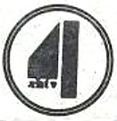
1981-1984
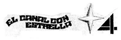
Its logo maintained the shape of the digit "4" but to the left of it appeared a 4-pointed star; his identification phrase in that period was "El Canal con Estrella". This slogan remained until Channel 2 (Mexico) began to be named known as "El Canal de las Estrellas" (in 1985) to avoid confusion between the two Televisa channels.
1984-1987
The number four was similar to that of the 1976 emblem, but the significant change it had was that it was formed by a single shape. The number became similar to NBC (New York) at the time, but united in a single line.
1984-1986

By 1984, the number became a three-dimensional, looking bellow the logo.
1986-1987

At the end of 1986, the logo is maintained only that now it appears two-dimensional and with the round edges, its motto was "Viva el 4", campaign created by Alejandro García and Gabriel Van Rankin (Televisa executives), supported by the use of digital multilayer in their identifications, which were created by Alejandro García and directed by Pablo Jato.
1987-1988
")
In September 1987, using the same form as the number 4, only that it appeared rounded inside the TV set whose antennae showed a band similar to cardiac pulses.
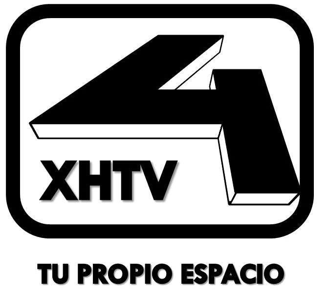
1988-1989
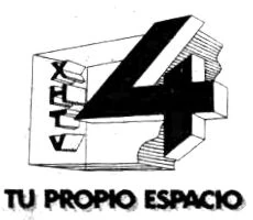
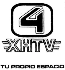
On October 8, 1988, the 1985 emblem was retaken with some changes, which appeared as the background of a broken tri-dimensional rectangle, with the callsign on the left which appeared vertically, and the slogan "Tu Propio Espacio" was on the bottom. This logo lasted until June 5, 1989.
June–August 1989
Temporarily, the number "4" brought back in 1984 with an outlined rounded rectangle, the callsign was on previous to the number underneath, and the slogan was still as the previous font.
1989-1990
Later that year, the rectangle was appeared only on the number four inside, the callsign was bellow between the two lines, and the font of the slogan was changed into a Microgramma font.
1990-1991
")
")
In October 1990, the form of the number "4" was reused as the 1976 logo, but it appeared in a single figure, while the callsign appeared in 2 different typefaces: the "XH" in Helvetica and the "TV" in a more informal. The motto of "Tu Propio Espacio" was still used until January 6, 1991. From January 7, "Tu Imagen" would be used as the motto.
1991-1993
")
")
The logo changes radically, adopting the trend of the Televisa channel logos using metallic shades (in gold and silver). The Logo was 4 lines in vertical of the same form and 4 in horizontal one longer than the previous one and a whole diagonal line that joined the first lines. His motto was "Ver...Para Saber"
1993-1994
")
")
")
")
The logo undergoes a radical transformation, only using the digit "4" in a Helvetica Black typeface. His slogan was "Siempre pasa algo bueno."
1994-1995

")
")
")
")
")
The number 4 was in a Times typeface, being surrounded by an incomplete circular band, which had a black dial with the acronym XHTV in lowercase.
November 1995-1997

Like Canal 9, the channel is identified by its acronym "XHTV". As a logo it had a black dial where the acronym "XHTV" as the 1994 logo.
Central 4
1997-1999
")
")
With the new name, it has three variants in a single logo. Basically, in the black rectangle was the name "CENTRAL" in white, as the digit 4 appeared in italics in the blue shape. In the bottom, there was a other name of the channel, "Diversión TV" in lowercase.
2000-2001
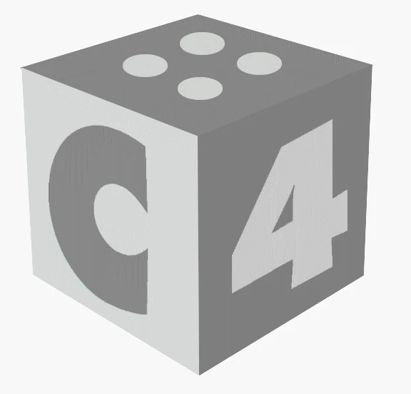
The 2000 logo was a 3D cube in gray tones; on the faces of it appeared the letter "C", the digit "4", the word "TV", a wave, and on one side four dots and another four lines.
4TV
2001-2003

With the another name, The 2001 logo consisted of the digit "4", orange and the letters "TV", green. The emblem had these colors, although in some identifications it appeared in gray tones.
2003-2010
For seven years, the logo was quadratically shaped, formed by a square with the large black "4" digit, two light blue triangles that appear in the upper left corner, two rectangles, a vertical yellow one that appears in the corner upper right and another horizontal green that appears in the lower left corner; and a red square in the lower right corner; between the yellow rectangle a red square and above the red square the word "TV" appears in white.
2003-2008
It was a two-dimensional variant with a motto "El Canal de la Ciudad".
2008–2010

")
In 2008, the logo became a three-dimensional, with the square in a round shape and the digit "4" slightly above the colored figures. And by the HD version, the four colors became divided into patterns to white.
FOROtv
On August 30, 2010, the channel was changed entirely as a successor of ECO with its local channels of the Televisa Regional network to broadcast certain news programs.
2010-2016

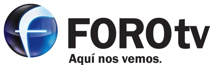
With a current name, the logo consists of a blue circle with an "F" and below the logo the name of the channel FOROtv.
2010–2012
At first, the F symbol became as a blue sphere with reflections.
")
")
2012-2015

Then, glows are also added to the logo.
")
")
2015-2016

And by the 2015 logo, the F symbol became as a circular logo with a two blue patterns.
")
")
2016-2020

By August 22, 2016, FOROtv revealed a new logo. The circle "F" was replaced by the turquoise blue circle with the exception of the lower left vertex inside the text "FORO" in uppercase, and to the right "tv" in lowercase with the Helvetica Black font. Sometimes, it uses an alternate logo "FORO" in uppercase and to the right "tv" in lowercase within the turquoise blue circle, except the lower left vertex.
2020-present


In January 2020, the color changed to red.

Template:TV stations in Mexico City