This logo is around a mannequin in outer space moving is with font as the previous, with a lighter gloss, written in 3D almost invisible in the back.
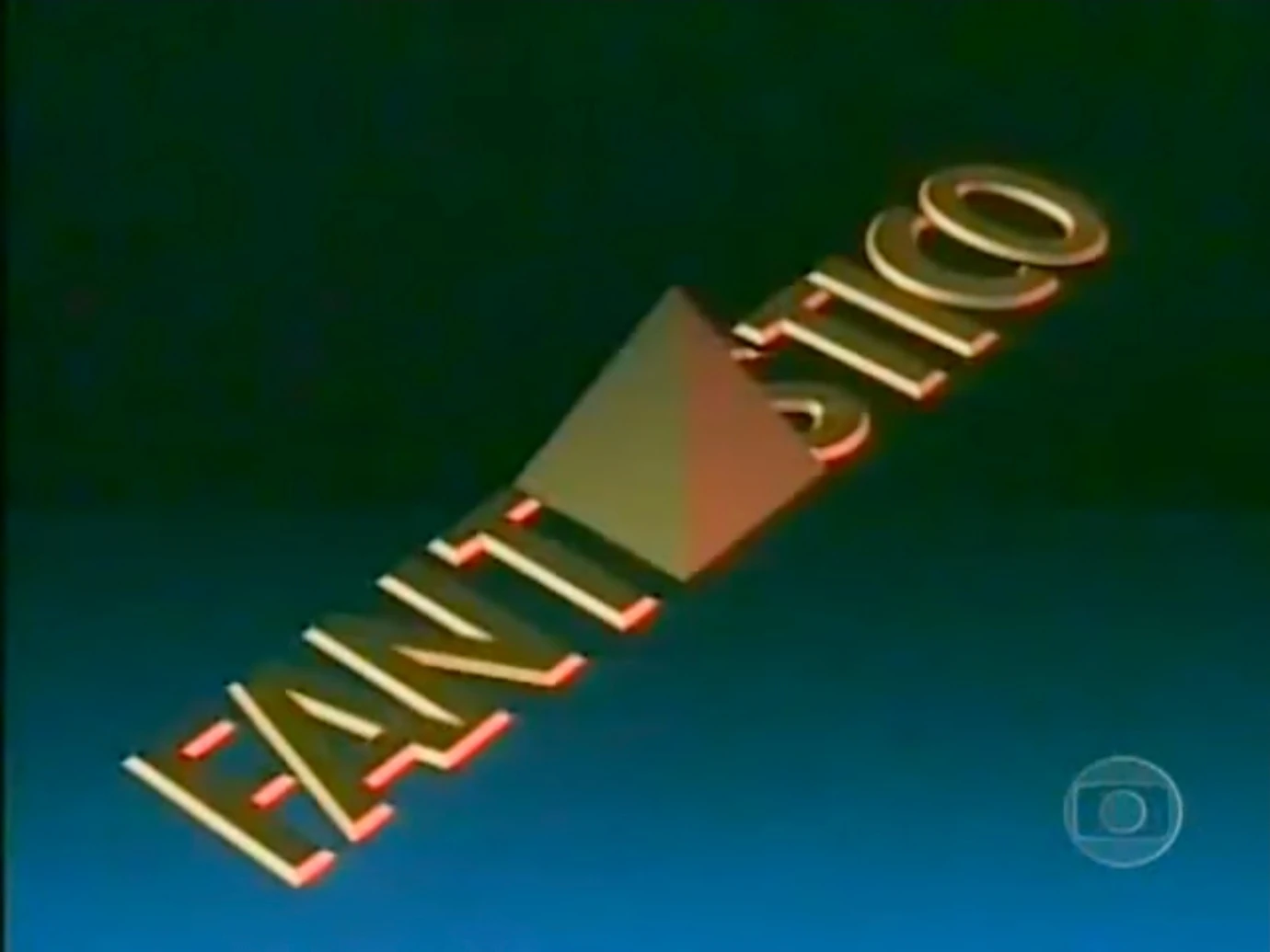
Commercial of 1994 to 1995
1995-present
1995-2001
Template:Missing former logo
2002-2010
2010-2014
Template:Missing former logo
2014-present
Template:Missing current logo
1995-2001
1995-1999
PNG version
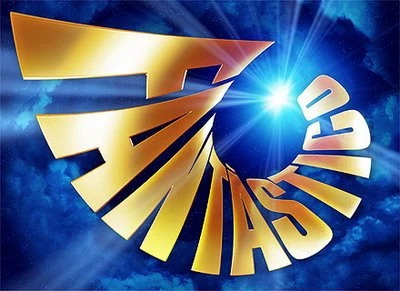
The logo features a spiral shape, the model that was soon well flashy. The logo is the colors azure blue and gold with orange illumination radiated by a little fireball around the outer space. This model served the following intros until the present day.
Opening Intro from Set in 1997-99
1999-2001
PNG version
The 1995 logo was almost silvery around a fully fireball lit, this intro was only shown in sponsorship, which is based on the introduction from set totally virtual.
A golden spiral 2D logo is placed in an almost invisible plate, there is a white light in a space neutral background.
Opening and Ending Intros from Virtual Set
Special 30th Anniversary in August 2003. (Alternate version)
Special 30th Anniversary in August 2003. (Official version)
2005-2010
PNG 2D version
PNG 3D version
The logo was displayed in some GCs and even closures at the premiere of the next opening. The intro was displayed wrongly in August 7, 2011 and a sponsorship in January 22, 2012.
Alternate version
Official version
Around the ray of light, spiral logo becomes light golden and back to 3D standard compared to the previous. The blue background is covered with clouds and some stars.
Special 35th Anniversary in August 2008
2010-2014
PNG 2D version (without shine effect)
PNG 3D version (A) (with shine effect)
PNG 3D version (B) (without shine effect)
The logo had little decrease in width, golden color receives shadows and lights, the 3D model of the logo was stretched similar to the 1995 logo.
In the background space is neutral, and sometimes, the space background turned blue. This "space" identity gave way to a program spin-off called "O Show da Vida é Fantástico" on Canal Viva.
SD alternate version
SD official version
HD alternate version: The space background turned blue.
HD official version
2012-2014
The intros for intervals were used only in the special 2000th edition versions of these logos are used on screen during some news.
Various materials equipment
Clean Graphic
Feathers and Plumes used for the Brazilian Carnival
Graphite
Various faces of characters like Mickey, SpongeBob and other characters
2014-present
2014-present
This is the retelling of the 2005 logo, except that the background is more simplified (as the clouds were removed from the background) and the title font is silver, reminiscent of Rede Globo's newly adopted gloss texture on its logo, which was launched on the same year.
This is a sponsorship for next season in 2014.
This version remains with the spiral form as in previous intros, unlike the first version in 2013, appears in attached letters.
PNG Version
2015-present
This is used for opening from new season in May 3, 2015.
10pm/11pm/Superseries Ilusões Perdidas | Marina (1965) | Paixão de Outono | Um Rosto de Mulher | Eu Compro esta Mulher | O Sheik de Agadir | A Rainha Louca | O Homem Proibido (1967) | A Gata de Vison | A Última Valsa | A Ponte dos Suspiros | Verão Vermelho | Assim na Terra como no Céu | O Cafona | Bandeira 2 | O Bofe | O Bem-Amado (1972) | Os Ossos do Barão | O Espigão | O Rebu (1974) | Gabriela (1975) | O Grito | Saramandaia (1976) | Nina | O Pulo do Gato | Sinal de Alerta | Eu Prometo | Araponga | O Astro (2011) | Gabriela (2012) | Saramandaia (2013) | O Rebu (2014) | Verdades Secretas | Liberdade, Liberdade | Os Dias Eram Assim | Onde Nascem os Fortes
Minisseries
1980s: Lampião e Maria Bonita | Avenida Paulista | Quem Ama Não Mata | Moinhos de Vento | Bandidos da Falange | Parabéns pra Você | Padre Cícero | Anarquistas, Graças a Deus | Meu Destino É Pecar | A Máfia no Brasil | Rabo de Saia | O Tempo e o Vento | Tenda dos Milagres | Grande Sertão: Veredas | Anos Dourados | Memórias de um Gigolô | O Pagador de Promessas | O Primo Basílio | Abolição | Sampa | República
1990s: Desejo | A, E, I, O... Urca | Boca do Lixo | Riacho Doce | La Mamma | Meu Marido | O Sorriso do Lagarto | O Portador | Tereza Batista | As Noivas de Copacabana | Anos Rebeldes | Contos de Verão | Sex Appeal | Agosto | A Madona de Cedro | Memorial de Maria Moura | Incidente em Antares | Engraçadinha... Seus Amores e Seus Pecados | Decadência | Guerra de Canudos | Dona Flor e Seus Dois Maridos | Hilda Furacão | Labirinto | O Auto da Compadecida | Chiquinha Gonzaga | Luna Caliente
2000s: A Muralha | A Invenção do Brasil | Aquarela do Brasil | Os Maias | Presença de Anita | O Quinto dos Infernos | Pastores da Noite | A Casa das Sete Mulheres | Um Só Coração | Hoje é Dia de Maria | Mad Maria | JK | Amazônia - De Galvez a Chico Mendes | A Pedra do Reino | Queridos Amigos | Capitu | Maysa - Quando Fala o Coração | Som & Fúria | Cinquentinha
2010s: Dalva e Herivelto - Uma canção de amor | Afinal, o Que Querem as Mulheres? | Amor em 4 Atos | Lara com Z | Dercy de Verdade | O Brado Retumbante | O Canto da Sereia | Amores Roubados | Felizes para Sempre? | Amorteamo | Ligações Perigosas | Justiça | Nada Será Como Antes | Dois Irmãos | Treze Dias Longe do Sol | Se Eu Fechar os Olhos Agora
Comedy/Sitcom:
1970s: Linguinha x Mr. Yes | A Grande Família (1972) | Kika e Xuxu | Super Bronco
1990s: O Bem-Amado (1980) | Amizade Colorida | Mário Fofoca | Armação Ilimitada | Tarcísio e Glória
1990s: A Comédia da Vida Privada | Casa do Terror | Sai de Baixo
2000s: Brava Gente | A Grande Família (2001) | Os Normais | Sexo Frágil | Cena Aberta | A Diarista | Sob Nova Direção | Os Aspones | Minha Nada Mole Vida | Toma Lá Dá Cá | O Sistema | Casos e Acasos | Dicas de Um Sedutor | Faça Sua História | Guerra e Paz | Ó Paí, Ó | Decamerão - A Comédia do Sexo | Aline | Norma
2010s: S.O.S. Emergência | A Vida Alheia | Separação?! | As Cariocas | Clandestinos: o Sonho Começou | Batendo Ponto | Tapas & Beijos | Divã | Macho Man | A Mulher Invisível | As Brasileiras | Louco por Elas | Como Aproveitar o Fim do Mundo | Pé na Cova | O Dentista Mascarado | A Mulher do Prefeito | Doce de Mãe | O Caçador | Segunda Dama | Sexo e as Negas | Chapa Quente | Mister Brau | A Cara do Pai | Vade Retro | A Fórmula | Filhos da Pátria (Season 2) | Cidade Proibida | Choque de Cultura (Seasons 3 and 5) | Pais de Primeira
2020s: Amor e Sorte
Drama:
1960s: Rua da Matriz | 22-2000 Cidade Aberta | TNT
1970s: Caso Especial | Ciranda Cirandinha | Aplauso | Carga Pesada (1979) | Malu Mulher | Plantão de Polícia
1980s: Obrigado Doutor | Caso Verdade | Cometa Loucura | Tele Tema
1990s: Delegacia de Mulheres | Você Decide | Retrato de Mulher | A Justiceira | Mulher
2000s: Cidade dos Homens | Hoje é Dia de Maria | Carandiru: Outras Histórias | Antônia | Força-Tarefa | Tudo Novo de Novo
2010s: Na Forma da Lei | A Cura | Suburbia | A Teia | O Caçador | Dupla Identidade | Os Experientes | Supermax | Sob Pressão | Carcereiros (Season 2-3) | Segunda Chamada
2020s: Passaporte para Liberdade
Fantástico' short-length episode series
1990s: A Vida Como Ela É... | A Vida Ao Vivo1 | Retrato Falado2
2000s: Copas de Mel | Papo Irado | Dias de Glória | Homem Objeto | As 50 Leis do Amor | Álbum de Casamento | Sitcom.br | Fazendo História | Damas e Cavalheiros | O Super Sincero | Os 7 Pecados Capitais | Te Quiero América | Sexo Oposto | Cilada3 (remake)
2010s: Agamenon, O Repórter | A Mulher da Sua Vida | Eu Que Amo Tanto | Não Se Apega, Não | Segredos de Justiça | Nelson, Por Ele Mesmo | Infratores | Isso a Globo Não Mostra 1Spun-off from Fantástico in 1998 2A Zorra Total' original segment from 1999, moved to Fantástico in 2000 3Based on a Multishow original series
_intro.png "Fantástico (1973) intro.png (357 KB)")

.jpg "Fantástico (1987).jpg (28 KB)")


.png "Fantástico (1994).png (233 KB)")


.png "Fantástico (1995).png (318 KB)")
.png "Fantástico (1997).png (392 KB)")


")
")


")
")
")
")

")
")
")
")
")
")

