| 1984-1991 | 1991-1993 | 1993-1996 | 1996-1997 | 1997-1999 |
| 1999-2001 | 2001-2002 | April-August 2002 | August-December 2002 | January-August 2003 |
| 2003-2005 | 2005-2007 | 2007-2010 | 2010-2021 | 2021-present |
TVER Canal 9[]
1984-1991[]

First logo inspired by the Buenos Aires channel: It is a 9 in Helvetica typography and is a little less tall. The white dove is shown on the curtains. This logo was used until 1991.
1991-1993[]
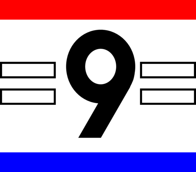
The number 9 has two horizontal lines to the left and right of it, above the number is the red line and below it is blue.
Canal 9 Justo José de Urquiza[]
1993-1996[]

The same logo but modified: the 2 horizontal lines are rounded and the 9 is gray with a different appearance, The 2 red and blue horizontal bars change position.
.jpg "Canal 9 Justo José de Urquiza (ID 1994).jpg (52 KB)")
1996-1997[]

It is a blue diamond with a white 9. At the bottom of the diamond is the red square.
1997-1999[]

Next to 9 is with a reflector on the right.
Azul Televisión Paraná[]
1999-2001[]
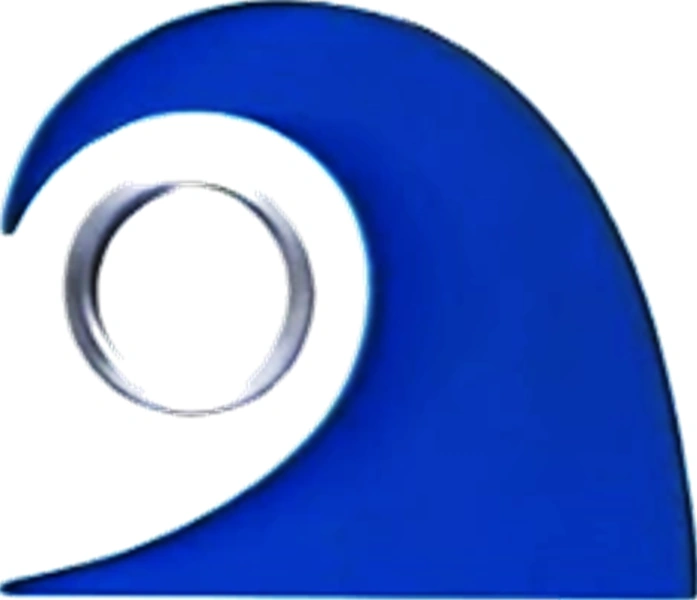
First logo inspired by Azul Televisión: It is a blue wave and a silver ring with a background of the same color, which strategically formed the number 9 and the letter "A". This is considered the logo of the channel, since it was the first one that it had and lasted until months before its disappearance. Below the logo appears the word "AZUL" and further down, the word "'TELEVISIÓN'" in Frutiger font in capital letters.
.jpg "Azul Televisión Paraná (ID 1999).jpg (38 KB)")
.jpg "Azul Televisión Paraná (ID 1999 - 2).jpg (46 KB)")
2001-2002[]

The second logo was the word "AZUL", in capital letters, in which the "A" was represented by a pyramid (▲ZUL). It was released in September 2001 and designed by the Ratto BBDO agency (2001). The promotions were characterized by having three actors painted blue (Blue Man Group style), showing the logo in different ways.
.jpg "Azul Televisión Paraná (ID 2001).jpg (49 KB)")
April-August 2002[]

In April 2002, the last logo of the channel modified its aesthetics, and replaced the hard pyramid with a softer and more stylized one, accompanied by the azul name and eliminating the suffix TELEVISIÓN in favor of the new one "te ve" (both in Handel Gothic font) with the word Paraná (in Verdana) below.
.png "Azul Televisión Paraná (Logo 2002 - 2).png (417 KB)")
.jpg "Azul Televisión Paraná (ID 2002).jpg (39 KB)")
Canal Nueve Litoral[]
August-December 2002[]

After the low period with Azul Televisión Paraná, the name of the channel returns as Canal 9 Litoral.
On August 20, 2002, the logo is a red parallelepiped placed vertically, on all 4 sides there is the white number 9 in Impact font. Below is a blue rectangle but lower, where there are the words "CANAL" and "NUEVE" in Eurostile Extended typography.
.jpg "Canal Nueve Litoral (ID 2002).jpg (58 KB)")
January-August 2003[]

On January 6, 2003, the blue rectangle with the words "CANAL" and "NUEVE" are removed. Now the parallelepiped is rounded and the 9 is metallic on all 4 sides. On the left is the text "canal nueve" and below the word "litoral" in Eurostile Extended.
.jpg "Canal Nueve Litoral (ID 2003).jpg (59 KB)")
2003-2005[]
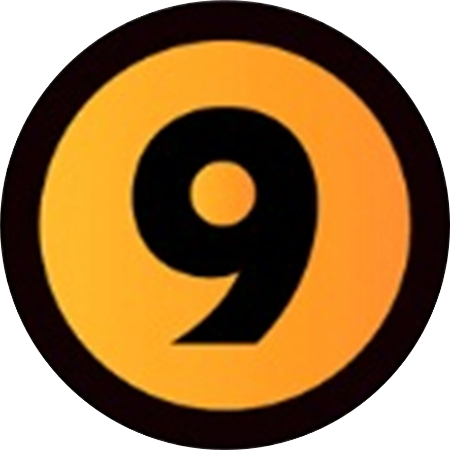
On August 26, 2003, this time it is now a 9 in black modern typeface. The number is inside an orange circle with a black ring inside that same figure. The logo was known as the "sierrita" and the word "canalnueve" is lowercase in Myriad font.
It was the last logo inspired by the Buenos Aires channel until 2005.
2005-2006[]

In 2006, Canal Nueve Litoral sold their sister stations to several companies. The channel's new logo is a red 9 with the words "CANAL" (above) and "LITORAL" (below) in Handel Gothic font.
In other variants, the logo had 2 versions:
- The word "NUEVE" is stylized as "NU9VE".
- The word "TELEVISION" is stylized as "TEL9VISION".
.jpg "Canal Nueve Litoral (ID 2005).jpg (46 KB)")
.jpg "Canal Nueve Litoral (2006 - Mundial).jpg (46 KB)")
2006-2010[]

The same logo has a 3D perspective view at 75 degrees.

Below it reads " CANAL NUeVe LITORAL ".
.jpg "Canal Nueve Litoral (ID 2006).jpg (41 KB)")
.jpg "Canal Nueve Litoral (ID 2006 - 2).jpg (36 KB)")
.jpg "Canal Nueve Litoral (ID 2006 - 3).jpg (29 KB)")
.jpg "Canal Nueve Litoral (2006 - Invierno).jpg (30 KB)")
.jpg "Canal Nueve Litoral (2008 - Primavera).jpg (48 KB)")
.jpg "Canal Nueve Litoral (2009 - Verano).jpg (55 KB)")
Nueve Litoral[]
2010-2021[]
2010-2011[]

On June 8, 2010, the logo is a red rounded rectangle with the silver number 9 on it.

Below the word CANAL was eliminated to be called " NUeVe LITORAL " in gray, it is similar to Canal 10 (Mar del Plata).
.jpg "Nueve Litoral (ID 2010).jpg (39 KB)")
.jpg "Nueve Litoral (ID 2010 - 2).jpg (37 KB)")
.jpg "Nueve Litoral (2010 - Continuidad).jpg (45 KB)")
.jpg "Nueve Litoral (2010 - Primavera).jpg (31 KB)")
2012-2021[]

The logo itself is made in 2D and the 9 is white.

The word " NUEVE LITORAL " is in DIN Pro typography, it is also similar to the Mar del Plata channel.
.png "Nueve Litoral (Logo navideño).png (269 KB)")
.png "Nueve Litoral (Logo Bicentenario de la Independencia Argentina).png (556 KB)")
.png "Nueve Litoral (Logo olímpico - 2016).png (320 KB)")
.jpg "Nueve Litoral (ID 2011 A).jpg (34 KB)")
.jpg "Nueve Litoral (ID 2011 B).jpg (25 KB)")
.jpg "Nueve Litoral (ID 2011 C).jpg (25 KB)")
.jpg "Nueve Litoral (2011 - Día del padre).jpg (23 KB)")
.jpg "Nueve Litoral (2012 - Día de la Patria).jpg (28 KB)")
")
")
.jpg "Nueve Litoral (ID 2012 - 2).jpg (22 KB)")
.jpg "Nueve Litoral (2013 - Verano).jpg (79 KB)")
.jpg "Nueve Litoral (2013 - Navidad).jpg (99 KB)")
.jpg "Nueve Litoral (2014 - Mundial).jpg (48 KB)")
.jpg "Nueve Litoral (2014 - Navidad).jpg (106 KB)")
.jpg "Nueve Litoral (2016 - Bicentenario de la Independencia).jpg (41 KB)")
.jpg "Nueve Litoral (2017 - Día de las Malvinas).jpg (63 KB)")
.jpg "Nueve Litoral (2018 - Verano).jpg (82 KB)")
.jpg "Nueve Litoral (2018 - Otoño).jpg (150 KB)")
.jpg "Nueve Litoral (2018 - Invierno).jpg (63 KB)")
.jpg "Nueve Litoral (2019 - Verano).jpg (85 KB)")
.jpg "Nueve Litoral (2019 - Invierno).jpg (45 KB)")
.jpg "Nueve Litoral (2019 - Primavera).jpg (49 KB)")
.jpg "Nueve Litoral (2020 - Verano).jpg (55 KB)")
.jpg "Nueve Litoral (2020 - Día de los enamorados).jpg (41 KB)")
.jpg "Nueve Litoral (2020 - Otoño).jpg (97 KB)")
.jpg "Nueve Litoral (2020 - Invierno).jpg (79 KB)")
.jpg "Nueve Litoral (2020 - Primavera).jpg (48 KB)")
.jpg "Nueve Litoral (2020 - Navidad).jpg (101 KB)")
.jpg "Nueve Litoral (2021 - Otoño).jpg (141 KB)")
.jpg "Nueve Litoral (2021 - Invierno).jpg (96 KB)")
Canal 9 Litoral[]
2021-present[]

On November 1, 2021, the logo is replaced by a red circle with a transparent trail to the left. It bears a white 9 and on the front it bears a white and red dotted curve. It is similar to the Buenos Aires version of Canal 9 in 2014.
.jpg "Canal 9 Litoral (ID 2021).jpg (42 KB)")
.jpg "Canal 9 Litoral (2021 - Primavera).jpg (44 KB)")
.jpg "Canal 9 Litoral (2021 - Navidad).jpg (71 KB)")
.jpg "Canal 9 Litoral (2022 - Verano).jpg (51 KB)")
.jpg "Canal 9 Litoral (2022 - Primavera).jpg (36 KB)")
.jpg "Canal 9 Litoral (2023 - Otoño).jpg (111 KB)")
.jpg "Canal 9 Litoral (2023 - Invierno).jpg (52 KB)")
.jpg "Canal 9 Litoral (2023 - Primavera).jpg (93 KB)")
| Part of Grupo Clarín
eltrece (free-to-air television network) Cable television channels Other assets Defunct Notes: |