This page only shows primary logo variants. For other related logos and images, see:
|
Canal 1, formerly or also known as HJTV-2, HJRN-TV, Televisora Nacional de Colombia, Canal Nacional, Primera Cadena, Primera Cadena Color, Cadena 1, Cadena Uno, Canal Uno and El 1, is a Colombian television channel of varied programming founded on June 13, 1954 (Public channel) and August 14, 2017 (Private channel) and is owned by Phoenix Media, and the Gobierno de Colombia.
HJTV-2 / HJRN-TV (Pre-Inravisión era)[]
1954–1956[]
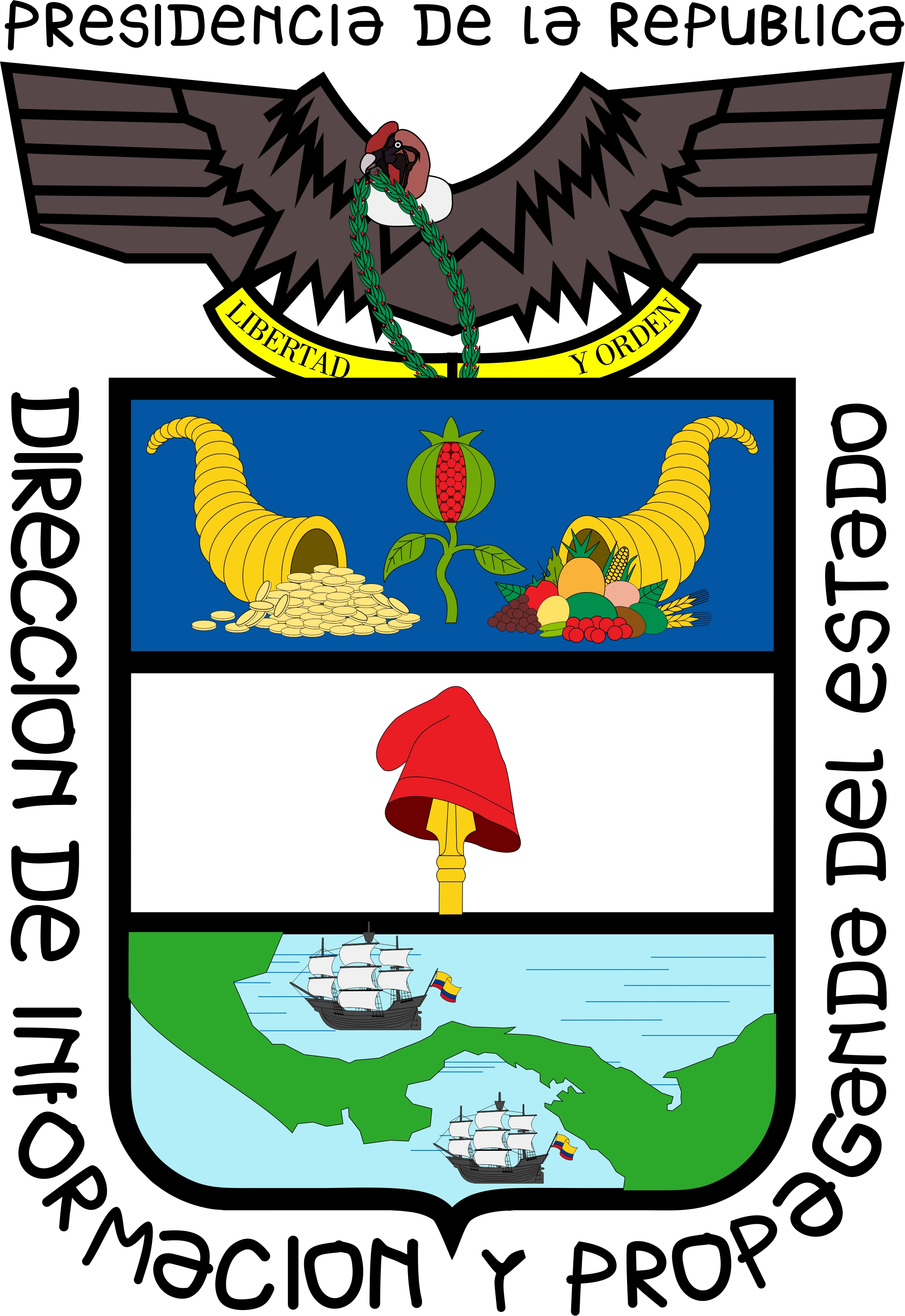
The channel's logo represents the Colombian coat of arms.
Televisora Nacional de Colombia[]
1956–1963[]
The text on the logotype was changed to a sans-serif font.
Inravisión Canal Nacional[]
1963–1972[]
In 1963, the "Coat of Arms" logo was changed. Back then, the channel shared its logo with its parent company, Inravisión.
Inravisión Primera Cadena[]
1972–1979[]
Inravisión Primera Cadena Color[]
1979–1981[]
Due to the rise of color television in Colombia, the color representing the channel was blue.
1982[]
Inravisión Cadena 1[]
1982–1987[]
|
|
| Typography:
|
Pump Com Medium
|
|
| Launched:
|
December 1, 1982
|
|
In 1982, Inravisión changed its logo, with its channels adopting the same one, albeit with the company's name being changed to the channel's name (in this case, Cadena 1).
1987–1989[]
|
|
| Typography:
|
Personalized (logo)
Eras Bold, Helvetica (on-air)
|
|
|
In 1987, all of Inravisión's channels adopted a new logo consisting of a shape behind the channel number. In the case for Cadena 1, it was a blue triangle behind a yellow number.
1990–1991[]
|
|
| Typography:
|
ITC Avant Garde
|
|
|
The channel's logo was again changed to the Inravisión logo, albeit flat and with lines and circle purple, with the number 1 to the right of it (in a blue-purple) gradient.
Inravisión Cadena Uno[]
1992–1994[]

|
SVG NEEDED
|
|
|
| Typography:
|
Personalized (logo)
Helvetica (on-air)
|
|
| Launched:
|
January 1, 1992
|
|
In 1992 due to the new programming of the semipublic channels, Cadena 1 became known as Cadena Uno (with the number as a word instead of a digit). The logo included an adaptable slogan, having different text depending on the context: below, are Uno tiene emociones, Uno tiene su corazoncito, Uno está en la jugada, Uno es noticia, Uno tiene opinión, Uno quiere a los niños, Uno es divertido and Uno es una nota, and a base slogan being Uno no se cambia por nada. The logo and name were unveilled during December 1991.
1994–1997[]
|
|
SVG NEEDED
|
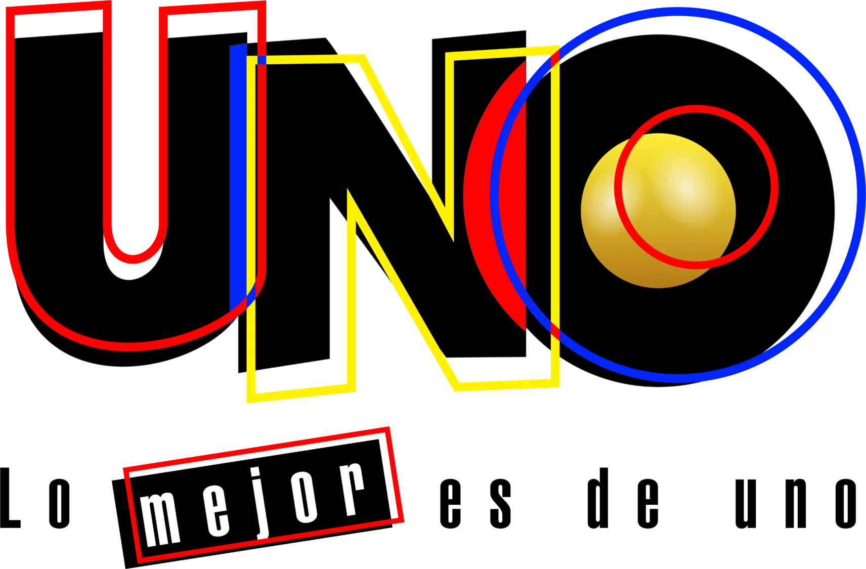
In 1994, during the 40th anniversary of Colombian television, the logo was changed again. The Uno became capitalized and in a sans-serif font. Borders would also appear in red, yellow and blue. A orange ball occupies the hole in the "O". Just like with the previous logo, the slogan could be adapted to have different variants depending on the context, with the base one being Lo mejor es de Uno. The adaptable slogans are: Las emociones son de Uno, Las telenovelas son de Uno, El deporte es de Uno, Las noticias son de Uno, La opinión es de Uno, Los niños son de Uno, El humor es de Uno and La música es de Uno.
Canal Uno[]
1998–2003[]
On New Year's Day 1998, Cadena Uno became known as Canal Uno with a new logo design and new graphics. The sans-serif letters were completely changed to a circle with a 1 cut of it. The 1 had a line to the right of it. Below, it had the text Canal Uno. Sometimes, the cut parts would have a white background, while other times it was completely transparent.
With slogan "Todo en uno"
Logo of Number 1 used alternatively
2002–2003[]
This logo was only used on programs produced by NTC Televisión and Programar Televisión.
2003–2011[]
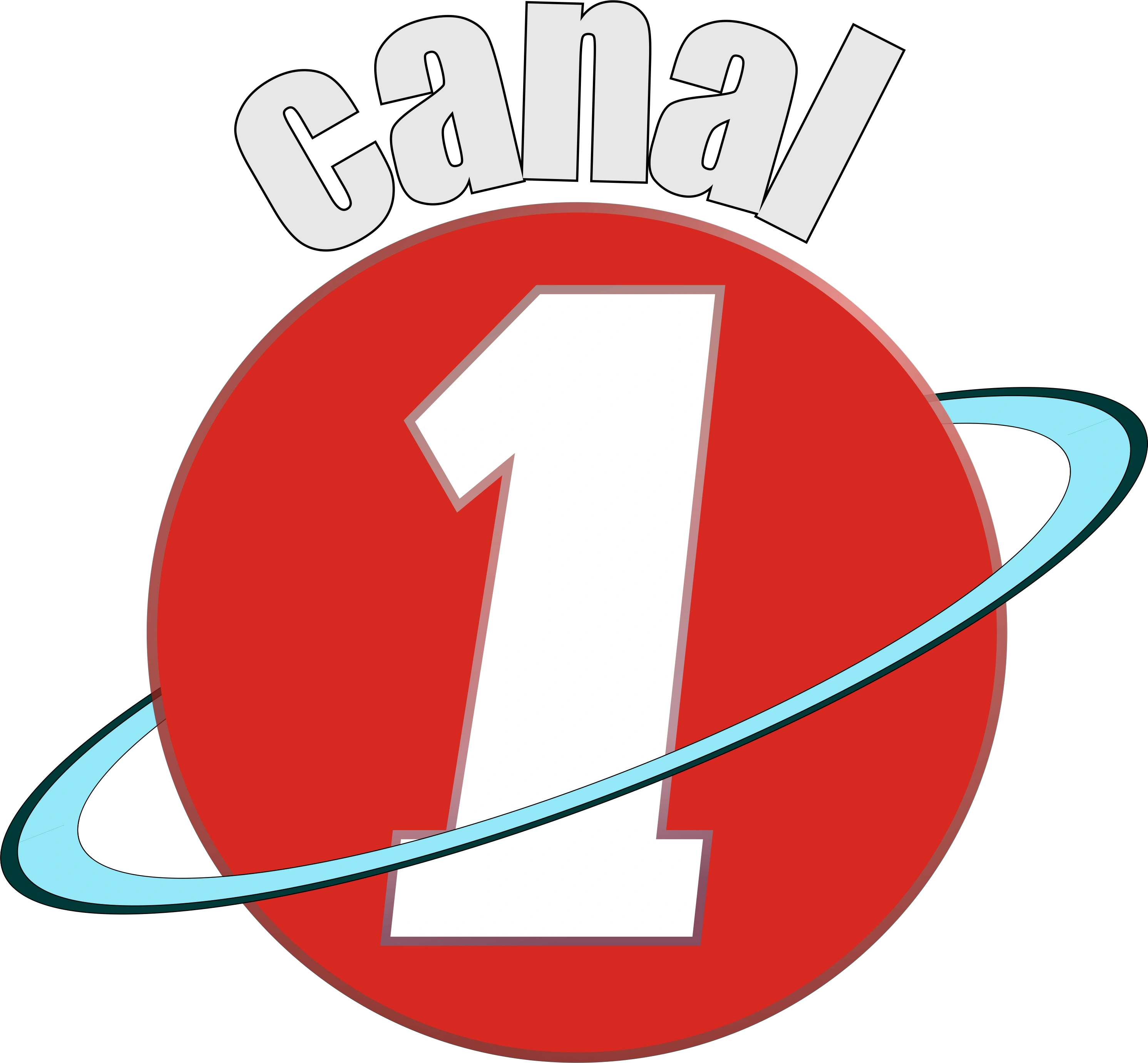
The number 1 is now over a red circle, with another circle making orbit. Above, the text "Canal" in curved shape. In 2011, the orbit was removed and the text Canal is placed to the left without distortions.
2011–2014[]
2014–2017[]
The number 1 returned to be an orange word (in small letters), although the digit is still highlighted in blue. Below, and also in blue, is the word CANAL.
A HD version was launched on May 24, 2015 on DTT.
Canal 1[]
2017–present[]
2017–2023[]
| Designer:
|
MullenLowe SSP3
|
|
| Typography:
|
Neo Sans (modified)
|
|
| Launched:
|
August 14, 2017
|
|
In 2017, a new logo was introduced as part of the channel's new direction to become yet another alternative to the private channels. The new logo was a rounded triangle pointing to the top-left. The 1 was cut in the bottom-right side. The triangle had various colors, which were (clockwise, from the bottom): yellow, orange, red and purple.
Logo with slogan "Aquí todos somos Uno"
2023–present[]
| Designer:
|
MullenLowe SSP3
|
|
| Typography:
|
Montserrat
Outfit
|
|
|
It was learned that Phoenix Media decided to shorten the name of the channel to "El 1" in its promotional, and made changes to its programming and its graphic part. These changes were effective from March 15, 2023.
Logo with slogan
"Como Tú" (2023–2024)
Logo with slogan
"Libre Como Tú" (2024–present)


")
")
")

.svg "Canal 1 (Colombia 1998-S).svg (20 KB)")
.svg "Canal 1 (Colombia 1998-I).svg (4 KB)")


")
")
")
")
")
")
")

")
")
