Note: For variations of these logos, see On-Screen Variations.
1924–1928[]
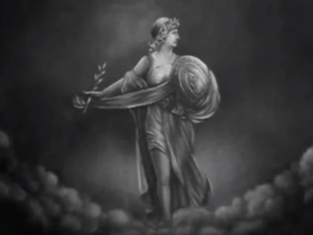
Columbia Pictures was founded on January 10, 1924 as Columbia Pictures Corporation. For their first films, the company used an illustration featuring a female Roman soldier holding a shield in her left hand and a stick of wheat in her right hand.
1928–1936[]
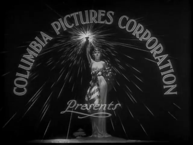
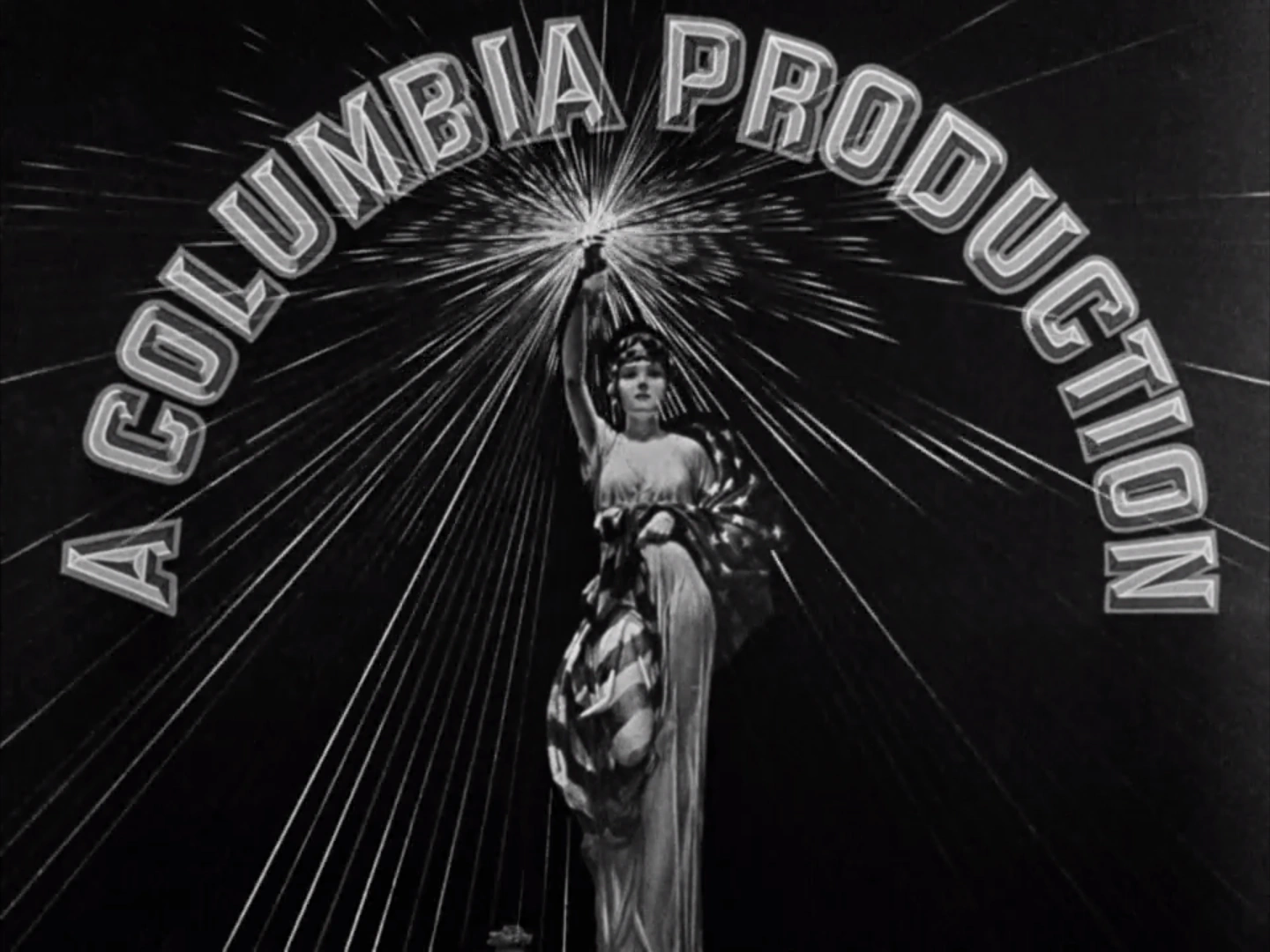
In 1928, the Roman soldier was replaced by Columbia (who is an early American personification of the United States) holding a torch on her right hand and wearing a draped US flag. Above her, the words "Columbia Pictures Corporation" (later "A Columbia Production") appear above in an arch.
1928–1932[]
1928–1936[]
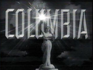
1936–1976[]
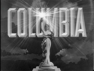
In 1936, the woman nicknamed as the Torch Lady now stands on a pedestal showing a giant Columbia text in chiseled letters behind her. The sky background was also added. This became the main design of the company for over 80 years.
1936–1942[]
1942–1952[]
In 1942, due to the United States Flag Code which considers illegal to wear the American flag as a costume, the draped US flag was replaced with an ordinary cloth.
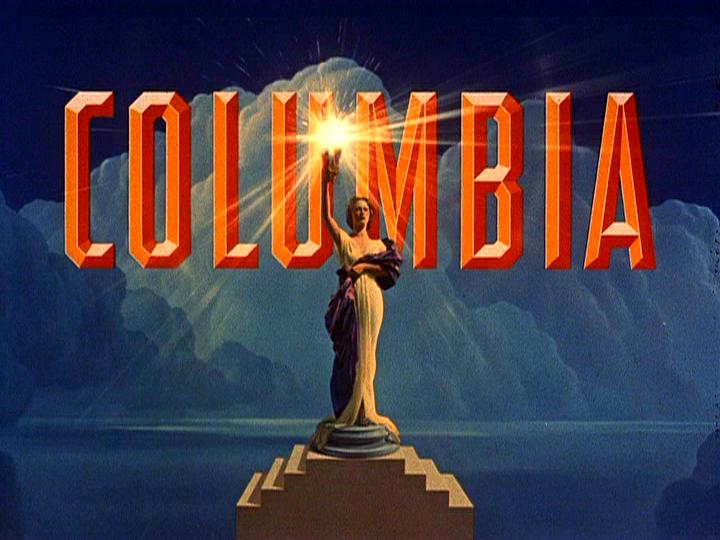
1943–1953[]
Technicolor variation. The pedestal is more visible now and the sky background was changed, resembling a snowy mountain.
1949–1954[]
Black and white version.
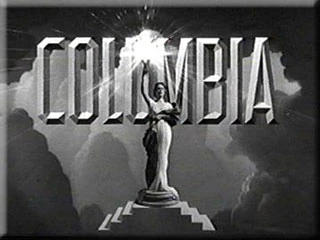
1953–1969[]
")
")
In 1953, since Technicolor films started to become more common, the entire logo was colored (although a Black and White variant was used in tandem with) and the ocean was added to the background to give the impression of a far horizon. Shortly after, it was zooming out to reveal more of the Torch Lady's pedestal.
1955–1968[]
This was the CinemaScope version. The sky background was modified again to fill the screen, resembling an iceberg. For 35mm uncropped film scan prints starting with 1958's The 7th Voyage of Sinbad, it was presented in 1.14:1 open matte and the Torch Lady's pedestal doesn't extend to the bottom of the screen, making it look like she's floating, just like the variant of the 1953 Columbia Pictures "50's Torch Lady" logo from Gun Fury.
1968–1973[]

In 1968, the clothing of the Torch Lady was slightly modified.
1973–1976[]
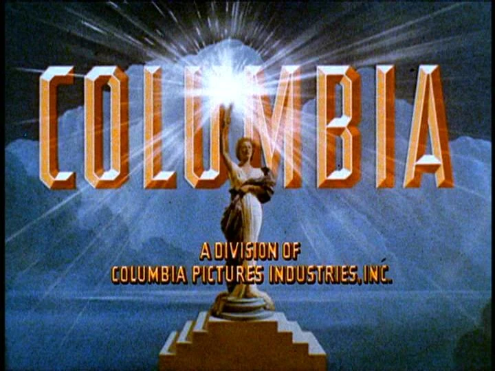
In 1974, the byline A Division Of Columbia Pictures Industries, Inc. was added on the bottom.
1976–1981[]
")
")
|
|
|
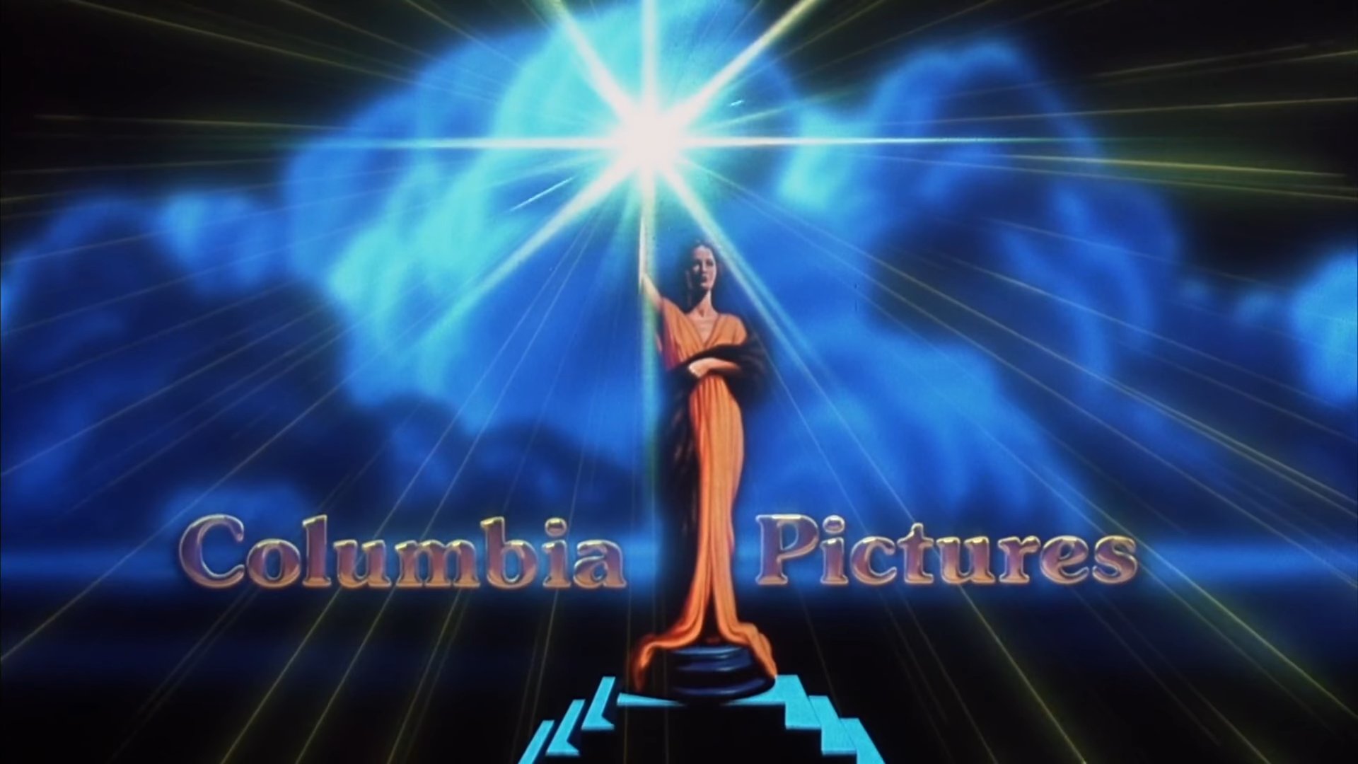
From 1976 to 1981, Columbia Pictures replaced the classic logo with the one known as "Sunburst logo" which represented the beams from the torch. The Torch Lady was still seen without the "Columbia" text, but only in very few seconds at beginning of the animation sequence. It was debuted in Murder by Death and last used in Happy Birthday to Me.
1981–1993[]
In 1981, Columbia discontinued the Sunburst logo and brought back the Torch Lady, but now the full name of the company was seen and the outfit of the Torch Lady were colored orange and the drape around her body is colored brown. The Torch Lady also has her hair down and her hair color is now dark brown. This logo is known for being used in Ghostbusters and its sequel. It was debuted in Cheech & Chong's Nice Dreams and last seen in Lost in Yonkers.
1993–present[]
1993–2007[]
1993–1999[]

|
|
|
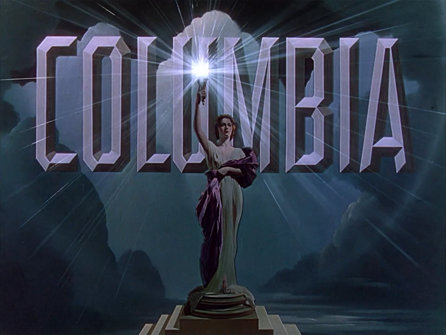
In 1993, the logo was repainted digitally by artist Michael Deas, giving it a more hyper-realistic look and the chiselled text was added again. In addition, the outfit of the Torch Lady is now white instead of orange and the drape around her body is colored royal blue. In addition, the Torch Lady’s hair color is now red and wears her hair in a bun. The opening sequnce was also changed using a 3D animation made by Jeff Kleiser and Diana Walczak of Synthespian Studios, in which the logo would zoom-out from torchlight to show the entire structure.
With a lifespan of 30 years, this became the most memorable logo of the company, and made its debut in Last Action Hero.
Trivia:[]
- Michael Deas hired Jennifer Joseph, a newspaper graphics artist, to model as the Torch Lady.
1996–2007[]
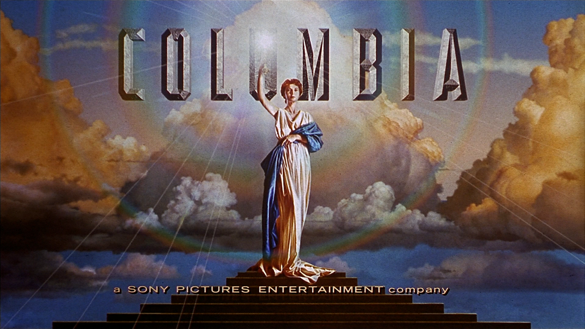
In 1996, the byline a Sony Pictures Entertainment company was added. It was debuted in The Juror, where the byline is slightly off-center. The later variant where the byline is smaller is first used in The Craft and last used in The Messengers. Additionally, it made a one-time surprise appearance in Little Women (2019), where it is stylized like the current 2014-present version.
2007–present[]
|
|
|
2007–2014[]
In 2007, the logo was updated with a more advanced CG animation by Sony Pictures Imageworks, where the sky is darker and the Torch Lady is in an "enhanced" look, similar to the 2001 on-screen Columbia TriStar Home Entertainment logo and Michael Deas' original artwork of the logo. It was debuted in The Holiday, released in 2006 (where the logo is already formed). An anamorphic variation exists, where the background is stretched and the text is larger. This version first appeared in Ghost Rider (first film to use the fully animated version of the logo) and it was last seen in Captain Phillips.
2014–present[]
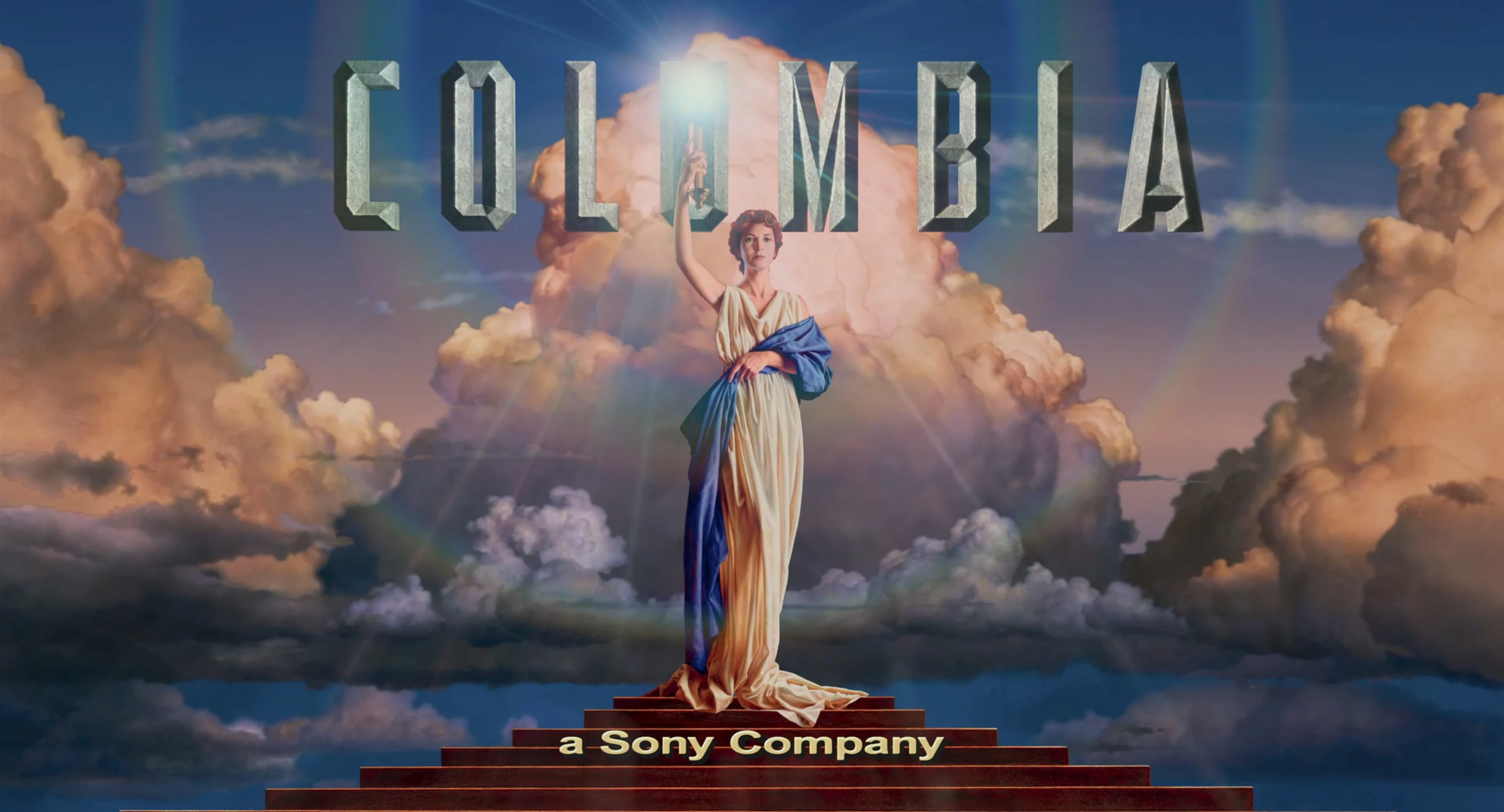
2014–2022[]
The byline was changed to a Sony Company in 2014. Also the logo begins with the Sony logo appearing and zooming in to some parting clouds with a bright light transitioning to the traditional zoom out of the torch. It was debuted in Marvel's The Amazing Spider-Man 2, released in the US on May 02 the same year, and last used in Hotel Transylvania: Transformania, released on Amazon Prime Video (albeit a variant). However, on Spectre, The Magnificent Seven (2016), and Napoleon (latter title uses the 2022 version instead), the Sony logo and the cloud transition do not appear, making it identical as the 2007 version.
In 2021, the logo is slightly updated with Sony's new motion logo (based on its brand identity used since June 2021) at the beginning and the clouds in the transition are slightly modified with a sharper look to compliment the new Sony logo. This debuted on Venom: Let There Be Carnage, exclusively released in US theaters on October 1 the same year, and last used in the digital and home media release of Bullet Train and theatrical prints of Devotion, following SPE's sale of the film's US home media rights to Paramount Pictures. This later made a surprise re-appearance on The Equalizer 3, released on September 1, 2023.
2022–present[]
A newer version of the logo has Sony's motion logo playing normally, but the clouds that were normally in the transition to this logo are replaced by those in gray and a red sun can be seen, while the torchlight rays are redone. It was first seen in theatrical prints of Bullet Train, released on August 5, 2022. This version of the logo later debuted on the digital and home media release of Lyle, Lyle, Crocodile.
2024 (100th anniversary logo)[]
|
|
|
On November 14, 2023, Sony Pictures Entertainment unveiled the new logo of Columbia Pictures to commemorate its 100th anniversary in January 10, 2024. It's revealed the animated logo based on Deas' original painting, where the torch has an enhanced glow to symbolize the vibrancy of the studio's history. This variant debuted in the theatrical re-release of Spider-Man: Across the Spider-Verse, plastering the variation of the previous logo, and showcased in the trailer of Ghostbusters: Frozen Empire.
