| 2007-2012 | 2012-2013 | 2012-2013 (iPad Only) | 2013-2015 | 2015-2017 | 2017-2020 | 2020-present |
2007–2012[]
This logo was used for the iPhone and iPod Touch from iPhone OS 1 in June 2007 to iOS 5 in August 2012.
2012–2013[]
The logo above was only used for the iPhone and iPod Touch during iOS 6 in September 2012 The minute and hour hands were rounded as opposed to pointy in iOS 5 and below.
2012–2013 (iPad Only)[]
The logo above was only used for the iPad during iOS 6 in September 2012, using the Swiss Railway Clock design.
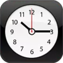
2013–2015[]
This logo was used since the launch of iOS 7 in September 2013. The new clock icon acts as a real clock based the time of the device. In iOS 8.0 to 8.2, the minute and hour hands were bolder and longer. In iOS 8.3 to iOS 8.4.1, the minute and hour hands lost their boldness, but were the same length as before.
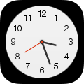
2015–2017[]
This logo is used since the launch of iOS 9 in 2015. In 2016 with iOS 10, the seconds hand turned from red to orange.
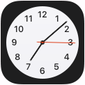
2017–2020[]
")
This logo was used at the launch of iOS 11 in 2017. In iOS 12, the second hand became a darker shade of orange and the minute and hour hands became bolder.
2020–present[]

In iOS 14 the hands were made bolder and were made to match the iOS 14 Clock widget and the orange hand was made darker.
| Applications and services AirPort Utility | Animoji | App Store | Books | Calculator | Calendar | Camera | Classroom | Clock | Compass | Contacts | FaceTime | Feedback Assistant | Files | Find My | Fitness | Freeform | Game Center | GarageBand | Health | Home | iCloud | iMovie | iTunes Movie Trailers | iTunes Store | iWork (Keynote | Pages | Numbers) | Magnifier | Mail | Maps | Measure | Messages | Mindfulness | Music | Music Classical | News | Notes | Phone | Photos | Podcasts | Reminders | Safari | Settings | Shortcuts | Siri | Sports | Stocks | Support | Texas Hold'em | Tips | Translate | TV | Videos (China only) | Voice Memos | VoiceOver | Wallet | Watch | Weather Discontinued  |