| 1955–1959 | 1959–1965 | 1965–1978 | 1978–1991 |
| 1991–1993 | 1993–2006 | 2006–2018 | 2018–present |
Bci (a stylized acronym of Banco de Crédito e Inversiones) is a Chilean bank.
1955–1959[]

1959–1965[]
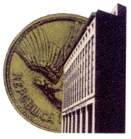
A new logo was introduced in 1959 that included a coin and the façade of the recently-built bank's main offices.
1965–1978[]

In 1965, the bank used the hourglass for the first time in its identity as a symbol of the value of customers' time.
- History of the Brand - Bci
1978–1991[]

The bank introduced a minimalist rendition of the hourglass in 1978, & introduced the slogan Somos diferentes in 1984.
1991–1993[]

1993–2006[]

In March 1993, the bank shortened its public name to Bci (pronounced letter-by-letter), and introduced an abstract version of the hourglass symbol, heavily inspired by the art of Joan Miró.
- Aviso del (nuevo) BCI (Banco de Crédito e Inversiones) en marzo de 1993 - Golpedirecto Coyhaique, August 10, 2015
2006–2018[]

In 2006 Bci tweaked its logo, introducing a new font - reducing the serifs - and defined the shapes of the hourglass logo.
")
")
")
2018–present[]

|
|
|
A new logo and slogan was introduced on July 4, 2018.
")
")
")