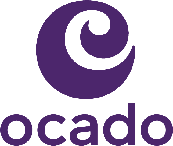
Ocado launched their new look in 2021, replacing the green colour with a purple hue called 'Grape' and making the swirl bolder.
The change in colour aims to make Ocado stand out against competitors, as green is common in the UK grocery industry (and associated with their previous partner Waitrose) and with the bolder swirl, was designed to look clearer on smaller screens. They also launched a new 'There's an Ocado just for you' jingle at this time.