This page only shows primary logo variants. For other related logos and images, see:
|
| 1960–1968 | 1968–1992 | 1984–1990 | 1990–1992 | 1992–1994 | 1994–1996 | 1996–1998 |
| 1998–2004 | 2004–2006 | 2006–2010 | 2010–2012 | 2012–2017 | 2017–2021 (primary), 2017-present (secondary) | 2021-present (primary) |
RPC is one of the first television networks from Panama, currently owned by Corporación Medcom (since 1997), and it has a sister radio station under the same name which came a decade prior. It was founded in March 14, 1960 by the brothers Fernando and Carlos Eleta Almarán, leading the arrival of panamanian television. The initals actually stand for Radio Programas Continentales, however the full name is often mentioned on the network.
1960–1968[]

| SVG NEEDED |
The "Rounded Parallelogram" logo was shown on various photos from the network's inauguration day on March 14. It only appeared in television cameras.
1968–1992[]
1968–1984[]

The so-called Huaca has been adopted for the first time as its emblem and the network began broadcasting in full color, especially for the historic Apollo 11 moon landing in 1969.
1984–1990[]

| SVG NEEDED |
1990–1992[]

The channel adopted the slogan El Primer Canal, that was used until 1996 with the following logos.
| SVG NEEDED |
1992–1996[]
1992–1994[]

|
|
|
The Huaca has received an updated appearance. Now it has a culture-themed look.
1994–1996[]

1996–1999[]

The 1992 Huaca has been modified to give it a more simple and symmetrical look.
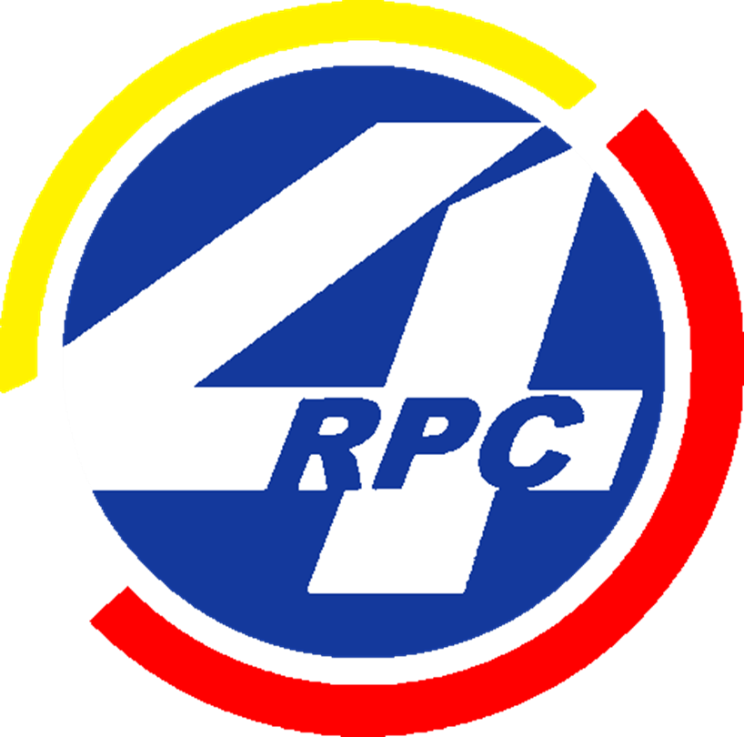
1999–2003[]

After thirty one years, The Huaca has been replaced by a simply number 4 inside a blue circle with yellow/orange (or red) semicircles.
2003–2006[]
| SVG NEEDED |
Semicircles are a little bit split and the network's name are stretched from the 4.
2006–2010[]

| SVG NEEDED |
The Huaca was brought back as its emblem for the first time in seven years. Now it's currently red. During that period, the channel's slogan was Vive sin límites.
2010–2012[]

| SVG NEEDED |
A new logo was unveiled when the network celebrated its 50th anniversary. The slogan used during that time was Con Todo.
2012–2017[]

| SVG NEEDED |
In June 1st, RPC launched its high-definition signal and also unveiled a newer logo. The logo consists of the modern Huaca with an slightly updated appearance: the vertical line between the smile became smaller and the split left arm is now joined through the triangular body. The logo and graphics were accompanied by its slogan Empieza Aquí. During its 55th anniversary, RPC also used Moviéndonos as a special slogan.
2017–2021 (primary), 2017-present (secondary)[]

By 2017 RPC unveilded a new look for the "Huaca" which now is minimalilst, and the channels letters now in uppercase (first time since 2010) The graphics were accompanied by the slogan #EstoyRPC.
2021-present (primary)[]

| BETTER LOGO NEEDED |
RPC unveiled a new "flat" look as the Huaca received a new appearance featuring just the head. Its current slogan is Tu Casa. In late 2022 RPC made a variant logo used as a screen bug.
The Huaca[]
The iconic logo of RPC, originally comes from one of the pre-Columbian pieces found in some provinces such as Cocle. The circular piece literally depicts a smiling dragon-like creature with a triangular body while opening its arms and legs.

The true original Huaca that RPC inspired as its own symbol.
.svg "RPC Huaca (Early 1960).svg (19 KB)")
")
.svg "RPC Huaca-(1992).svg (4 KB)")
.svg "RPC Huaca (1994).svg (4 KB)")
")
.png "RPC-TV (2010).png (99 KB)")
")
.svg "RPC Huaca (2012).svg (6 KB)")
.svg "RPC Huaca (2017).svg (7 KB)")
")
| Television Free-to-air TV channels Radio OTT TV productions Defunct Former operations Notes:  |
| Institutional Members ATA | ARPA | ABERT | ANATEL (Chile) | ARCHI | ASOMEDIOS | CANARA (Costa Rica) | ACTVE | AER | ASDER | NAB | Cámara de Radiodifusión de Guatemala | Cámara de la Industria de la Radio y Televisión | Unión Nicaragüense de Radiodifusores | Asociación Panameña de Radiodifusión | Asociación Paraguaya de Radiodifusión Privada | Cámara Paraguaya de Estaciones de Radio y Televisión | Sociedad Nacional de Radio y Televisión (Perú) | Asociación Nacional de Broadcasters Uruguayos | Cámara Venezolana de Televisión | Cámara Venezolana de la Industria de la Radiodifusión | Unión de Asociaciones de Radiodifusión de Centro América Television  |