| Emblems • Assets • Look of the Games • Pictograms • Medals • Torch Relays • Other |
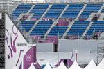
Tokyo 2020's look revolves around the three rectangles that form up the games' emblems and a Japanese colour layering technique called "kasane no irome" which was used in kimono fabrics during the Heian Period (794–1185).[1] The look can be presented in four base colours representing the four seasons:
- Kurenai (red): a traditional colour of Japan, commonly used in celebrations
- Ai (blue): the colour of the games' emblems
- Fuji (purple): the colour of Wisteria, a common flower in Japan, Korea and China
- Matsuba (green): the colour of pine needles, commonly used in celebrations
On 16 April 2021, TOCOG unveiled the first of a set of illustrations to used in conjunction with the look of the games.[2] These illustrations will be displaced in Narita International Airport, greeting incoming athletes and observers with images of Japanese culture and artistry. The second set was released on 2 July.
Tokyo 1964 Film
Merchandising[]
Tickets[]
Promotional materials[]
1 Year to Go![]
Venues[]
On-air presentation[]
Torch Relay[]
OBS presentation[]
Miscellaneous[]
Round red look w/ gold trim (used on Mario & Sonic at the Olympic Games Tokyo 2020)


