1990–1996[]
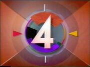
The original logo was created by Jerker Belvert well before the channel would eventually launch.[1][2] The first idents used started out with a shot of a runestone. Four computer-animated fours would slide in from the left and merge on the middle of the screen, resulting to as being similar to the 1989-1993 PBS ident.
- Youtube: TV4-avslutning 1991-02-09
- Youtube: TV4 Avslutning 1991-08-14
- Youtube: TV4 closedown 1992-01-17
- Youtube: TV4 Avslutning 1992-02-18
1992–1996[]
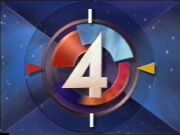
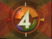
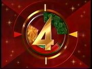
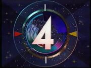
Because of this, the channel adopted a more colourful entertainment-based profile. It was created by TV4's graphic designer Tina Eriksson in cooperation with TV4's illustrator Mette Camp and John Ridgeway of Novocom.[3] The idents featured colourful slices that were spinning behind the logo.
The logo itself was also changed, with the addition of a yellow and a red triangle.
The following gallery contains most of the idents used by TV4 during this period.
- Youtube: TV4 Avslutning 1992-09-01
- Youtube: TV4 Avslutning 1992-12-17
- Youtube: TV4 Avslutning 1993-01-31
- Youtube: TV4 Avslutning 1994-03-05
1996–1999[]
TV4 moved into a new building on May 13, 1996. At the same time, the channel launched a new look and an updated logo.
- Youtube: TV4 Avslutning 1998-01-04
- Youtube: TV4 Avslutning 1998-08-28
- Youtube: Tv4-Avslut 1998-11-24
2000–2004[]
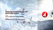
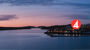
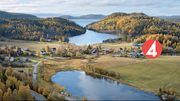
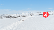
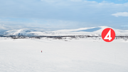
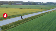
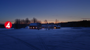
A completely new look was introduced on January 1, 2000. It was called "Getting Closer" and was created by English & Pockett. Unlike previous identifications, which have had the focus on computer-animated versions of the logo, the new graphics feature live footage, with a small version of the logo appearing on the middle of the screen.
- Youtube: TV4-avslutning 2001-07-27
- Youtube: Tv4-avslutning 2001-11-19
- Youtube: TV4 Avslutning 2002-05-04
2004–2006[]
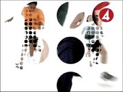
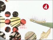
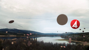
Another new design was launched on March 5, 2004. The new look features a patten of circles, through which one can see short bits of footage.[2]
2006–2012[]
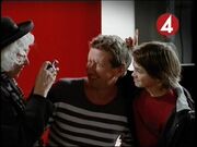
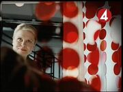
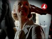
TV4's ident look was adopted on September 18, 2006. The idents now feature presenters and personalities from the channel shot in a studio featuring curtains made up of circles and much of TV4's red signature colour. The new look was mostly created in-house, with Martin Poole of Sway Media acting as a consultant. The new theme music was created by Jättemedia. On October 15, 2007, the graphics had to be overhauled as all major Swedish channels switched in 16:9 widescreen presentation. The general theme was kept and the idents were adapted by cutting off the lower and upper part of the image to make them fit in a 16:9 screen.
2012–2016[]
2016–2023[]
2023–present[]
References and sources[]
- ↑ [1]
- ↑ Folklighet, fyror och snurr, Dagens Nyheter, April 14, 1994. "Logotypen togs fram av reklammannen Jerker Belvert redan 1988 och skulle då signalera TV 4:s ambitioner att bli en kanal som satsade på nyheter och svenskproducerade program."
- ↑ Grafiskt grepp om tittarna, Dagens Nyheter, April 12, 1994. "Runslingorna är det enda som finns kvar från TV 4:s första nordiskt blonda satellitprofil. När TV 4 blev en marksänd kanal manifesterades det med en ny, färgstarkare snurra, skapad av Tina Eriksson i samarbete med hennes tidigare arbetsgivare amerikanen John Ridgeway och TV 4:s tecknare Mette Camp."


