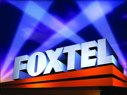
Foxtel began on 22 October 1995. The workmark uses the font FF Super Grotesk Bold and is similar to the print logo from 20th Century Fox since 1987, and as an on-screen logo between 1994 and 2010.
Foxtel old Logo - VHS Capture
2002–2012
2002–2005
Foxtel Digital logo
BETTER LOGO NEEDED
In 2002, the logo was altered to consolidate the searchlights into a quickly identifiable icon. Also, the wordmark was made thinner.
The primary difference is that the previous logo was modified and turned orange in September 2005.
2012–2017
Print variant
Print flared variant
White flared variant
On 25 May 2012, the searchlights icon was removed from the main logo and adapted into the visual styling of Foxtel promos. Typographically, the wordmark was also tweaked, particularly with the 'O' widened to match the likeness of the Fox and original Foxtel logo, and the 'T' was attached to the 'X'.
On 6 June 2017, Foxtel officially launched the company's biggest change of identity in its history alongside a refresh of their SVOD service Foxtel Now, formerly known as Foxtel Play. The new logo shows a lighter, sans-serif, lower-case logotype in a light red hue and sees the return of a side-icon: six dots forming a pixelated "f", possibly referencing the spotlight motif consistent with Foxtel's branding. As of 14 August 2018, this logo is now used as a secondary logo.
Foxtel from Telstra logo
2018–present
On 14 August 2018, Foxtel ditched the pixelated 'f' on their website and on their promotional materials. This comes on the same day they announced their new box Foxtel iQ4, along with Australia's first terrestrial 4K TV channel Foxtel 4K.
Pop-up channels
2015: Best of 2015 | Heroes
2016: Harry Potter | The Fast and the Furious | Star Trek | Star Wars | A Nightmare on Elm Street | 12 Days of Christmas | Best of 2016
2017: Resident Evil | Batman vs Superman | Arnold Schwarzenegger | X-Men | Alien vs. Predator
2018: Heath Ledger
2019:
2020:
HarperCollins: United States:Avon Publications | Caedmon Audio | Ecco | Harper | Harper Perennial | I Can Read! | William Morrow and Company United Kingdom:Farshore | William Collins, Sons | Collins Bartholomew | The Friday Project | Leckie & Leckie Australia:Angus & Robertson Germany:Nagel und Kimche | Reverial | Schneiderbuch | Dragonfly Christian:BibleGateway.com | Thomas Nelson | Women of Faith | Zondervan Canada:Harlequin
ACT: The Canberra Star
Central Coast: Central Coast Express Advocate
City & East: Central Sydney | Wentworth Courier | Southern Courier
Illawarra: Illawarra Star
Inner West: Inner West Courier
Macarthur: Macarthur Chronicle
Newcastle: The Newcastle News
Northern Beaches: Manly Daily
North Shore: Mosman Daily | North Shore Times
Parramatta: Parramatta Advertiser
South West: Fairfield Advance | Liverpool Leader | The Express
St. George Region: St George Shire Standard
The Hills: Northern Times | Hornsby Advocate | Rouse Hill Times | Hills Shire Times
West: Blacktown Advocate | Penrith Press
North: Bayside Star | City North News | North-West News | Northside Chronicle
South East: City South News | South-East Advertiser | Wynnum Herald | Southern Star
Redlands Coast: Redlands Community News
South West: Westside News | South-West Satellite
Springfield: Springfield News
Logan: Albert & Logan News
Moreton: Bribie Weekly | Caboolture Herald | Caboolture News | Redcliffe & Bayside Herald | Pine Rivers Press
North Lakes: North Lakes Times Moreton Life
Pop-up channels
2015: Best of 2015 | Heroes
2016: Harry Potter | The Fast and the Furious | Star Trek | Star Wars | A Nightmare on Elm Street | 12 Days of Christmas | Best of 2016
2017: Resident Evil | Batman vs Superman | Arnold Schwarzenegger | X-Men | Alien vs. Predator
2018: Heath Ledger
2019:
2020:
")
")

")
")


