Sit Mel2002 (talk | contribs) Tag: Source edit |
Sit Mel2002 (talk | contribs) Tag: Source edit |
||
| Line 27: | Line 27: | ||
{{Television Networks US}} |
{{Television Networks US}} |
||
[[Category:HBO]] |
[[Category:HBO]] |
||
| ⚫ | |||
[[Category:Television networks in the United States]] |
[[Category:Television networks in the United States]] |
||
[[Category:Commercial-free television networks]] |
[[Category:Commercial-free television networks]] |
||
| Line 34: | Line 35: | ||
[[Category:1972]] |
[[Category:1972]] |
||
[[Category:Premium movie channels in the United States]] |
[[Category:Premium movie channels in the United States]] |
||
| ⚫ | |||
[[Category:WarnerMedia]] |
[[Category:WarnerMedia]] |
||
[[Category:WarnerMedia subsidiaries]] |
[[Category:WarnerMedia subsidiaries]] |
||
| + | [[Category:Warner Bros.]] |
||
[[Category:Cable networks in the United States]] |
[[Category:Cable networks in the United States]] |
||
[[Category:Premium channels in the United States]] |
[[Category:Premium channels in the United States]] |
||
Revision as of 09:42, 12 January 2021
| 1972–1975 | 1975–1980 | 1980–present |
1972–1975
|
|
|
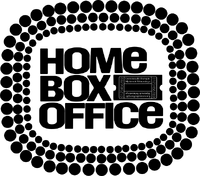
For the first four years of its existence, HBO identified itself with a still image of its original logo, a ticket stub, and the channel's full name Home Box Office, surrounded by a minimalist marquee light design.
1975–1980
|
|
|
HBO's iconic logo has looked essentially the same since 1975, utilizing a simple wordmark with a circle inside the "O" in "HBO", representing a camera lens. The early logo differs, however, in that it had the "O" overlapping the "B". In network IDs, the logo was often accompanied by three lines colored red, yellow, and blue, below or next to it. This logo and the next one were both designed by Betty Brugger, the art director for Time-Life at that time. During 1980, HBO used this logo in tandem with the next logo. It can still be found on some old motel signs.
1980–present
|
|
|
In 1980, the 1975 logo was revised, with the "O" in the letter mark moved off of to the right of the "B", but still contacting the latter at two points. As a result, the previous logo and its tri-colored lines were gradually phased out in 1981. A major reason for this change was that the partially obscured "B" of the previous logo gave many the impression it was an "E". Also, the letters in the logo were trimmed to be slightly less bold, and the spaces between letters and around the circle in the center of the "O" were widened.
External links
| Part of Warner Bros. Discovery Film/television production Other assets U.S. Channels International channels Formers: Current programming Upcoming programming Miniseries Former programming 115% with Robert Johnson, BET executives and shareholders, Taft Television & Radio Company and Liberty Media/Tele-Communications Inc., sold its stake in 1996 |
Template:WarnerMedia Template:Television Networks US


