| Line 39: | Line 39: | ||
== HiT Entertainment == |
== HiT Entertainment == |
||
| − | === |
+ | === 2007–present === |
[[File:HiT_Entertainment_(2006).png|center|200px]] |
[[File:HiT_Entertainment_(2006).png|center|200px]] |
||
In 2006, HIT Entertainment modified their logo to a "cube" variation of the main logo. The logo would now have the letters H and T in white, the I in blue being surrounded by red, yellow and blue squares which have round edges. |
In 2006, HIT Entertainment modified their logo to a "cube" variation of the main logo. The logo would now have the letters H and T in white, the I in blue being surrounded by red, yellow and blue squares which have round edges. |
||
Revision as of 19:56, 22 October 2019
This page only shows primary logo variants. For other related logos and images, see:
|
| 1983–1989 | 1989–1996 | 1994–1996 | 1996–2001 | 2000–2006 | 2006–present |
Henson International Television
1983–1989

Founded in 1982, this logo was first used in The Muppet Show in 1983. The name would be stylized as "hit!".
HIT Communications
1989–1996
HIT Entertainment PLC
1994?-1995
This logo seems to be a prototype of the next logo but has only been used for a year. It was only known to be released on international prints of Season 1 Reboot as HIT was the distributor.
1994–1996

1996–2001
2000–2006
HIT Entertainment switched to its 2D variation in 2000. This logo remained on some Thomas and Friends DVD's until they were expired in 2006.
HIT Entertainment
2001–2007
This logo debuted with HIT Consumer Products, which was a short-lived logo. In 2001, the "PLC" was dropped from the logo and the company was renamed "HIT Entertainment".
HiT Entertainment
2007–present
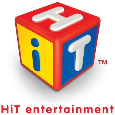
In 2006, HIT Entertainment modified their logo to a "cube" variation of the main logo. The logo would now have the letters H and T in white, the I in blue being surrounded by red, yellow and blue squares which have round edges.

| Subsidiaries Jim Henson Productions | Jim Henson Home Entertainment | Jim Henson Records | Jim Henson's Creature Shop | Henson Alternative | Henson Recording Studios | The Henson Soundstage Predecessor companies Defunct/Former |
HIT Entertainment
|
|---|
| Part of Mattel
Programs Sub-brands Former Sub-brands 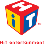 |