Skinnersteamedhams (talk | contribs) No edit summary |
|||
| (23 intermediate revisions by 13 users not shown) | |||
| Line 1: | Line 1: | ||
| + | {{ImageTOC| |
||
| + | IHOP58.png|1958–1982| |
||
| + | IHOP1982.png|1982–1992| |
||
| ⚫ | |||
| + | IHOP Restaurant.svg|1994–2015| |
||
| + | IHOP 2015.svg|2015–present}} |
||
==International House of Pancakes== |
==International House of Pancakes== |
||
===1958–1982=== |
===1958–1982=== |
||
| − | [[File: |
+ | [[File:IHOP58.png|200px|center]] |
| + | |||
| ⚫ | |||
| + | {{SVG needed}} |
||
| + | |||
| ⚫ | |||
| + | <gallery spacing="medium" widths="150" bordersize="none" bordercolor="transparent" position="center" captionalign="center" captionsize="medium" hideaddbutton="true"> |
||
| + | Ihop_old.jpg|Another version of the logo. |
||
| + | </gallery> |
||
===1982–1992=== |
===1982–1992=== |
||
| − | [[File:IHOP1982.png| |
+ | [[File:IHOP1982.png|250px|center]] |
| + | |||
| + | {{SVG needed}} |
||
| + | |||
| + | ===1992–1994 (primary logo), 1994–2003 (secondary logo)=== |
||
| ⚫ | |||
| + | <gallery spacing="medium" widths="150" bordersize="none" bordercolor="transparent" position="center" captionalign="center" captionsize="medium" hideaddbutton="true"> |
||
| + | ihop-restaurant.png|Print version |
||
| + | </gallery> |
||
| ⚫ | |||
| ⚫ | |||
From 1992 to 2003, this logo was used simultaneously with the next, more simplistic logo. In 2003, it was gradually phased out in favor of the next logo. It is still used at a few scant locations. |
From 1992 to 2003, this logo was used simultaneously with the next, more simplistic logo. In 2003, it was gradually phased out in favor of the next logo. It is still used at a few scant locations. |
||
==IHOP== |
==IHOP== |
||
===1994–2015=== |
===1994–2015=== |
||
| − | [[File:IHOP Restaurant.svg| |
+ | [[File:IHOP Restaurant.svg|250px|center]] |
Similar to the previous logo, except the "International House of Pancakes" wordmark was simply replaced with the acronym "IHOP". This logo would go on to be the longest-running used for the company, It lasted for 21 years. It is still used at some locations. |
Similar to the previous logo, except the "International House of Pancakes" wordmark was simply replaced with the acronym "IHOP". This logo would go on to be the longest-running used for the company, It lasted for 21 years. It is still used at some locations. |
||
| + | |||
| ⚫ | |||
| + | <gallery spacing="medium" widths="150" bordersize="none" bordercolor="transparent" position="center" captionalign="center" captionsize="medium" hideaddbutton="true"> |
||
| ⚫ | |||
| + | </gallery> |
||
===2015–present=== |
===2015–present=== |
||
| − | [[File:IHOP 2015.svg|center| |
+ | [[File:IHOP 2015.svg|center|250px]] |
| − | In June 2015, IHOP changed its logo for the first time in 21 years, with a logo containing a curve under the 1994 wordmark resembling a smile (the "O" and "P" are the eyes while the half of "P" serves as the nose). This change was rumored to be made in order to make IHOP look "happier", as if the former was "frowning" (although ads in the "Come Hungry, Leave Happy" campaign had the banner curving upwards as if it was smiling). Also, the word "Restaurant" was dropped from the logo |
+ | In June 2015, IHOP changed its logo for the first time in 21 years, with a logo containing a curve under the 1994 wordmark resembling a smile (the "O" and "P" are the eyes while the half of "P" serves as the nose). This change was rumored to be made in order to make IHOP look "happier", as if the former was "frowning" (although ads in the "Come Hungry, Leave Happy" campaign had the banner curving upwards as if it was smiling). Also, the word "Restaurant" was dropped from the logo. |
| + | |||
| − | [[File:IHOB.svg|Used in 2018 to promote burgers (known as International House of Burgers).|200px|center]] |
||
| + | ==IHOB== |
||
| + | ===2018=== |
||
| + | [[File:IHOB.svg|250px|center]] |
||
| + | In 2018, the P in the logo was turned upside down to look like a B to promote their burgers. A lot of people took this change seriously, thinking it was real, but it returned to its usual look after a short time. |
||
[[Category:Restaurants]] |
[[Category:Restaurants]] |
||
[[Category:Restaurant chains in the United States]] |
[[Category:Restaurant chains in the United States]] |
||
| Line 39: | Line 64: | ||
[[Category:Restaurant chains in Lebanon]] |
[[Category:Restaurant chains in Lebanon]] |
||
[[Category:Dine Brands]] |
[[Category:Dine Brands]] |
||
| + | [[Category:Grupo El Rosado]] |
||
Revision as of 03:11, 10 May 2020
| 1958–1982 | 1982–1992 | 1992–2003 | 1994–2015 | 2015–present |
International House of Pancakes
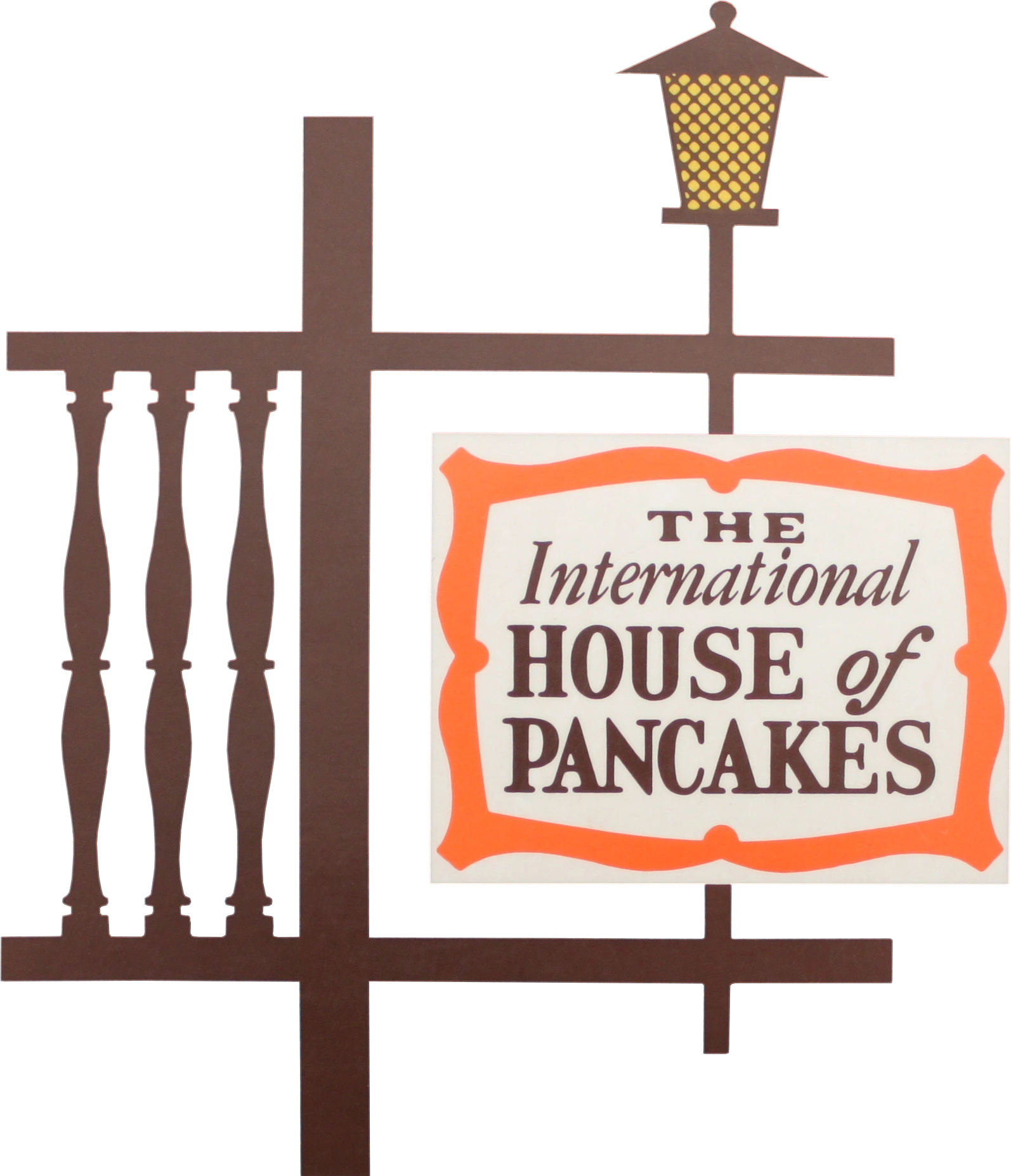
1958–1982
| SVG NEEDED |
IHOP was established in 1958 as the International House of Pancakes.
")
1982–1992
| SVG NEEDED |
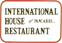
1992–1994 (primary logo), 1994–2003 (secondary logo)

")
From 1992 to 2003, this logo was used simultaneously with the next, more simplistic logo. In 2003, it was gradually phased out in favor of the next logo. It is still used at a few scant locations.
IHOP
1994–2015

Similar to the previous logo, except the "International House of Pancakes" wordmark was simply replaced with the acronym "IHOP". This logo would go on to be the longest-running used for the company, It lasted for 21 years. It is still used at some locations.
2015–present

In June 2015, IHOP changed its logo for the first time in 21 years, with a logo containing a curve under the 1994 wordmark resembling a smile (the "O" and "P" are the eyes while the half of "P" serves as the nose). This change was rumored to be made in order to make IHOP look "happier", as if the former was "frowning" (although ads in the "Come Hungry, Leave Happy" campaign had the banner curving upwards as if it was smiling). Also, the word "Restaurant" was dropped from the logo.
IHOB
2018

In 2018, the P in the logo was turned upside down to look like a B to promote their burgers. A lot of people took this change seriously, thinking it was real, but it returned to its usual look after a short time.