1991–2006

This logo was used in both standalone and associated processors.
2003–2006

A highly similar logo to the previous one, but with the wordmark changed to resemble the original 1968 Intel logo, with the lowering of the "e" in "intel" as well as a different typeface. The circle was also slightly modified as well. This logo was used in tandem with the 1991 logo until the introduction of Intel's current logo.
2005–present

2005–2009
Intel phased out the original corporate Intel and Intel Inside logos in favor of a new base Intel logo, clearly inspired by the older Intel Inside logo, but omitted the word "inside". The typeface was changed to Neo Sans Intel. In some instances the slogan "Leap ahead" was added to the corporate logo.
2009–2013
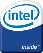
2009–2011
In 2009, the logo was changed to a horizontal shape with a visual exposure of silicon inside the label, to help portray the idea that Intel's processors were beside the chips and wiring inside computers. The various brand names that used this basic design included Core 2 (Solo, Duo, Quad, Extreme, vPro), Core i3, Core i5, Core i7, Atom, Pentium and Xeon. Others included Chipset, Server Board and Workstation Board.
2011–2013
The Intel Inside logos were modified by moving the exposed silicon to the middle of the logo, with a different texture on the shape. It also moved the word "inside" next to the Intel logo, more closely associating the two words. The product brand name is displayed at the bottom of the logo.
This logo was unveiled with the launch of Intel's second-generation Core processors (codenamed Sandy Bridge), and was also used to promote Intel's third-gen Core processors (codenamed Ivy Bridge). Note that Pentium and Celeron, as well as Intel's first-gen Core processors continued to use the previous logo.
2013–2015
2013–2014
A new version of the previous logo was introduced in 2013; the logo returned to having a vertical layout, the silicon image was moved to the top of the logo, and the logo was given a more two-dimensional look. The word "inside" is also not italic. The computer brand name is still at the bottom of the logo except on Celeron chips, which only have an "Intel Inside" label without the processor name.
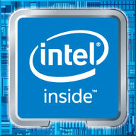
2014–2015
The typeface used on the word "inside" was changed in 2014.
2015–present

A new logo with the Intel Inside logo from the previous logo set against a blue silicon image was introduced in 2015.
| Intel Inside
Processors: Other products: Platforms: Subsidiaries : Defunct: Notes:  |