| 2000–2006 | |||||
| 1902–1909 | 1909–1913 | 1948–1963 | 1963–1971 | 1971–2006 | 2000–2006 |
| 2011–2012 | |||||
| 2006–2008 | 2008–2011, 2013–2019 | 2011–2012 | 2012–2013 | 2013 | 2019–present |
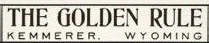
The Golden Rule
1902–1909
1909–1913
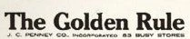
J. C. Penney Company, Incorporated
1913–1948
Template:Missing former logo
Penneys
1948–1963

1963–1971

JCPenney (first era)
1971–2006
In 1971, Penneys was rebranded as JCPenney.
2000–2006
A square was added to the logo in 2000. The red square hearkens back to a very old corporate motto, "Fair and Square".
2006–2008
| SVG NEEDED |
For this period, JCPenney was displayed in a bolder font.
2008–2011, 2013–2019

The square was dropped in 2008.
jcpenney
2011–2012
| SVG NEEDED |
In 2011, jcpenney remodelled their look, bringing back the red square, but only covering the "jcp" part of the logo. The font is still Helvetica. jcpenney said that this is a modern look.
The logo was first used on a commercial during the 83rd Academy Awards on February 27, 2011.
2012–2013

Ron Johnson, known for introducing the first Apple retailers, became CEO of the company in November 2011. With new ideas proposed for the company, this new logo was introduced on January 25, 2012. The font has been changed to Gotham and the logo simply states JCP. It came into effect on February 1st.
The logo returned the "Fair and Square" slogan that had been used decades ago, and the store format is mostly based on square shapes.
A grey version is currently used for the "jcp" brand clothing line.
2013

In May 2013, jcpenney quietly introduced a new logo with the company name (still in Gotham) in lowercase. It was used alongside the 2012 logo in advertising. This logo was officially dropped in September due to an extremely negative response from customers.
JCPenney (second era)
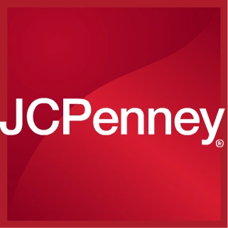
2019–present

A new logo resembling the 2013 jcpenney logo was introduced in November 2019.