No edit summary Tag: Visual edit |
TCDLFanOfStudios (talk | contribs) |
||
| (24 intermediate revisions by 18 users not shown) | |||
| Line 1: | Line 1: | ||
| ⚫ | |||
:''This article is about the restaurant chain. For other uses, see [[KFC (disambiguation)]].'' |
:''This article is about the restaurant chain. For other uses, see [[KFC (disambiguation)]].'' |
||
| + | |||
| ⚫ | |||
| + | {{ImageTOC |
||
| + | |KFC52.jpg|1952–1978 |
||
| + | |Kentucky_Fried_Chicken_1978.svg|1978–1991 |
||
| + | |Kfclogo1991.svg|1991–1997 |
||
| + | |KFC logo.svg|1997–2006 |
||
| + | |KFClogo.svg|2006–2014 |
||
| + | |KFC_(2014).svg|2014–2018 |
||
| + | |KFC_(2018).svg|2018–present |
||
| + | }} |
||
| + | |||
==Kentucky Fried Chicken== |
==Kentucky Fried Chicken== |
||
| − | === |
+ | ===1952-1978=== |
| + | ====1952–1978, 2016–present==== |
||
[[File:KFC52.jpg|200px|center]] |
[[File:KFC52.jpg|200px|center]] |
||
| Line 8: | Line 20: | ||
As of 2016, this logo is currently being used as an alternate logo for KFC advertisements. The logo is also currently used. (see 2014 logo) |
As of 2016, this logo is currently being used as an alternate logo for KFC advertisements. The logo is also currently used. (see 2014 logo) |
||
| − | |||
| − | ===1978–1997=== |
||
| − | [[File:Colonel-sanders-logo.svg|159x159px|center]] |
||
| − | {{Better logo needed|details missing; left eyebrow, inner left ear etc.}} |
||
===1978–1991=== |
===1978–1991=== |
||
| + | ====1978-1991, 2016-present==== |
||
| − | [[File:KFC79.jpg|200px|center]] |
||
| − | [[File: |
+ | [[File:Kentucky_Fried_Chicken_1978.svg|center|250px]] |
| − | In 1978, the logo was updated for the first time |
+ | In 1978, the logo was updated for the first time and adopted a new design including the mansard roof and the cubic tower on the center front of their restaurants. Like the logo in 1952, and as of 2016, this logo is currently being used as an alternate logo for KFC advertisements. The Colonel Sanders head icon is also updated, becoming an abstract design. |
==KFC== |
==KFC== |
||
===1991–1997=== |
===1991–1997=== |
||
[[File:Kfclogo1991.svg|200px|center]] |
[[File:Kfclogo1991.svg|200px|center]] |
||
| − | The 1991 logo was the first logo to have the company refer to itself as "KFC" rather than "Kentucky Fried Chicken". The reasoning KFC gave behind this was that the word "fried" was often associated with very unhealthy foods. With this logo, the signature mansard roofs on restaurants were updated from the brown shingles to the new red plastic strips. The Colonel Sanders head icon from the 1978 logo is still used. |
+ | The 1991 logo was the first logo to have the company refer to itself as "KFC" rather than "Kentucky Fried Chicken". The reasoning KFC gave behind this was that the word "fried" was often associated with very unhealthy foods and that their menu went beyond just fried chicken. With this logo, the signature mansard roofs on restaurants were updated from the brown shingles to the new red plastic strips. The Colonel Sanders head icon from the 1978 logo is still used. |
===1997–2006=== |
===1997–2006=== |
||
[[File:KFC logo.svg|200px|center]] |
[[File:KFC logo.svg|200px|center]] |
||
| − | This logo was designed by [[Landor Associates]]. Along with this logo, new and |
+ | This logo was designed by [[Landor Associates]]. Along with this logo, new and remodelled restaurants took away their mansard roof from the two previous logos, and now have a flat roof and awnings directly above the windows and entrances. The signature tower was made thicker and edgier with a flatter pyramid, and new restaurants placed the tower on one of the corners of the front end rather than in the middle, though remodelled restaurants usually kept the tower in the middle where they were when they were first built. This logo is still seen and used at some locations. The Colonel Sanders head icon from the last two logos is replaced with a new Colonel Sanders symbol showing his tuxedo. |
| − | === |
+ | ===2006–2014=== |
[[File:KFClogo.svg|200px|center]] |
[[File:KFClogo.svg|200px|center]] |
||
| − | In 2006, the Colonel Sanders symbol was given a facelift, removing the wrinkles and replacing his tuxedo with an apron. The logo now has thicker lines on it, which help it stand out more. New and |
+ | In 2006, the Colonel Sanders symbol was given a facelift, removing the wrinkles and replacing his tuxedo with an apron. The logo now has thicker lines on it, which help it stand out more. New and remodelled restaurants with this logo were updated once again, only with awnings flatter than from the previous logo and only above the windows where the tower stands, and have hanging black platforms with the words "WELCOME" and "DRIVE THRU" above the front doors and pick-up window, respectively. |
| − | As the new look was unveiled in |
+ | As the new look was unveiled in 2014, this logo being secondary use and still used in some countries, such as China. |
| − | === |
+ | ===2014–2018=== |
| − | [[File:KFC_( |
+ | [[File:KFC_(2014).svg|thumb|centre|150px]] |
The company started using this throwback logo, a homage to the 1952 and 1978 logos, on recent advertising starting in January 2014. |
The company started using this throwback logo, a homage to the 1952 and 1978 logos, on recent advertising starting in January 2014. |
||
| − | In 2016, the whole new look was launched with keeping some elements from 2006 logo. Since 2017, the new design began to roll out worldwide. Also, it is the first logo since the 1991 logo where the Colonel Sanders head icon is used. |
+ | In 2016, the whole new look was launched with keeping some elements from the 2006 logo. Since 2017, the new design began to roll out worldwide. Also, it is the first logo since the 1991 logo where the Colonel Sanders head icon is used. |
| − | ===2018–present |
+ | ===2018–present=== |
[[File:KFC_(2018).svg|center|190px]] |
[[File:KFC_(2018).svg|center|190px]] |
||
In late 2018, a new version of the logo was introduced across many countries. The illustration of Colonel Sanders' head was modified slightly, noticeably by making his right ear clearer to see. The wordmark has been altered significantly, taking on a more slab-serif appearance. Some countries still use previous designs. |
In late 2018, a new version of the logo was introduced across many countries. The illustration of Colonel Sanders' head was modified slightly, noticeably by making his right ear clearer to see. The wordmark has been altered significantly, taking on a more slab-serif appearance. Some countries still use previous designs. |
||
==External links== |
==External links== |
||
| − | *[http://www.kfc.com/ KFC] |
+ | *[http://www.kfc.com/ KFC] |
| + | |||
| ⚫ | |||
| + | {{Yum! Brands}} |
||
| + | {{PepsiCo}} |
||
| ⚫ | |||
[[Category:Restaurants]] |
[[Category:Restaurants]] |
||
[[Category:Kentucky]] |
[[Category:Kentucky]] |
||
| Line 70: | Line 81: | ||
[[Category:Restaurant chains in Romania]] |
[[Category:Restaurant chains in Romania]] |
||
[[Category:Restaurant chains in Peru]] |
[[Category:Restaurant chains in Peru]] |
||
| − | [[Category:Food and drink in the United States]] |
||
[[Category:Restaurant chains in Indonesia]] |
[[Category:Restaurant chains in Indonesia]] |
||
| − | [[Category:Food and drink in the Philippines]] |
||
| − | [[Category:Food and drink in the United Kingdom]] |
||
| ⚫ | |||
| − | [[Category:Food and drink in Germany]] |
||
| − | [[Category:Food and drink in Sweden]] |
||
| − | [[Category:Food and drink in the Dominican Republic]] |
||
| − | [[Category:Food and drink in Vietnam]] |
||
| − | [[Category:Food and drink in the Middle East]] |
||
| − | [[Category:Restaurant chains in Argentina]] |
||
| − | [[Category:Food and drink in Colombia]] |
||
| − | [[Category:Food and drink in Australia]] |
||
[[Category:Restaurant chains in Hungary]] |
[[Category:Restaurant chains in Hungary]] |
||
| ⚫ | |||
| ⚫ | |||
[[Category:Restaurant chains in Chile]] |
[[Category:Restaurant chains in Chile]] |
||
| ⚫ | |||
[[Category:PepsiCo]] |
[[Category:PepsiCo]] |
||
[[Category:Restaurant chains in the United Arab Emirates]] |
[[Category:Restaurant chains in the United Arab Emirates]] |
||
| − | [[Category:Food and drink in Indonesia]] |
||
[[Category:Restaurant chains in Ukraine]] |
[[Category:Restaurant chains in Ukraine]] |
||
| ⚫ | |||
| + | [[Category:Twenty20]] |
||
| ⚫ | |||
Revision as of 21:28, 31 August 2019
- This article is about the restaurant chain. For other uses, see KFC (disambiguation).
This page only shows primary logo variants. For other related logos and images, see:
|
| 1952–1978 | 1978–1991 | 1991–1997 | 1997–2006 | 2006–2014 | 2014–2018 | 2018–present |
Kentucky Fried Chicken
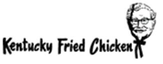
1952-1978
1952–1978, 2016–present
| SVG NEEDED |
As of 2016, this logo is currently being used as an alternate logo for KFC advertisements. The logo is also currently used. (see 2014 logo)
1978–1991
1978-1991, 2016-present

In 1978, the logo was updated for the first time and adopted a new design including the mansard roof and the cubic tower on the center front of their restaurants. Like the logo in 1952, and as of 2016, this logo is currently being used as an alternate logo for KFC advertisements. The Colonel Sanders head icon is also updated, becoming an abstract design.
KFC
1991–1997

The 1991 logo was the first logo to have the company refer to itself as "KFC" rather than "Kentucky Fried Chicken". The reasoning KFC gave behind this was that the word "fried" was often associated with very unhealthy foods and that their menu went beyond just fried chicken. With this logo, the signature mansard roofs on restaurants were updated from the brown shingles to the new red plastic strips. The Colonel Sanders head icon from the 1978 logo is still used.
1997–2006
This logo was designed by Landor Associates. Along with this logo, new and remodelled restaurants took away their mansard roof from the two previous logos, and now have a flat roof and awnings directly above the windows and entrances. The signature tower was made thicker and edgier with a flatter pyramid, and new restaurants placed the tower on one of the corners of the front end rather than in the middle, though remodelled restaurants usually kept the tower in the middle where they were when they were first built. This logo is still seen and used at some locations. The Colonel Sanders head icon from the last two logos is replaced with a new Colonel Sanders symbol showing his tuxedo.
2006–2014

In 2006, the Colonel Sanders symbol was given a facelift, removing the wrinkles and replacing his tuxedo with an apron. The logo now has thicker lines on it, which help it stand out more. New and remodelled restaurants with this logo were updated once again, only with awnings flatter than from the previous logo and only above the windows where the tower stands, and have hanging black platforms with the words "WELCOME" and "DRIVE THRU" above the front doors and pick-up window, respectively.
As the new look was unveiled in 2014, this logo being secondary use and still used in some countries, such as China.
2014–2018


.svg)
The company started using this throwback logo, a homage to the 1952 and 1978 logos, on recent advertising starting in January 2014.
In 2016, the whole new look was launched with keeping some elements from the 2006 logo. Since 2017, the new design began to roll out worldwide. Also, it is the first logo since the 1991 logo where the Colonel Sanders head icon is used.
2018–present

In late 2018, a new version of the logo was introduced across many countries. The illustration of Colonel Sanders' head was modified slightly, noticeably by making his right ear clearer to see. The wordmark has been altered significantly, taking on a more slab-serif appearance. Some countries still use previous designs.
External links
| U.S. restaurant chains: Banh Shop | KFC (SoCal) | Pizza Hut (Express | WingStreet) | Taco Bell (Express) | The Habit Burger Grill International chains: Former chains: |