| 1984–1986 | 1987–1988 | |||
| 1984–1986 | 1985–1987 | 1987–1988 | 1988–1995 | 1995–2006 |
| 2006–2008 | 2008–2012 | 2012–2013 | 2013–2017 | 2017–present |
1984–1986
Lifetime's first logo contained a heart-shaped apple which was inherited from Cable Health Network.
")
1985–1987

About 1985, Lifetime started branding itself as "Talk Television" with a nightly lineup of talkshows and call-in programs hosted by people like Regis Philbin and Dr. Ruth Westheimer. In the process, they dropped the apple from their logo.
")
")
1987–1988
")
1988–1995

")
1995–2006

Used from 1995 to July 2006; The then CEO of Lifetime, Doug McCormick, has described the previous logo as looking "like some kind of yachting flag or engineering logo". Under his watch, the network switched to a simple wordmark with the tagline "Television for Women".[2]
2006–2008

In 2006, Lifetime's wordmark logo was tweaked.
2008–2012

In 2008, Lifetime got a new logo.
")
2012–2013

On May 2, 2012, Lifetime introduced a stylized "L" logo, and the new tagline "Your Life. Your Time." The conceptualization of the rebrand logo was developed by Tim Nolan, Senior Vice President of Marketing for Lifetime in partnership with design firm Leroy + Clarkson. The same day, a deal was made to launch a Canadian version in August of that year.
")
2013–2017
| SVG NEEDED |
Lifetime revealed an updated version of the logo on February 4, 2013. The logo was given a glossy look, and the channel name is in a slightly different font, with the "L" capitalized. It debuted on-air on April 25, 2013. Since then, Lifetime has continued to expand internationally, launching in the United Kingdom in 2013 and Latin America a year later.
")
")
")
")
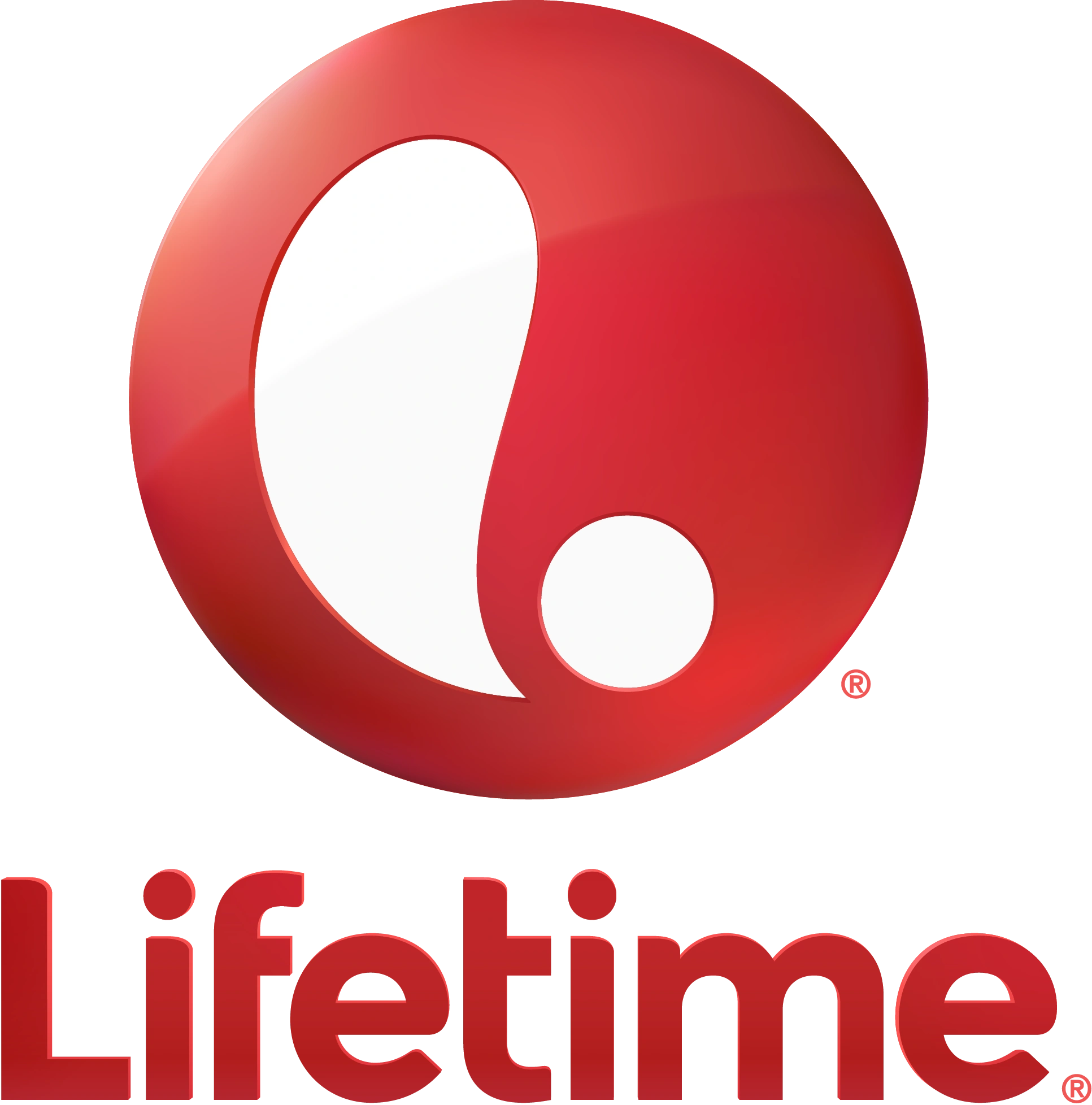
2017–present

On February 2, 2017, following the announcement that the network would carry games for the National Women's Soccer League, a new logo was unveiled.
