No edit summary |
mNo edit summary |
||
| Line 8: | Line 8: | ||
{{ImageTOC |
{{ImageTOC |
||
|MTV logo 1957–1975.png |
|MTV logo 1957–1975.png |
||
| + | |1957–1975 |
||
| ⚫ | |||
| ⚫ | |||
| ⚫ | |||
| ⚫ | |||
| ⚫ | |||
| + | |1983-1988 |
||
| ⚫ | |||
|1986–1990 (idents only) |
|1986–1990 (idents only) |
||
|MTV Kanava Logo (1988-1989).png |
|MTV Kanava Logo (1988-1989).png |
||
| Line 18: | Line 26: | ||
|1996–2001 |
|1996–2001 |
||
|MTV3 logo 2001.svg |
|MTV3 logo 2001.svg |
||
| − | |1957–1966 |
||
|2001–2005 |
|2001–2005 |
||
|MTV3 logo 2006.svg |
|MTV3 logo 2006.svg |
||
|2005–2013 |
|2005–2013 |
||
|Mtv3 new logo.svg |
|Mtv3 new logo.svg |
||
| + | |2013–2019 |
||
| − | |2013–present |
||
|MTV3 new logo 2017.svg |
|MTV3 new logo 2017.svg |
||
| + | |2017–2019 |
||
| − | |2017–present |
||
| ⚫ | |||
| ⚫ | |||
| ⚫ | |||
| ⚫ | |||
| ⚫ | |||
| − | |1983–1988 |
||
| ⚫ | |||
}} |
}} |
||
| Line 135: | Line 135: | ||
</gallery> |
</gallery> |
||
| − | === |
+ | === 2013–2019 === |
[[File:Mtv3 new logo.svg|180x180px|center]]<br /> |
[[File:Mtv3 new logo.svg|180x180px|center]]<br /> |
||
| Line 159: | Line 159: | ||
* Idents: [https://vimeo.com/78621885 ''Roller Derby''], [https://vimeo.com/163988622 ''Pier Leap''], [https://vimeo.com/163988606 ''Colour Party''] and [https://vimeo.com/163988624 ''Bubble Battle''] |
* Idents: [https://vimeo.com/78621885 ''Roller Derby''], [https://vimeo.com/163988622 ''Pier Leap''], [https://vimeo.com/163988606 ''Colour Party''] and [https://vimeo.com/163988624 ''Bubble Battle''] |
||
| − | ==== |
+ | ==== 2017–2019 ==== |
[[File:MTV3 new logo 2017.svg|180px|center]]<br /> |
[[File:MTV3 new logo 2017.svg|180px|center]]<br /> |
||
On 22 May 2017, MTV3 modified its 2013 logo slightly by putting it inside a red square. A new set of idents and a slightly modified graphics package were introduced. The new look was created by Wake Dynamite. |
On 22 May 2017, MTV3 modified its 2013 logo slightly by putting it inside a red square. A new set of idents and a slightly modified graphics package were introduced. The new look was created by Wake Dynamite. |
||
| Line 165: | Line 165: | ||
* [https://www.marmai.fi/uutiset/mtv3-uudisti-kanavailmeensa-yhdessa-wake-dynamiten-kanssa-6653611 Markkinointi & Mainonta] |
* [https://www.marmai.fi/uutiset/mtv3-uudisti-kanavailmeensa-yhdessa-wake-dynamiten-kanssa-6653611 Markkinointi & Mainonta] |
||
* [https://mediaviikko.fi/kategoriat/uutiset/wake-dynamite-uudisti-mtv3n-ilmeen.html Mediaviikko] |
* [https://mediaviikko.fi/kategoriat/uutiset/wake-dynamite-uudisti-mtv3n-ilmeen.html Mediaviikko] |
||
| + | |||
| + | === 2019–Present === |
||
{{Bonnier}} |
{{Bonnier}} |
||
Revision as of 14:40, 6 August 2019
MTV3 (originally Mainos-TV, or Commercial TV) is the oldest and largest private commercial TV channel in Finland. Mainos-TV was established in 1957 to produce programs for Yle, the Finnish public broadcaster. In 1986, Kolmoskanava (Third Channel)—a joint venture between Yle, MTV and Nokia—was established; a full-fledged private TV channel, MTV3 (renamed from MTV to avoid confusion with its American namesake), was launched in 1993. MTV3 is colloquially known as Maikkari (or Kolmonen, ‘The Third’).
MTV3 is the flagship channel of MTV Oy, the largest Finnish commercial broadcaster and a subsidiary of Bonnier Broadcasting, which is pending acquisition by Swedish telecommunications company Telia Company.
MTV(3) used an owl as its logo for many decades (and an owl’s eye from 2001) until its major networkwide rebrand in 2013.
- The story of the MTV owl (Finnish)
| 1957–1975 | 1966–1975 | 1975–1983 | 1983-1988 | 1986–1990 (idents only) | 1988–1989 | 1990–1992 |
| 1993–1996 | 1996–2001 | 2001–2005 | 2005–2013 | 2013–2019 | 2017–2019 | |
Mainos-TV
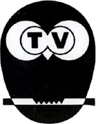
1957–1975
MTV3's history dates back to 1957 when it was originally born as MTV. Its parent company Oy Mainos-TV-Reklam Ab was first founded on 29 April 1957, and then, 8 months later, on 13 August 1957, that same year, commenced its official broadcasting with its channel being officially with its first logo being an cheeky owl colored black and having its eyes and visible branch colored with black and white stripes. It is designed by an artist named Per-Olof "Peppe" Nyström, and his idea for this logo was centered around the slogan "Buy wisely, buy with the caution". The original suggestion for the logo was involved "Mercury's helmet with wings", but Nyström then sketched an egg, that ultimately lead into an wise bird, such as an owl in this case.
According to Nyström, the first ident starts with a view of an owl zoom in on a white background, with the eyes being replaced with the letters "T" and "V". The owl's feathers around its eyes and its beak make up a stylized "M", completing the name "MTV". The eyes blink a few times, as well as the music is a calm guitar theme, that is a recomposed version of Les Paul's single "Brazil" from 1947, specifically the first part. In comparison, the very first three notes from the original single were moved to the end point of the ident. Its availability is extinct, but the logo was used as both opening and closing ident for programming blocks, and as the commercial bumper with the scare factor being from low to medium, that is the strange look of the logo along with the owl zooming in that can give people the shakes. The owl might be cute for some.
1966–1975
In 1966, MTV introduced a new logo which was a slightly modified variant of the 1957 logo that was tidely renewed and were tweakening different than the previous logo. With it, a new look was launched with the new ident shows a cartoon owl fly onto a branch. The owl fits itself in a comfortable position, turns more detailed while its eyes open (and yet again say "MTV"). The ident then ends with the last part that continues from the same setting, thus the detailed looking owl winks its right eye, morphs back into its animated form and flies away.
The music for the new ident is a similar guitar theme to the first logo,composed with glockenspiel and guitar. There is also a short version of the tune in closing variant, that only plays the last guitar note. But because of this new logo, its effects are more primitive animation here, and the owl was also turning more detailed that it wasn't necessary. The availability is extinct on TV, with each two variants that has been used for opening and closing idents, as well being spotted as commercial bumpers.
MTV
1975–1983
In February 1975, MTV stopped broadcasting its programs in black and white and were instead beginning to broadcast programs in color. At the same time, to coincide with the introduction of color television, the 9-year-old remastering owl logo from 1966 were replaced by a new logo that is a big bluebcircle that has two medium white circles with two small black dots and also a turned-down yellow triangle that appears at the bottom of in the middle at the two medium white circles, including the "MTV" wordmark that appears small at the bottom of the owl logo as well as it uses the Impact typeface. The new logo which was introduced in February 1975, was a blue, round-shaped owl logo that was designed by Ilkka Levonranta, who was on the work list in the Finnish now-defunct marketing communications agency "Markinointi Viherjuuri (nowadays known as "Evia Oyj".)
Like this logo, the ident for the new logo begins with a white circle which sticks itself out and lays itself on the background as other circles begins to form in eight colors such as it is colored light blue, light green, dark green, jungle green, violet, pink, purple and mauve purple. With it, the same circle flashes again, and zooms into the screen, as well as the circle then "rotates" and reveals the face of a simplistic owl as the "MTV" wordmark (in a typeface called Impact) (and later written as MTV in a typeface called VAG Rounded)) appears below at the bottom of the logo, then the owl winks its right eye.
Its has effects being the circles appearing and the owl being revealed from one of the circles. It is a primitive animation, relatively new concept for the time, but its cheesy factor contains a choppy zooming effect and bleak color palette for its circles. It may have worked in the 1970s, but it is gladly updated with the second variant in the early 1980s. The music for the ident to this logo is a soft synth theme with an uprising sounder as the circle zooms in, along with two acoustic notes, and the availability for this ident is also extinct on TV, except each one of the three variants were used for both opening and closing idents for their programming blocks. It reminds that the scare factor is none to minimal, that some may not like logos with zooming shapes and synth music, but this should be pretty comfortable to watch. It has become quite fondly remembered television ident by many in Finland, who have seen it from mid-1970s to late 1980s.
")
1983-1988
In 1983, the existing color circle idents were simply re-edited. At the same time, MTV introduced a new logo that shows the 1975 logo getting recolored from turquoise to dark blue by having the "MTV" wordmark changing its typeface to Frankfurter and making the logo become a bit redesigned. Also, a new look was introduced with an updated variant of the 1975 ident that has been used with significant changes. The circle pattern has changed with the amount of circles decreased from 48 into 42, and all circles do also have detailed shading on them and they are colored green, purple, crayola red, brown, orange and light blue. The dark blue owl has also shading, that disappears around it before it winks the right eye, with the "MTV" wormdark is also now more softer and larger compared to previous one. By around 1987, the brighter and fuzzier version of the 1983–1988 ident could be spotted, and it is closely the same, except the colors are much brighter, including the light blue owl itself with its light yellow beak.
Its cheesy factor was considered for a fuzzier version of this ident that has obviously worn-out film transfer. From 1984 and 1985, the availability is that there have been occasions when the original 1975–1983 ident was being used instead of the updated 1983–1988 variant. Each one of the three variants can be found in numerous preserved Betamax and VHS recordings from the 1980s.
")
1986–1990 (idents only)
).png)
| BETTER LOGO NEEDED |
From 1986 to 1990, MTV started using an alternate version of its 1983 logo that shows the owl symbol being removed by leaving it only with the "MTV" wordmark, and that alternate logo is only appearing in idents and promos until 1990.
With this alternate logo, the ident for the alternate logo began with a reversed version of the 1983 ident showing the 1983 logo on a white background. Then, the white background disappears and fades to a night background as the black "MTV" wordmark, with the stars begins to sparkle by making the owl symbol become gradient. After that, the owl symbol zooms out and disappears into a bright star, as well as the three letters M, T, and V from the 1983 logo come out of the bright star and zooms in with their blue color and gradient effects until a bright flash evacuates the sky and makes the "MTV" wordmark shine clean.
At the end of the ident, a blue laser appears and draws a rectircle at the bottom of the "MTV" wordmark. Then, another laser flies to the right and makes the word "Kanava" appear inside the rectircle. After that, the logo then shines again.
")
1988–1989
.png)
| BETTER LOGO NEEDED |
")
1990–1992
| BETTER LOGO NEEDED |
")
MTV3
1993–1996
MTV was relaunched as MTV3 on 1 January 1993 to avoid confusion with the American TV network with the same name.
1996–2001

2001–2005
MTV3 got a new logo on 6 September 2001. It was created by Novocom and is supposed to represent a stylized owl's eye, harking back to the channel's legacy of having owls in its logos.
2005–2013
On 3 October 2005, MTV3 received a minor update for its 2001 owl's eye logo by changing the 3 numeral's colour from red to black. With it, the station presented a new identity designed by London–based design group Kemistry.
")
2013–2019
MTV Media underwent a major corporate rebranding in 2013 and renamed itself to MTV Oy. The rebrand was commissioned by London-based creative agency DixonBaxi. The rebrand was announced in May 2013; the new logo scheme was unveiled in August.
The rebrand was implemented on 3 November 2013 at 7pm on all of MTV’s TV channels, which introduced new logos and graphics packages. The new corporate font is FS Emeric, which is used by all channels and properties.
- MTV Media rebrand announcement and logo unveil (English)
- DixonBaxi press release
- The Branding Source:
- Brand New:
")
")
")
MTV3 dropped the historic owl symbol and introduced a new circular logo. However, the idents and graphics package were nevertheless influenced by an owl’s wing.
- Idents: Roller Derby, Pier Leap, Colour Party and Bubble Battle
2017–2019
On 22 May 2017, MTV3 modified its 2013 logo slightly by putting it inside a red square. A new set of idents and a slightly modified graphics package were introduced. The new look was created by Wake Dynamite.
- Idents (1, 2, 3 and 4)
- Markkinointi & Mainonta
- Mediaviikko
2019–Present
| Bonnier Publications Bo Bedre | FHM (Norway) | Idényt | Penge og Privatøkonomi | Illustrerad Vetenskap Bonnier Tidskrifter Bonnier Corporation (United States) Newspapers Film Radio Other Defunct properties Television channels: Print publications: Babytalk | Caribbean Travel & Life | Parenting | Popular Photography | Science Illustrated | Skiing |