|
|
| (20 intermediate revisions by 8 users not shown) |
| Line 1: |
Line 1: |
| − |
{{Print Logos|Anniversary}} |
+ |
{{Primary Logos|Anniversary}} |
| |
{{ImageTOC |
|
{{ImageTOC |
| − |
|Mega1990-1.png|1990-1991 |
+ |
|Mega1990oficial.png|1990-1991 |
| − |
|Megavisión1991-1995.jpg|1991-1995 |
+ |
|Mega1991oficial.png|1991-1993 |
| − |
|1991-3.png|1995-1998 |
+ |
|Mega1993oficial.png|1993-1998 |
| |
+ |
|Mega1999oficial.png|1998-2001 |
| − |
|Logo Megavisión (1999 - 2001).jpg|1999-2001 |
|
| − |
|Mega2001v1.jpg|2001 |
+ |
|Mega2001oficial 1.png|2001 |
| − |
|2001-0.png|2001-2010 |
+ |
|Mega2001oficial 2.png|2001-2010 |
| − |
|Mega2006oficial.jpg|2006-2010 |
+ |
|Mega2006oficial.png|2006-2010 |
| − |
|Megaactual.png|2010-2013 |
+ |
|Mega2010oficial.png|2010-2013 |
| |
|Mega2013oficial.png|2013-2015 |
|
|Mega2013oficial.png|2013-2015 |
| − |
|LogoMega2015.png|2015-present |
+ |
|Logotipo Mega 2015.svg|2015-present}} |
| |
+ |
'''Mega''' (Legal name: '''Red Televisiva Megavisión S.A.''') is a Chilean private television network headquartered in Santiago de Chile. In 2012, ownership of Mega was transferred from Claro Group to [[Holding Bethia]], with [[Discovery, Inc.]] acquiring 27,5% in 2016, both owning the channel through [[Mega Media]]. |
| − |
}} |
|
| ⚫ |
|
|
| |
|
|
|
| |
⚫ |
|
| |
=== 1990-1991 === |
|
=== 1990-1991 === |
| − |
[[File:Mega1990-1.png|center|250px]] |
+ |
[[File:Mega1990oficial.png|center|250px]] |
| |
The first official logo of the channel consisted of three diagonal stripes of red, light green and light blue, on a rounded black rectangle simulating a television screen. The diagonal red and celestial were normal and the green diagonal was stylized in ray form, giving form to the letters united MV, acronym of Megavisión. Under it the word mark Megavision, occasionally red, with a mix of types: The letter e of Century Gothic typography. The letters g and a of typography SF Orson Casual Light. The letter s Bauhaus Thin typography. The letters M and V identical to the Avant Garde typography and the other letters in Century Gothic typography. |
|
The first official logo of the channel consisted of three diagonal stripes of red, light green and light blue, on a rounded black rectangle simulating a television screen. The diagonal red and celestial were normal and the green diagonal was stylized in ray form, giving form to the letters united MV, acronym of Megavisión. Under it the word mark Megavision, occasionally red, with a mix of types: The letter e of Century Gothic typography. The letters g and a of typography SF Orson Casual Light. The letter s Bauhaus Thin typography. The letters M and V identical to the Avant Garde typography and the other letters in Century Gothic typography. |
| |
|
|
|
| |
=== 1991-2001 === |
|
=== 1991-2001 === |
| |
⚫ |
|
| − |
|
|
| |
⚫ |
[[File: Mega1991oficial. png|center|250px]] |
| ⚫ |
|
|
| ⚫ |
[[File: Megavisión1991-1995. jpg|center|250px]] |
|
| |
This second corporate image consisted of the simple diagonal stripes of red, green and blue colors, but this time enclosed in a rounded rectangle bordered by gray simulating a television screen. Under it the word mark Megavision with the same typographies of the previous logo. |
|
This second corporate image consisted of the simple diagonal stripes of red, green and blue colors, but this time enclosed in a rounded rectangle bordered by gray simulating a television screen. Under it the word mark Megavision with the same typographies of the previous logo. |
| |
|
|
|
| − |
==== 1995-1999 ==== |
+ |
==== 1993-1998 ==== |
| − |
[[File:1991-3.png|center|250px]] |
+ |
[[File:Mega1993oficial.png|center|250px]] |
| − |
From 1995 to December 1998 the screen is eliminated, leaving only the stripes and the word mark. During the time the Viña Festival was broadcast between 1994 and 1999, the logo consisted of a blue circle that in the middle of it the mega motto of Helvetica-Compressed typography, and under it the three fringes. |
+ |
From 1993 to December 1998 the screen is eliminated, leaving only the stripes and the word mark. During the time the Viña Festival was broadcast between 1994 and 1999, the logo consisted of a blue circle that in the middle of it the mega motto of Helvetica-Compressed typography, and under it the three fringes. |
| |
|
|
|
| − |
==== 1999-2001 ==== |
+ |
==== 1998-2001 ==== |
| − |
[[File:Logo Megavisión (1999 - 2001).jpg|center|250px]] |
+ |
[[File:Mega1999oficial.png|center|250px]] |
| |
+ |
During 1999-2001, the text "Megavision" changed to a different font and became italic. |
| |
|
|
|
| |
== Mega == |
|
== Mega == |
| − |
|
|
| |
=== 2001 === |
|
=== 2001 === |
| − |
[[File:Mega2001v1.jpg|center|200px]] |
+ |
[[File:Mega2001oficial 1.png|center|200px]] |
| |
⚫ |
The new corporate image , that would last a few months, consisted of 3 parallelograms of red, green and blue, and under it the new motto 'MEGA' of gray color, being the letter M similarly square and the letter A without horizontal bar, similar to the Greek letter capital Λ . |
| − |
|
|
| − |
{{PNG needed}} |
|
| − |
|
|
| ⚫ |
The new corporate image consisted of 3 parallelograms of red, green and blue, and under it the new motto 'MEGA' of gray color, being the letter M similarly square and the letter A without horizontal bar, similar to the Greek letter capital Λ . |
|
| |
|
|
|
| |
=== 2001-2010 === |
|
=== 2001-2010 === |
| − |
[[File:2001-0.png|center|300px]] |
+ |
[[File:Mega2001oficial 2.png|center|300px]] |
| |
<gallery position="center" bordercolor="transparent" widths="150" spacing="small" bordersize="none" captionalign="center"> |
|
<gallery position="center" bordercolor="transparent" widths="150" spacing="small" bordersize="none" captionalign="center"> |
| |
Logo Mega (Oct. 2001 - Ago. 2004).jpg|logo with slogan |
|
Logo Mega (Oct. 2001 - Ago. 2004).jpg|logo with slogan |
| Line 50: |
Line 46: |
| |
|
|
|
| |
=== 2006-2010 === |
|
=== 2006-2010 === |
| − |
[[File:Mega2006oficial.jpg|center|300px]] |
+ |
[[File:Mega2006oficial.png|center|300px]] |
| − |
In 2006, 3 semi-transparent rounded rectangles are added and the MEGA word becomes white. Used as the official logo from 2006 to 2010 (although the previous logo was still used as the on-screen logo). |
+ |
In 2006, 3 green semi-transparent rounded rectangles are added and the MEGA word becomes white. Used as the official logo from 2006 to 2010 (although the previous logo was still used as the on-screen logo). |
| |
|
|
|
| |
=== 2010-2013 === |
|
=== 2010-2013 === |
| − |
[[File:Megaactual.png|center|200px]] |
+ |
[[File:Mega2010oficial.png|center|190px]] |
| − |
The fourth corporate image shows the syllables ME and GA in multicolored style. |
+ |
The fourth corporate image shows the syllables ME and GA in multicolored style. This logo was designed by chilean agency Hambre<ref>Brand New - [https://www.underconsideration.com/brandnew/archives/mega_amount_of_triangles.php Mega Amount of Triangles]</ref>. |
| |
<gallery position="center" bordercolor="transparent" widths="150" spacing="small" bordersize="none" captionalign="center"> |
|
<gallery position="center" bordercolor="transparent" widths="150" spacing="small" bordersize="none" captionalign="center"> |
| |
logomega2010slogan.jpg|Logo with slogan (2010-2013) |
|
logomega2010slogan.jpg|Logo with slogan (2010-2013) |
| − |
Mega2012Gris.jpg|Gray logo (2012-2013)
|
+ |
Mega2012oficial.png|Gray logo (2012-2013) |
| |
</gallery> |
|
</gallery> |
| |
|
|
|
| Line 69: |
Line 65: |
| |
|
|
|
| |
=== 2015-present === |
|
=== 2015-present === |
| − |
[[File:Mega2015oficial.png|center|200px]] |
+ |
[[File:Logotipo Mega 2015.svg|center|200px]] |
| − |
In November 2015 the sixth and current image of the channel consists of two diagonals or reverse bars from left to right with a third opposite to them and cut in half forming an M, structurally formed in a slightly thick purple border. Below it, the Mega motto of the same color and in another typography and sometimes, is enclosed in a purple square with the white logo. The logo was designed by [http://www.dyu.cl Dittborn & Unzueta]. |
+ |
In November 2015 the sixth and current image of the channel consists of two diagonals or reverse bars from left to right with a third opposite to them and cut in half forming an M, structurally formed in a slightly thick purple border. Below it, the Mega motto of the same color and in another typography and sometimes, is enclosed in a purple square with the white logo. The logo was designed by Chilean agency [http://www.dyu.cl Dittborn & Unzueta], with the first batch of idents produced by Argentina-based agency Plenty<ref>Brandemia - [http://www.brandemia.org/renuevan-la-marca-mega-la-primera-cadena-de-tv-privada-de-chile Renuevan la marca Mega, la primera cadena de TV privada de Chile]</ref>. |
| |
<gallery position="center" bordercolor="transparent" widths="150" spacing="small" bordersize="none" captionalign="center"> |
|
<gallery position="center" bordercolor="transparent" widths="150" spacing="small" bordersize="none" captionalign="center"> |
| |
File:2015-3.png|Logo without square, used in white as the on-screen logo |
|
File:2015-3.png|Logo without square, used in white as the on-screen logo |
| Line 78: |
Line 74: |
| |
==External links== |
|
==External links== |
| |
*[http://www.mega.cl/ Mega (Chile)] |
|
*[http://www.mega.cl/ Mega (Chile)] |
| |
+ |
|
| |
+ |
==References== |
| |
+ |
{{Reflist}} |
| |
|
|
|
| |
==See also== |
|
==See also== |
| |
+ |
*[[Mega Plus]] |
| |
*[[Mega Internacional (Chile)|Mega Internacional]] |
|
*[[Mega Internacional (Chile)|Mega Internacional]] |
| |
|
|
|
| − |
{{Holding Bethia}} |
+ |
{{Bethia Comunicaciones S.A.}} |
| |
{{Discovery Communications}} |
|
{{Discovery Communications}} |
| |
{{Organización de Telecomunicaciones Iberoamericanas}} |
|
{{Organización de Telecomunicaciones Iberoamericanas}} |
| Line 100: |
Line 100: |
| |
[[Category:Discovery Networks Latin America]] |
|
[[Category:Discovery Networks Latin America]] |
| |
[[Category:Television stations broadcasting on channel 9]] |
|
[[Category:Television stations broadcasting on channel 9]] |
| |
+ |
[[Category:Bethia Comunicaciones S.A.]] |
| |
+ |
[[Category:Mega Media]] |
This page only shows primary logo variants. For other related logos and images, see:
|
Mega (Legal name: Red Televisiva Megavisión S.A.) is a Chilean private television network headquartered in Santiago de Chile. In 2012, ownership of Mega was transferred from Claro Group to Holding Bethia, with Discovery, Inc. acquiring 27,5% in 2016, both owning the channel through Mega Media.
Megavisión
1990-1991
The first official logo of the channel consisted of three diagonal stripes of red, light green and light blue, on a rounded black rectangle simulating a television screen. The diagonal red and celestial were normal and the green diagonal was stylized in ray form, giving form to the letters united MV, acronym of Megavisión. Under it the word mark Megavision, occasionally red, with a mix of types: The letter e of Century Gothic typography. The letters g and a of typography SF Orson Casual Light. The letter s Bauhaus Thin typography. The letters M and V identical to the Avant Garde typography and the other letters in Century Gothic typography.
1991-2001
1991-1993
This second corporate image consisted of the simple diagonal stripes of red, green and blue colors, but this time enclosed in a rounded rectangle bordered by gray simulating a television screen. Under it the word mark Megavision with the same typographies of the previous logo.
1993-1998
From 1993 to December 1998 the screen is eliminated, leaving only the stripes and the word mark. During the time the Viña Festival was broadcast between 1994 and 1999, the logo consisted of a blue circle that in the middle of it the mega motto of Helvetica-Compressed typography, and under it the three fringes.
1998-2001
During 1999-2001, the text "Megavision" changed to a different font and became italic.
Mega
2001
The new corporate image, that would last a few months, consisted of 3 parallelograms of red, green and blue, and under it the new motto 'MEGA' of gray color, being the letter M similarly square and the letter A without horizontal bar, similar to the Greek letter capital Λ .
2001-2010
Logo in squares (2004-2005)
In December 2001 the logo is redesigned, moving the parallelograms to the letter A and shrinking.
This logo was used from 2001 to 2006 as the official logo, and until 2010 it was used as the on-screen logo.
2006-2010
In 2006, 3 green semi-transparent rounded rectangles are added and the MEGA word becomes white. Used as the official logo from 2006 to 2010 (although the previous logo was still used as the on-screen logo).
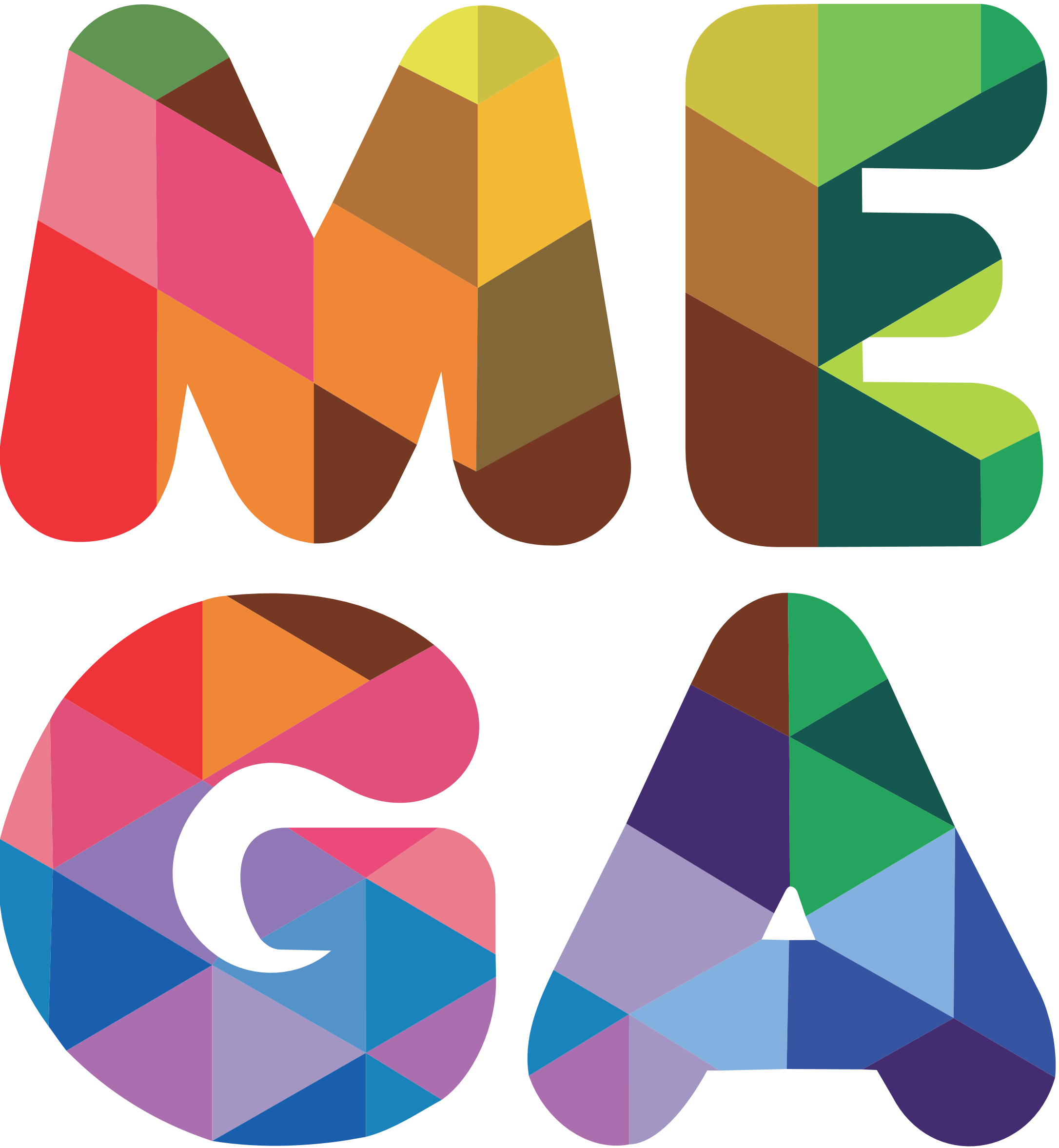
2010-2013
The fourth corporate image shows the syllables ME and GA in multicolored style. This logo was designed by chilean agency Hambre[1].
Logo with slogan (2010-2013)
2013-2015
In September 23 of 2013, the fifth corporate image of the channel consists of a rounded violet square, within it the syllables ME and GA. The motto shows a similarity to the 2001 logo with a letter G of two arrows that spin in a circle and the A ("Λ") without the horizontal bar. In addition its structure maintains the design of its predecessor.
Logo with slogan (2013-2015)
2015-present
In November 2015 the sixth and current image of the channel consists of two diagonals or reverse bars from left to right with a third opposite to them and cut in half forming an M, structurally formed in a slightly thick purple border. Below it, the Mega motto of the same color and in another typography and sometimes, is enclosed in a purple square with the white logo. The logo was designed by Chilean agency Dittborn & Unzueta, with the first batch of idents produced by Argentina-based agency Plenty[2].
Logo without square, used in white as the on-screen logo
Logo With slogan (2015-present)
External links
References
See also
|
|
| Predecessors
WarnerMedia | Discovery, Inc.
(National Cleaning Contractors | Kinney Parking System | Warner Communications | Time Inc. | Turner Broadcasting System | Discovery Holding Company | Scripps Networks Interactive)
Warner Bros. Entertainment
WB Motion Picture Group:
Warner Bros. Pictures | Warner Bros. Pictures Animation | DC Studios | DC Kids Movies | Cartoon Network Movies | Castle Rock Entertainment | CNN Films | Flagship Entertainment Group | New Line Cinema | Spyglass Media Group1 | Wang Film Productions | Discovery Films
WB Television Group:
Domestic units: Warner Bros. Television Studios | Warner Horizon Unscripted Television | Alloy Entertainment | Blue Ribbon Content | Max Originals | Telepictures | A Very Good Production | Cartoon Network Studios | Cartoon Network Productions | Warner Bros. Animation (Warner Bros. Classic Animation) | Williams Street Productions | The CW3 (Plus | Sports)
International units: All3Media (50%)2 | Cartoon Network Latin America Original Productions | Warner Bros. International Television Production (Australia | Belgium (Eyeworks | Savage Film) | Germany | Netherlands (Blazhoffski | Hollands Licht) | Spain | UK (Renegade Pictures | Ricochet | Twenty Twenty | Wall to Wall | Hanna-Barbera Studios Europe | LazyTown Entertainment)
Other assets:
Fandango Media (assets)11 | The Wolper Organization | Turner Entertainment Co. | Warner Bros. Theatre Ventures | WaterTower Music
DC Entertainment:
DC Comics (Others | Logo Variations) | DC All Access | DC Black Label | DC Collectibles | DC Ink | DC Kids | DC Kids Interactive | DC Kids Movies | DC Universe Infinite | DC Vertigo (DC Vertigo/Other) | DC Zoom | Mad
Warner Bros. Discovery Global Streaming & Interactive Entertainment
General streaming:
Max (Netherlands and Belgium) | Discovery+ (India | UK & Ireland) | Discovery GO (United States | Canada) | Player.pl (Poland) | BluTV | ThreeNow | TuDiscovery.com
Specialty streaming:
Discovery VR | Motor Trend On Demand | Food Network Kitchen
WB Interactive Entertainment:
Warner Bros. Games | Warner Play | WB Games Boston | WB Games Montréal | WB Games New York | WB Games San Diego | WB Games San Francisco | Avalanche Software | Cartoon Network Games | DC Kids Interactive | Adult Swim Games | Monolith Productions | NetherRealm Studios | Portkey Games | Rocksteady Studios | TT Games (Traveller's Tales | TT Games Publishing | TT Fusion | TT Odyssey)
Other assets:
Warner Bros. Digital Networks (OneFifty | Stage 13 | Uninterrupted | IStreamPlanet) | Food.com | Discovery Digital Studios
CNN Worldwide
U.S. domestic networks
CNN
International channels:
CNN International | CNN en Español (US and Latin America, Spanish) | CNN Brasil18 (Brazilian Portuguese) | CNN Chile (Spanish) | CNN Indonesia19 (Indonesian) | CNN-News1820 (India, English) | CNN Portugal31 (Portuguese) | CNN Prima News22 (Czech) | Antena 3 CNN33 (Romanian) | CNN Türk (Turkish) | CNNj23 (Japanese)
Former channels
CNN-D (Germany) | CNN Philippines (English) | CNN+ (TV channel)32 (Spanish) | CNN Airport
Warner Bros. Discovery Networks U.S.
Factual and lifestyle networks:
Discovery Channel (en Español) | American Heroes Channel | Animal Planet | Cooking Channel 5 | Discovery Life | Food Network 5 | HGTV (Hogar de HGTV) | Magnolia Network6 | Science | TLC
Entertainment networks:
Turner Entertainment Networks (TNT | TBS | TruTV | Turner Classic Movies) | Investigation Discovery | HLN | Oprah Winfrey Network | Destination America | Travel Channel
Cartoon Network Group:
Cartoon Network (Cartoonito | Adult Swim (Toonami | Checkered Past)) | Boomerang | Discovery Family7 | Discovery Familia
Home Box Office, Inc.
Television channels:
HBO (On Demand) | HBO 2 | HBO Comedy | HBO Family | HBO Latino | HBO Signature | HBO Zone
Cinemax | Go | 5StarMax | ActionMax | Cinemáx | MoreMax | MovieMax | OuterMax | ThrillerMax
Production studios:
HBO Films | HBO Documentary Films | HBO Entertainment | HBO Enterprises | HBO Kids
Warner Bros. Discovery International
Animal Planet | Boomerang | Cartoon Network | Cartoonito | Discovery Channel | Discovery Kids | DMAX | Discovery Science | Investigation Discovery | TLC
Americas networks:
Canada:
Adult Swim8 | Boomerang8 | Cartoon Network8 | Turner Classic Movies | Cooking Channel8 | Discovery9 | Discovery Science9 | Discovery Velocity9 | Magnolia Network8 | Food Network8 | HGTV8 | Investigation Discovery9 | Oprah Winfrey Network8
Latin America, Carribean and Brazil:
Animal Planet | Cartoon Network | Cartoonito | Cinemax | Discovery Channel | Discovery Science | Discovery Turbo | Food Network | HBO Pack (HBO | HBO 2 | Family | Signature | Mundi | Xtreme | Pop | HBO+) | HGTV | Investigation Discovery | TLC | TNT (Series | Novelas) | Adult Swim | TCM | Warner Channel | HTV | Space | Tooncast | Discovery Home & Health | Discovery Kids (HD) | Discovery Theater HD | Discovery World HD | Golf Channel11
Europe, Middle East and Africa networks:
Western Europe:
UK and Ireland: Adult Swim12 | Boomerang | Cartoon Network (+1) | Cartoonito | Discovery Channel | DMAX | Food Network | Discovery History | Discovery Turbo | DMAX | HGTV | Quest | Quest Red | Really | TLC | TCM Movies
France: Boomerang | Cartoon Network | Cartoonito | Investigation Discovery | TCM Cinéma | TLC | Warner TV (Next)
Benelux: Discovery Channel | Cartoon Network | TLC (NL | BE)
Central Europe:
Germany, Austria and Switzerland: Cartoon Network (Germany | Switzerland) | DMAX | Discovery Channel | HGTV | Tele 5 | TLC | Warner TV (Comedy | Film | Serie)
Hungary: Animal Planet | Cartoon Network | Discovery Channel | Cinemax (HD | 2 | 2 HD) | HBO (HD | 2 | 3)
Other: Cartoonito
Nordics:
Sweden: Kanal 5 | Kanal 9 | Kanal 11
Norway: FEM | REX | VOX | TVNorge
Finland: Frii | Kutonen | TV5
Denmark: 6'eren | Canal 9 | Kanal 4 | Kanal 5 | Investigation Discovery
Other: Cartoon Network | Cartoonito
Southern Europe:
Italy: Animal Planet | Boing (Plus)29| Boomerang | Cartoon Network | Cartoonito29 | Discovery Channel | Investigation Discovery | DMAX | Food Network | Frisbee | Giallo | HGTV | K2 | Motor Trend | Nove | Real Time | Warner TV
Spain: Boing30 | DMAX | DKISS | TCM | Warner TV
Portugal: Invesitagtion Discovery | Cartoon Network | Cartoonito
CIS:
Animal Planet | Cartoonito | Cartoon Network | Discovery (Science | Ultra) | Golf TV | HGTV | Motor Trend | TLC
Southeastern Europe:
Romania: Cartoonito | Cartoon Network | Investigation Discovery | Warner TV
Turkey: DMAX | Cartoon Network | Cartoonito
Greece: Cartoonito | Cartoon Network | TCM
Czech Republic: Cartoon Network | Warner TV
Bulgaria: Cartoon Network | TLC
Other: Cartoonito | Cinemax (HD | 2 | 2 HD) | HBO (HD | 2 | 3)
Middle East & Africa:
Asharq Discovery34 | Boing | Cartoonito | Cartoon Network (Africa | Middle East (Arabic | Hindi | English)) | Discovery Family (Middle East) | DMAX | Fatafeat | TNT (Africa) | Toonami (Africa) | TCM (Middle East) |
Polish networks:
TVN | TVN7 | Metro | TVN24 | TVN24 BiS | TVN Style | TVN Turbo | TVN Fabuła | TTV | Animal Planet | Discovery Channel | TLC | Discovery Life | Discovery Science | DTX | Discovery Historia | Cartoon Network | Cartoonito | iTVN | iTVN Extra | HBO (2 | 3) | Cinemax (2) | HGTV | Food Network | Investigation Discovery | Travel Channel | Warner TV
Asia-Pacific networks:
India and Pakistan:
Animal Planet | Cartoonito | Cartoon Network (India | Pakistan) | Discovery Channel (Tamil) | Discovery Kids | Discovery Science | Discovery Turbo | Investigation Discovery | TLC | Pogo
East Asia:
Japan: Discovery | Animal Planet | Motor Trend | Cartoon Network | Mondo TV | TABI Channel
South Korea: Boomerang | Cartoon Network
Taiwan: Boomerang | Cartoon Network
Southeast Asia:
Asian Food Network | Boomerang | Cartoon Network (Philippines | Thailand) | Cartoonito | Cinemax | Discovery Asia | Discovery Kids | DMAX | Food Network | HBO (Hits | Signature | Family) | TLC | Warner TV |
Australia & New Zealand:
Boomerang | Discovery Channel | Cartoon Network | TLC | 9Rush (Australia)15 | Warner Bros. Discovery New Zealand (assets)
TNT Sports
U.S. television networks:
NBA TV | MLB Network (16.67%)16 | Motor Trend
International networks:
TNT Sports:
Argentina | Brazil | Chile (Basic, Premium) | Mexico
UK & Ireland28 (1 | 2 | 3 | 4 | 5 | 6 | 7 | 8 | 9 | 10 | Ultimate | Box Office | Box Office 2 | Films)
Eurosport
Eurosport 1 (UK and Ireland) | Eurosport 2 (Denmark) | Eurosport 3 | Eurosport 4 | Eurosport 5 | Eurosport 4K | Eurosport Norge (Norway) | Eurosport Asia | Eurosport India | Eurosport 360
Other assets:
Bleacher Report | Turner Sports | Play Sports Network | Eurosport Mobile | Eurosport.com | Eurosport Player | Discovery Sports Events | Eurosport Arabiya | Estadio TNT Sports | GOLFTV | Golf Digest (Golf World) | Motor Trend Group
Warner Bros. Discovery Global Brands and Experiences
Global consumer products:
Discovery Adventures | Discovery Expedition | Discovery Mindblown | Discovery Store | Wizarding World | Warner Bros. Studio Store
Global themed entertainment:
Discovery Adventures Moganshan Park | Discovery Destinations | Discovery at Sea | Warner Bros. World Abu Dhabi | Warner Bros. Movie World | The Wizarding World of Harry Potter | Parque Warner Madrid
Content sales & distribution:
Warner Bros. Domestic Television Distribution | Warner Bros. Discovery Home Entertainment (Studio Distribution Services27)
Other assets:
Discovery Game Studios | Discovery Private Networks | Discovery Program Sales | Discovery Access | InJaus | Discovery Studios | Media Alliance25 | Platforma Canal+ (32%)26 | Cartoon Network Books | Momlogic | TCM Classic Film Festival | Petfinder | Warner Bros. Digital Distribution | Warner Bros. Post Production Creative Services | Warner Bros. Sound | Warner Bros. Studios | Warner Bros. Technology | WB2B | CartoonNetwork.com | Vox Media | Philo
Former/defunct assets
Adult Swim Video | AOL | AT&T SportsNet (Pittsburgh | Rocky Mountain | Southwest | Utah) | Atari | Atlanta Braves | Atlanta Hawks | Atlanta Thrashers | Bamzu | Boing (France) | Boing (Turkey) | Boomerang (EMEA) | Boomerang (Germany) | Boomerang (Asia) | Boomerang (Southeast Asia) | Boomerang (Japan) | Boomerang (Turkey) | Brut Productions | The Burbank Studios13 | Cable Music Channel | Canais Esporte Interativo (1 | 2 | BR) | DTX | Eurosport (6 | 7 | 8 | 9 | Gold | Pluss) | Cartoon Cartoons | Cartoon Network (Spain) | Cartoon Network Too | Cartoon Network Video | Cartoon Orbit | Cartoonito (Romanian block) | Cartoonito (Spain) | Castle Rock Entertainment Television | Charter Entertainment | Cheddar U | CN Real | CNN+ | CNNfn | CNN Sports Illustrated | Comedy Central | CW Seed | DC Ink | DC Vertigo | DC Zoom | Death Row Records | DePatie-Freleng Enterprises | Dplay | Discovery Kids Plus (Block | Website) | E! | Hanna-Barbera Australia | Essanay Film Manufacturing Company | Eyeworks | Festival | FilmStruck | Fine Line Features | Game Show Network14 | Geffen Pictures | Geffen Television | Glitz | Gunpowder & Sky | Hanna-Barbera | Hanna-Barbera Home Video | Hanna-Barbera Poland | Har Har Tharsdays | HBO (application) | HBO GO (US Only) | HBO Now | HBO/Cannon Video | HBO Defined (India) | HBO Downtown Productions | HBO en Español | HBO Netherlands (HBO 2 | HBO 3) | HBO South Asia | HBO Hits (India) | HBO Home Entertainment (Others) | HBO Independent Productions | HBO NYC Productions | HBO Savoy Video | HLN HD | WarnerFilms (Canada) | HOOQ15 | HubBub | Huboom! | Huboom! Nights | Hulu | I-Sat | Infinifilm | Joyn24 | Kideo Video | KOL (AOL Kids) | The Ladd Company | Lorimar Home Video | Lorimar Television | Machinima | Midway Games | MTV | Much (Latin America) | Nelson Entertainment | New @ 7 | New Line Home Entertainment | New Line Television | New Line Television Distribution | New Line Television Pay Per View | New York Cosmos | Nickelodeon | Orion Pictures | Panavision | Picturehouse | Prime Time Entertainment Network | Rankin Bass Animated Entertainment | Raw Feed | Red by HBO13 | Ruby-Spears Productions | Seven Arts Productions | Seven Arts Associated Corporation | Seven Arts Television | Showtime Networks | Silver Screen Partners | Snowblind Studios | Studio T | Summer @ Seven | Super Deluxe | T.M. Productions, C.A. | TBS Productions | TMZ | TNT Productions | TNT (Asia) | Ted Turner Pictures | Thorn EMI/HBO Video | Time-Telepictures Television | Time Warner Cable | Toonzai | Toonami (Asia) | Toonami (India) | TriStar Pictures (Others) | Turner Classic Movies 2 | Turner Classic Movies (Asia) | Turner Classic Movies (Europe) | Turner Classic Movies (Hungary) | Turner Classic Movies (Nordic) | Turner Home Entertainment | TW Telecom | Upwave | VH1 | Warner-Amex Satellite Entertainment | Warner Bros. Studio 2.0 | Warner China Film HG | Warner Independent Pictures | Warner Max | Warner Music Group | Warner-Nest Animation | WB Channel (India) | WB Toy | World Championship Wrestling | WPCH-TV | 3net | 7'eren | 7food network30 | BBC America | Curiosity.com | Discovery Civilization | Discovery Digital Networks | Discovery Education | Discovery Family (France) | Discovery Films | Discovery Geschichte | Discovery Health | Discovery Home & Health | Discovery Home & Health (UK and Ireland) | Discovery Kids (Canada)7 | Discovery Kids (UK) | Discovery News | Discovery People | Discovery Pictures | Discovery Real Time | Discovery Shed | Discovery Showcase HD | Discovery Travel (Channel) | Discovery Travel & Living | DKids (Middle East) | DLife | DMAX (Middle East) | Eurosport News | ETC10 | Fine Living | Fine Living (Italy) | Focus | Food2.com | Good Food16 | GXT | HGTV Remodels | HGTV FrontDoor | HowStuffWorks | Particular Crowd | Quest Arabiya | Ready Set Learn | Rooster Teeth Productions | Revision3 | SBS Discovery Media | Spoon University | Switchover Media | ThreeLife | UKTV (50%) | Vivolta | The Voice (TV Channel) | Great American Country | Chilevisión | Crunchyroll | Fullscreen | TNT (Benelux) | TNT (UK & Ireland | Nordic | France) | Turner Program Services | Group Nine Media | DKids | Food Network (New Zealand) | HBO GO (Latin America) | HBO Max | HBO Nordic | HBO Portugal | HBO España | Mega (Chile)10 | Mega Go10 | Mega Internacional10 | Mega Plus10 | Mega Media (27,5%)10 | Warner Bros. International Theatres (Warner Village Cinemas | Warner Lusomundo Sogecable Cines | Warner MyCal Cinemas) | Oh!K14 | Otter Media | Warner Bros. Studio Store | WB Kids, Young Adults and Classics | Williams Street East | Williams Street West | Xandr | Mondo Mah-jong TV | Tabi Tele | TruTV Latin America | NonStop Television (Showtime | Silver | Star!)
1Minority stake, co-owned by Lantern Entertainment and Lionsgate Entertainment Corporation.
2Joint venture with Liberty Global.
312.5% stake co-owned with Paramount, the remaining 75% stake is owned by Nexstar Media Group.
4Joint venture with Harpo Studios.
5Majority stake, co-owned by Nexstar Media Group.
6Joint venture with Chip and Joanna Gaines.
7Joint venture with Hasbro.
8Co-owned by Corus Entertainment
9Co-owned by Bell Media.
10Minority stake. Co-owned with Holding Bethia.
11Co-owned/under license by NBCUniversal (Comcast).
12Co-owned by Channel Four Television Corporation.
13Joint venture with Mei Ah Entertainment.
14Joint venture with Munhwa Broadcasting Corporation.
15Joint venture with Nine Entertainment Co..
16Minority stake, co-owned by Major League Baseball, NBCUniversal (Comcast), Charter Communications and Cox Communications.
17Co-owned by Novus Mídia.
18Co-owned by Trans Media (CT Corp).
19Co-owned by TV18 (Reliance Industries Limited).
20Co-owned by Nine Media Corporation.
21Co-owned by FTV Prima.
22Co-owned by TV Asahi Holdings Corporation.
23Joint venture with ProSiebenSat.1 Media.
24Joint venture with National Media Group.
25Minority stake, co-owned by Canal+ Group (Vivendi) and Liberty Global.
26Joint venture with Universal Pictures Home Entertainment.
27Joint venture with BT.
28Co-owned by Mediaset.
29Co-owned by Seven West Media.
30Joint venture with Media Capital.
31Joint venture with PRISA.
32Joint venture with Intact Media Group.
33Joint venture with SRMG.
|

.jpg "Logo Mega (Oct. 2001 - Ago. 2004).jpg (23 KB)")
.jpg "Logo Mega (2004 - 2006).jpg (8 KB)")

")
")

")

")
")


