No edit summary |
m (The new logo took effect in December 2015. I remember getting a bottle with the new logo during that time period, plus I recall them switching their social media at the time.) |
||
| Line 27: | Line 27: | ||
In 1999, the logo was updated with a circular yellow backdrop. This was the only Mello Yello logo to last for more than a decade, and was used longer than any other logo in history. It still exists on some mechanical Coke fountains and vending machines. |
In 1999, the logo was updated with a circular yellow backdrop. This was the only Mello Yello logo to last for more than a decade, and was used longer than any other logo in history. It still exists on some mechanical Coke fountains and vending machines. |
||
| − | == |
+ | ==2010–2015== |
[[File:Mello Yello 2010.png|200px|center]] |
[[File:Mello Yello 2010.png|200px|center]] |
||
<gallery> |
<gallery> |
||
| Line 35: | Line 35: | ||
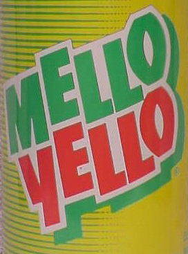
In June 2010, the Mello Yello logo was changed with a surprise rebrand which hearkened back to its 1970s roots. The "L's" were changed into long lines parallel to each other, stretching off to the edges of the packaging. Although it is replaced by the new logo, it is still used in some vending machines. The logo was still present on 20 oz bottles of Cherry and Peach Mello Yello until mid-2017 before being updated to feature the present logo. |
In June 2010, the Mello Yello logo was changed with a surprise rebrand which hearkened back to its 1970s roots. The "L's" were changed into long lines parallel to each other, stretching off to the edges of the packaging. Although it is replaced by the new logo, it is still used in some vending machines. The logo was still present on 20 oz bottles of Cherry and Peach Mello Yello until mid-2017 before being updated to feature the present logo. |
||
| − | == |
+ | ==2015-present== |
[[File:Mello yello logo before after copy.png|centre|thumb|203x203px]] |
[[File:Mello yello logo before after copy.png|centre|thumb|203x203px]] |
||
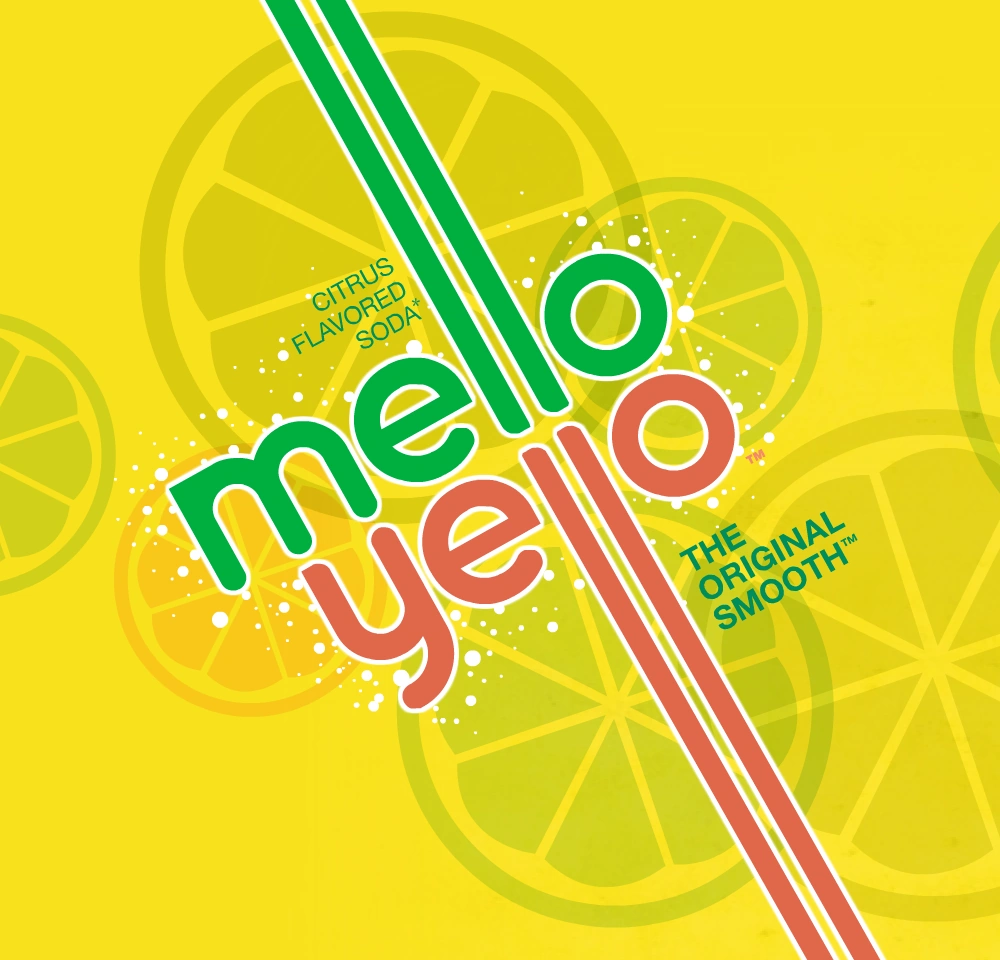
In December 2015, the logo had changed to something substantially more modern than its earlier iterations. This change came with a new can design and the 'MY' monogram. |
In December 2015, the logo had changed to something substantially more modern than its earlier iterations. This change came with a new can design and the 'MY' monogram. |
||
Revision as of 16:46, 29 July 2018
1979–1987 (USA and International), 2003–present (East Asia)
1987–1988
In 1987, the Mello Yello logo was updated for the first time with all uppercase lettering (with the logo in comparison with the 90s' Mountain Dew logo). This was the shortest-lived logo for the brand, only lasting for one year.
1988–1994

1994–1999
In 1994, the logo was given a wild font, and labels used gridlines.
1999–2010
| SVG NEEDED |
In 1999, the logo was updated with a circular yellow backdrop. This was the only Mello Yello logo to last for more than a decade, and was used longer than any other logo in history. It still exists on some mechanical Coke fountains and vending machines.
2010–2015
")
In June 2010, the Mello Yello logo was changed with a surprise rebrand which hearkened back to its 1970s roots. The "L's" were changed into long lines parallel to each other, stretching off to the edges of the packaging. Although it is replaced by the new logo, it is still used in some vending machines. The logo was still present on 20 oz bottles of Cherry and Peach Mello Yello until mid-2017 before being updated to feature the present logo.
2015-present
In December 2015, the logo had changed to something substantially more modern than its earlier iterations. This change came with a new can design and the 'MY' monogram.
")
