1979–1987, 20??-present (East Asia)
1987-1988
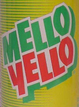
In 1987, the Mello Yellow logo was updated for the first time with all uppercase lettering. This was the shortest-lived logo for the brand, only lasting for one year.
1988-1994
1994-1999
In 1994, the logo was given a wild font, and labels used gridlines.
1999-2010
In 1999, the logo was updated with a circular yellow backdrop. This was the only logo to last for a decade, and was used longer than any other logo in history. It still exists on some mechanical Coke fountains and vending machines.
2010-present
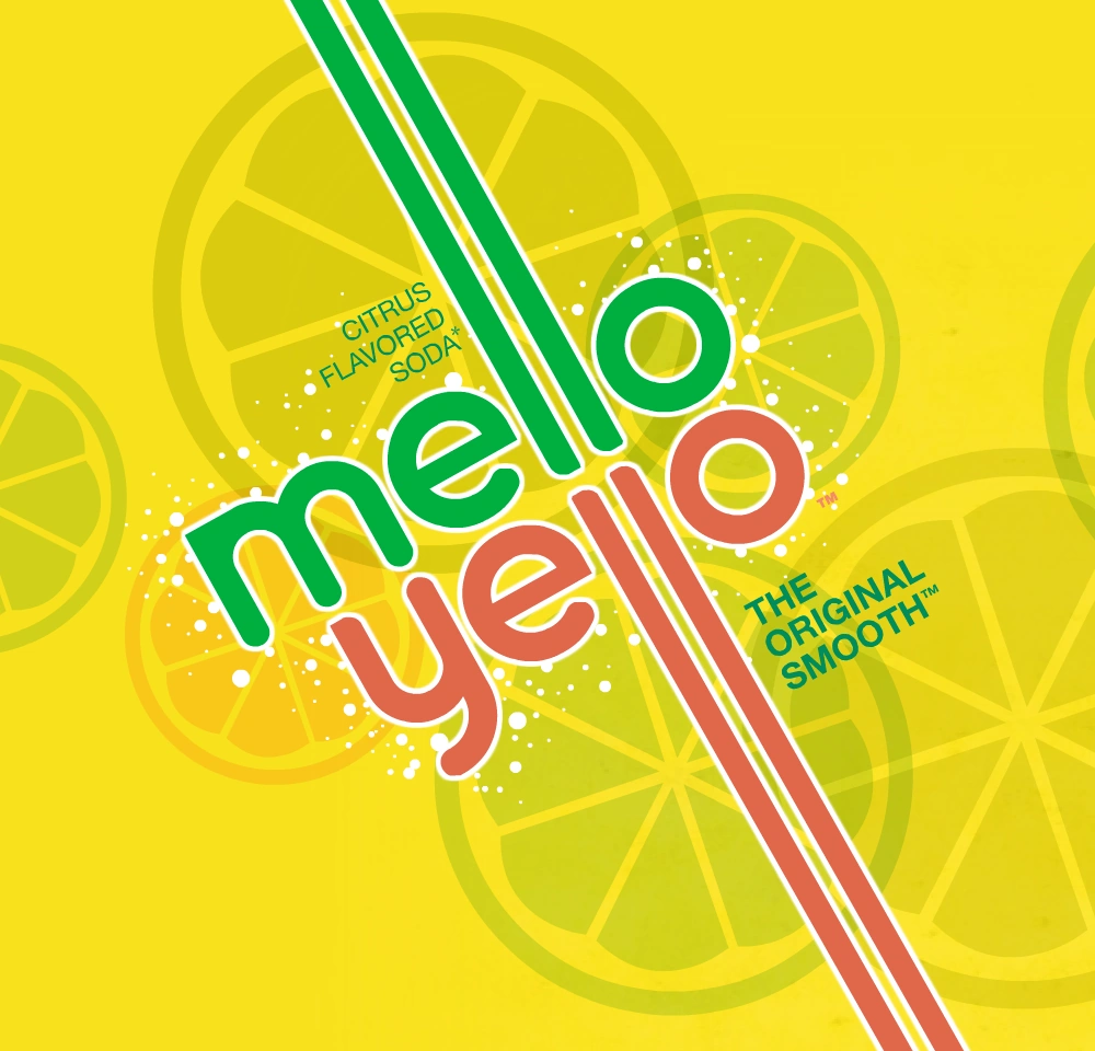
In 2010, Mello Yello was given a new look which harkens back to its 1970s roots. The "L's" are now long lines parallel to each other. The new look was created by Stag & Hare.[1][2]
