This page only shows primary logo variants. For other related logos and images, see:
|
1996-2000

Launched on 1 July 1996 this was the first logo to be seen. The letters were showing on all directions besides the middle down, the middle left and the middle right. The logo without the wave would cover the corners of the screen.
2000-2002

On 14 February 2000 the wave was kept without the letters (on-screen bug), and thus the wave was split into 3.
2002-2003

A different type of the logo was introduced on 9 September 2002 to retain the previous logo but the on-screen bug changed its colour to white. Plus, a red dot was added.
2003-2005
A short overhaul of the 2002 logo was redone on 7 September 2003. The previous on-screen bug was dropped and the "TV" (Russian spelling "TB") was added in a red dot.
2005-2006
2005-2006
.png)
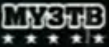
The type of the logo was changed by the Start of September 2005. The 5 stars were placed at the bottom and thus they represent each Russian letter.
2006
In August 2006 a short overhaul on the 2005 logo was redone but it continued while a couple of things changed. The outlining for the text was included and nothing was inside it. The stars became a bit smaller.
2006-2008
2006-2007

A new logo was later introduced in September. This time the letters, which spell "MY3" out, were changed into a "jelly" style.
2007

In March 2007, a short overhaul on the 2006 logo was redone. The "TB" was removed, and the logo became 2D.
2007-2008

Again in September, a short overhaul on the 2006 logo was redone. The letters are shaped like a ball.
2008

In March 2008 the previous logo was formed into a sphere. It holds the 3 letters together.
2008-present
2008-2010

By September, Muz-TV introduced a completely different logo type. The equalizer is 7 columns long and it resembles the M without the bottom holes.
2010-2018
2010-2011

A complete overhaul of the logo was made in February 2010: the equalizer was shortened to only 5 bars. The colours, however, are fine so the font was edged up and the U didn't have a hinge.
2011

In January 2011 the logo's line was changed into a thick variant and the text at the bottom became grey. This logo was short-lived.
2011-2012 (TV), 2011-2013 (online)

Muz TV became Yu in 2012, and now it is 100% entertainment and no longer broadcasts music videos, Muz TV remained only online.
2013-2015

On 9 September 2013 Muz-TV's logo reverted to the 2011 variant, but the text was black instead of grey and the spheres became dots again.
2014-2015

This logo was used during New Year's Eve 2014-15. At the bottom, the text lost its gradient so it became lighter and the dots became spheres again.
2015-2018

On 17 February 2015 a big change occurred on this logo: the font was changed again like both logos used between 2008 and 2010, also the U has a hinge. The dots were made smaller and had more space between others. The colours pink and yellow changed their places.
2018-present

A new look for the logo was introduced on 8 September 2018.
| Parent companies: National Media Group (49%) | VTB (51%) Television channels Regional stations Cinema and production Online Defunct channels Defunct brands Former owners  |