This page only shows primary logo variants. For other related logos and images, see:
|
| 1951–1953 | 1953–1969 | 1969–1973 | 1973–1984 | 1984–1988 | 1988–1991 |
| 1991–2000 | 1996–2000 | 2000–2003 | 2003–2014 | 2014–present | |
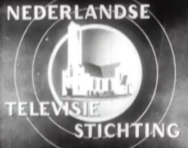
Nederlandse Televisie Stichting
1951–1953
1953–1969

In October 1964, Nederland 2 enter airwaves.
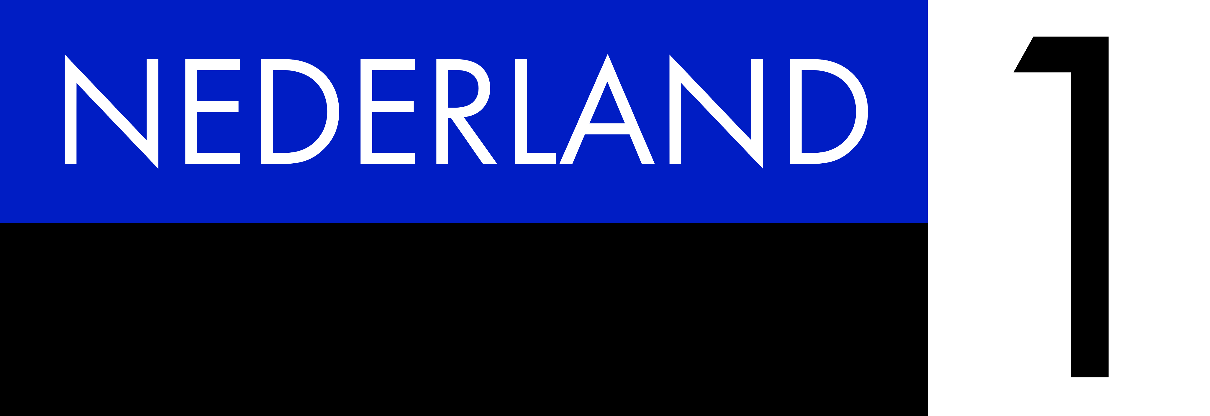
Nederland 1
1969–1973

1973–1984
.svg "Nederland 1 (1970s).svg (6 KB)")
.svg "Nederland 1 (1980s).svg (9 KB)")
- Sources: YouTube (Microgramma version) and YouTube (Helvetica version)
1984–1988

.png)
")
1988–1991

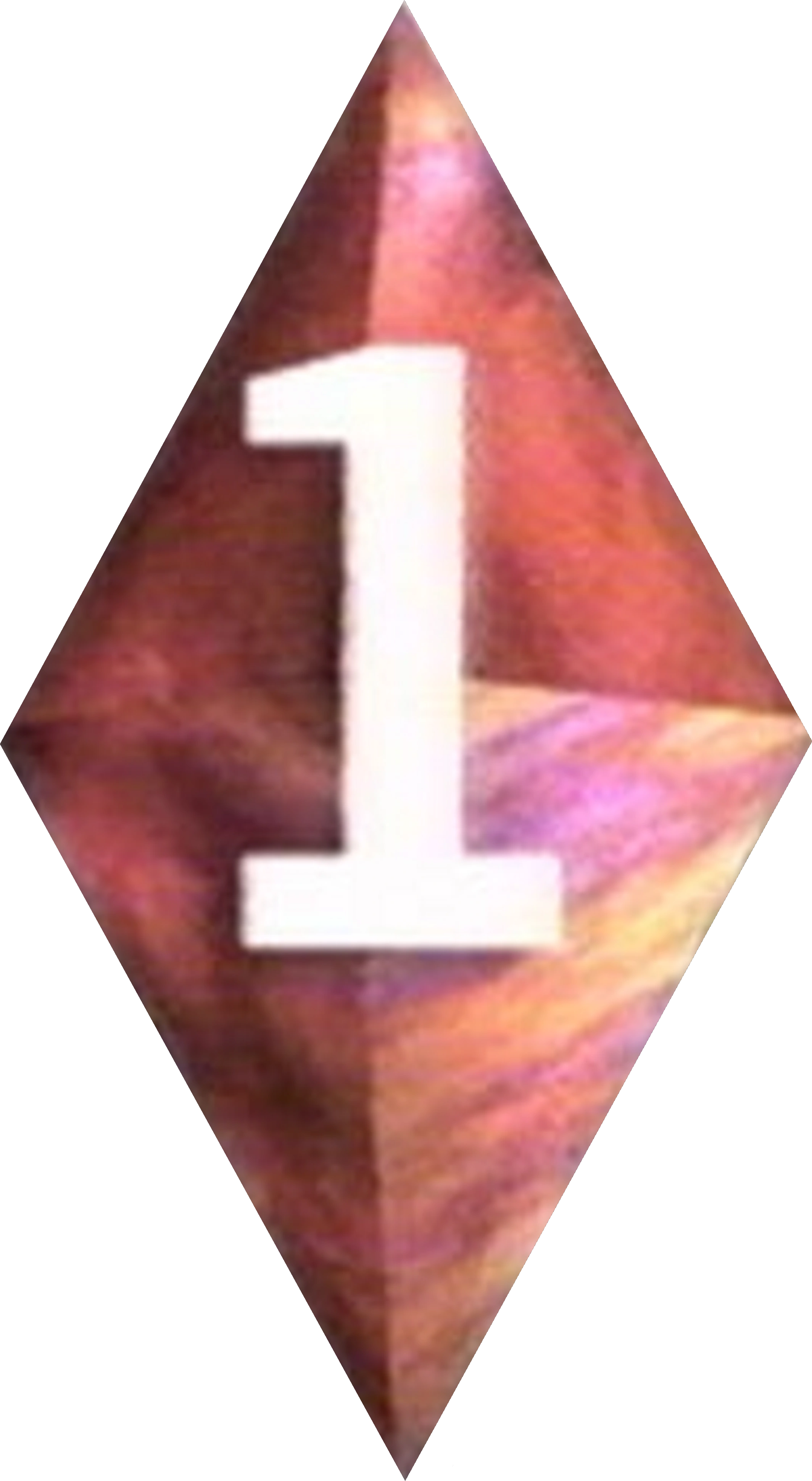
1991–2000

In 1991, the doors disappeared in favor of a little-squeezed blue 2D diamond shape with a yellow "1".
1996–2000
")
Between 1996 and 2000 an alternate version of the logo was used, the 2D diamond shape was now 3D and red, and the "1" is white instead of yellow. [1]
2000–2003

|
|
|
Nederland 1 got a new look, created with assistance from BBC Broadcast (later Red Bee Media).[2]
2003–2014

|
|
|
Nederland 1, Nederland 2 and Nederland 3 were all rebranded on September 5, 2003. The logos for the three channels, which consisted of slanted squares with simple numerals based on "De Stijl", was credited to Kemistry. The idents focused on hands.
The profiles of the different channels changed in 2006, and they were redesigned by Kemistry once again. Nederland 1 did however keep its logo and color.
NPO 1
2014–present

Five years after the foundation of the NPO in 2008, NPO announced a renaming of Nederland 1, Nederland 2, and Nederland 3 to NPO 1, NPO 2, and NPO 3, respectively. This was done to make the channels and programming easly recognizable. Although the current logos of the respective channels before the renaming are still in use, it incorporates the NPO logo with the Channel's logo before the Renaming, with the "NPO" matching to the color of the square with the numeral in a gray square.
| Television channels NPO 1 | NPO 2 | NPO 3/NPO Zapp/NPO Zappelin | BVN Digital theme-channels (NPO Themakanalen) Radio stations Online/Multimedia Current broadcasters NOS newscasts: Journaal | Jeugdjournaal | op 3 | Stories Former/merged broadcasters |