- For other uses, see PBS (disambiguation).
"Educational Television and Radio Center" redirects here.
Not to be confused with NET, Nihon Educational Television; the former name for TV Asahi, or National Education Association.
This page only shows primary logo variants. For other related logos and images, see:
|
| 1952–1959 | 1952–1955 | 1956–1959 | 1959–1961 | 1961–1970 | 1963–1967 | 1967–1970 |
| 1971–1984 | ||||||
| 1970-1972 | 1970–1971 | 1971–1984 | 1984–1998 | 1998–2002 | 2002–2019 | 2019–present |
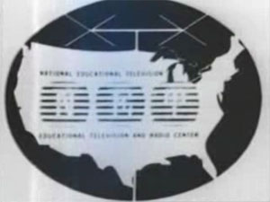
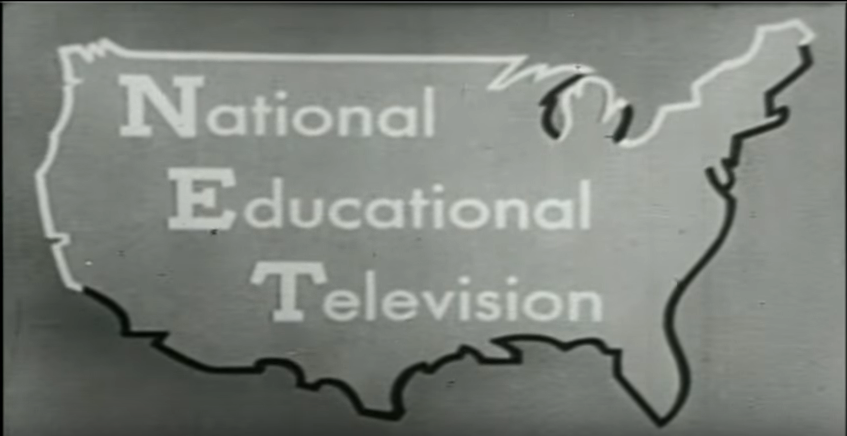
National Educational Television
1952–1959
This logo has a white circle with a black "NET" inside it.
1952-1955
1956–1959
1959–1961
1961–1970
1963–1967
1967–1970
This color variation of the 1961 "house" logo first appeared in 1967. NET ceased network operations on October 4, 1970, with PBS taking over the following day, though WNET continued to produce some shows for the national PBS schedule with the NET branding until about 1972.
1970–1972

Although NET had ceased operations in 1970, programs that still carried the NET branding used this logo. It was never used as a network identifier logo.
Public Broadcasting Service
1970–1971
On October 5, 1970, National Educational Television was replaced by the Public Broadcasting Service. The first logo consisted of the words stacked up on top of each other, with “PUBLIC” in red, “BROADCASTING” in yellow, and “SERVICE” in blue.
PBS
1971–1984
|
|
|
This logo premiered in 1971. It was designed by the late Herb Lubalin who also designed the accompanying typeface ITC Avant Garde Gothic. The "P" resembles a human head (nicknamed the "P-Head" by many fans) while the "B" and "S" are more overtly geometric. The nickname for this is the "Tri-Colored Everyman P-Heads". The logo was still used on new episodes of PBS shows until 1985. The colors were changed as well. PBS Digital Studios brought back this logo (sans the company name underneath) in 2014 with the introduction of its new logo which includes the Tri-Colored letters, and was used until 2019 when the new PBS logo was introduced.
1984–1998

|
|
|
Chermayeff & Geismar designed a modified version of the "P-Head" from the previous logo and placed it in a forward-facing position and added two additional facial outlines on the edge, one in negative space and one in positive space. The font used for the "PBS" identification was designed specifically for the network. The logo is also used on PBS Home Video. It aired on September 30, 1984 as the channel was shortened to the PBS abbreviation.
1998–2002

In 1998, the "P-Head" logo was placed in a black circle, with the "P-Head" now being colored white.
2002–2019

In 2002, the logo was redesigned so that the P-Head circle appears bigger than the text. This wordmark uses the font Caecilia 75 Heavy instead of Lubalin Graph Demi. Sometimes, the circle is 3D. Even though this logo was replaced by the next logo in November 2019, This logo is still being used on some platforms like the Samsung Smart TV, and it's still being used at the end of some of PBS' shows like Firing Line, Motorweek, and To the Contrary as of May 2020.
2019–present

|
|
|
To coincide with the 50th anniversary of its founding, a new logo for PBS designed by Lippincott was unveiled on November 4, 2019. The P-Head design has been slightly modified, with rounder edges around the nose, and a new custom font, named PBS Sans, for the wordmark was used. The previous icon is still used for PBS NewsHour, and on most affiliates such as KOCE, which is branded as PBS SoCal.
External links
See Also
- PBS
- WNET


.svg)
Template:Television Networks US