1914–1917[]
1917–1927[]
1917–1922[]
1922–1927[]
1927–1942[]
1927–1930[]
1929–1942[]
1934–1939[]
1942–1953[]
1942–1945[]
1944–1951[]
1950–1953[]
1953–1986[]
1953–1968[]
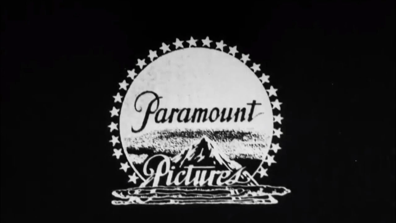
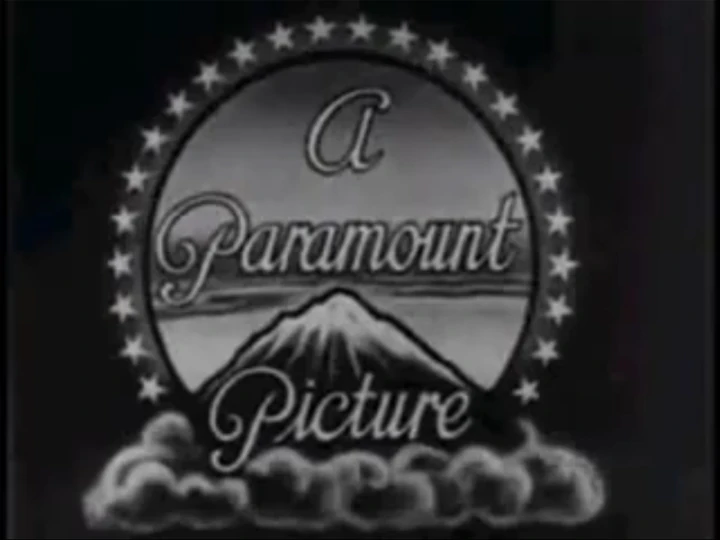
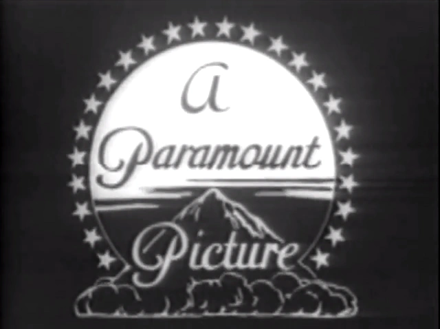
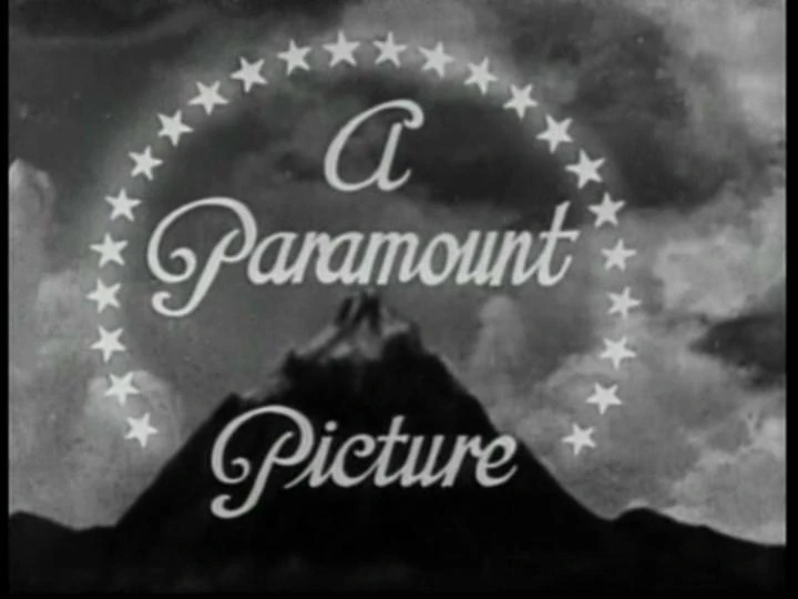
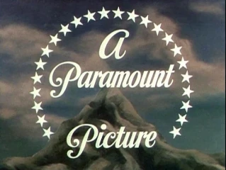
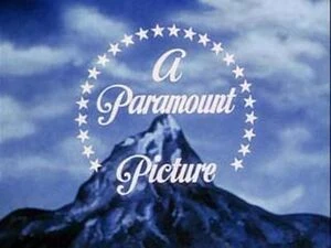
1953–1954[]
In 1953, Jan Domela painted the mountain and added the trees around the mountain, which debuted on-film in 1953.
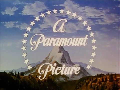
1954–1968[]
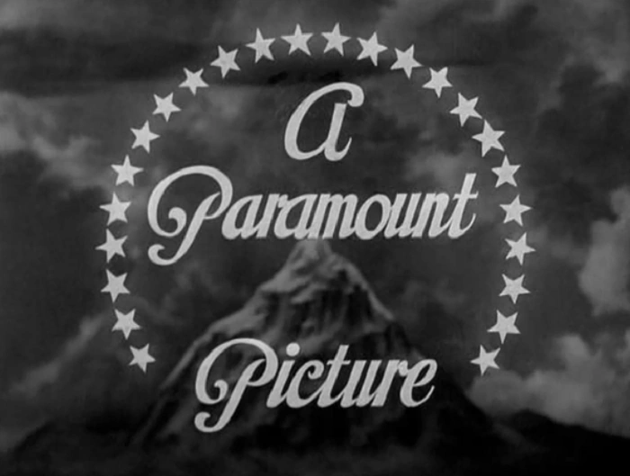
"Release" variant (for independent movies distributed by Paramount)
"Release" variant (B&W) (alternate)
1968–1975[]
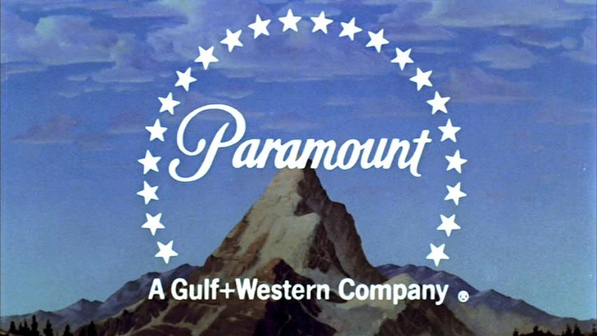
1968–1974[]
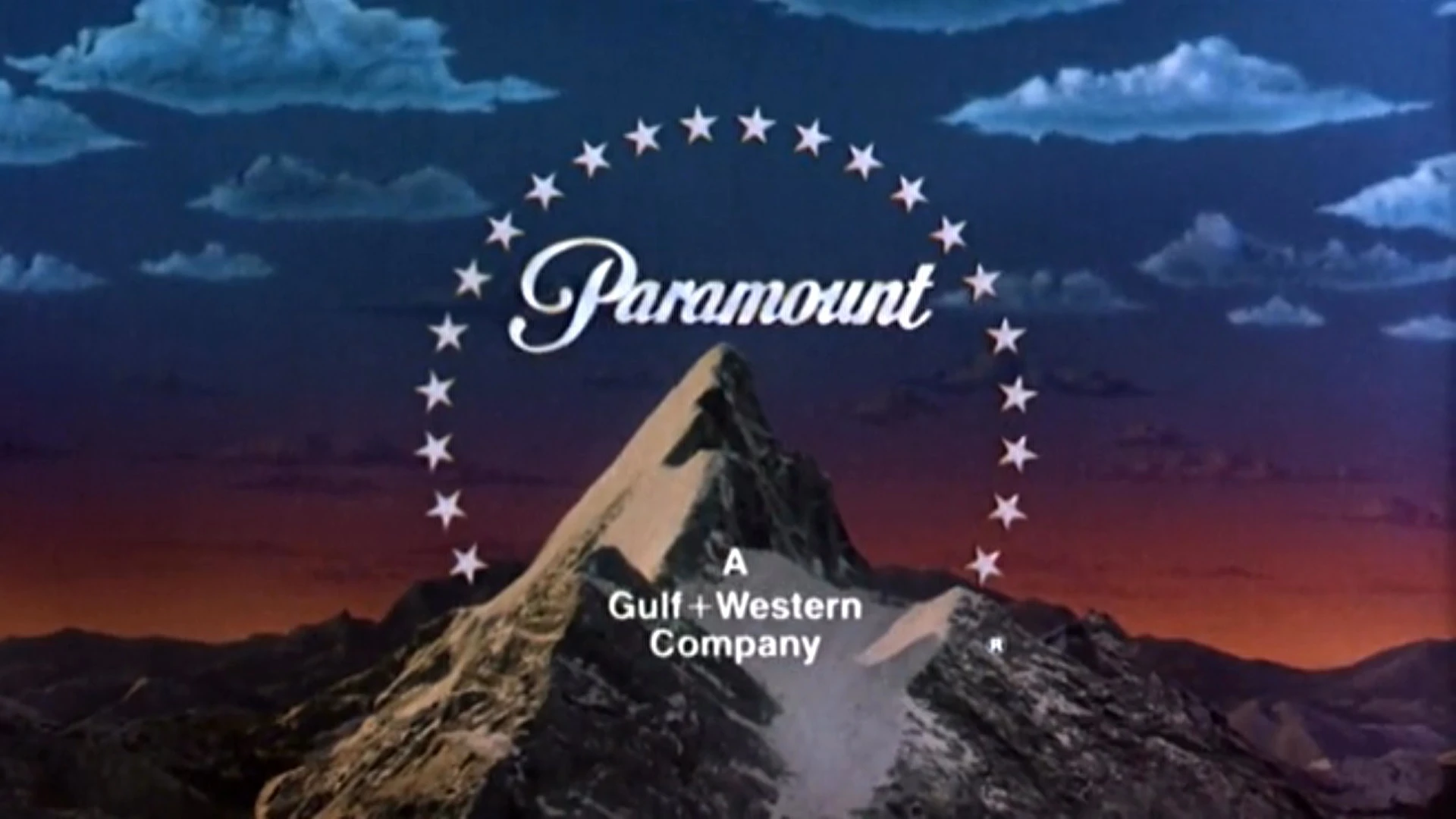
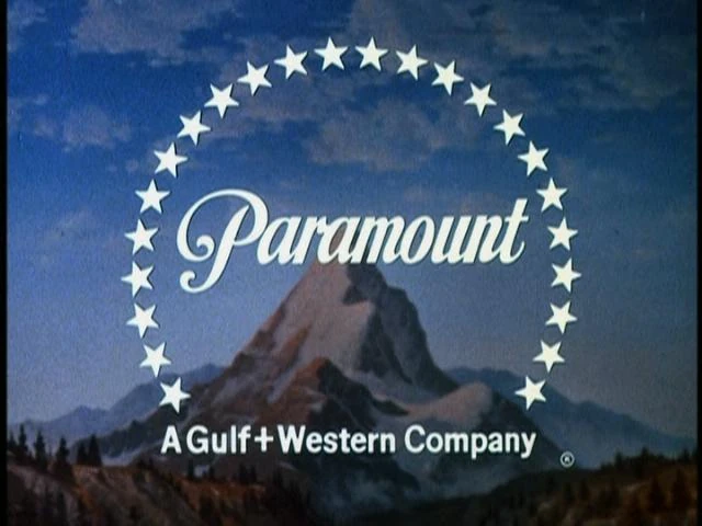
In 1968, starting with the film The Odd Couple, a byline was added that reads A Gulf + Western Company. Also the words "A" and "Picture" were removed. There is also a variant for 35mm open matte film scan prints, where the logo is zoomed out to a much farther distance to reveal more of the trees around the mountain.
Variant with no drop-shadow (used on films like Rosemary's Baby and 5 Card Stud (both 1968), among others)
B&W variant with no drop-shadow (used only on If... (1968))
Alternate 35mm open matte variant
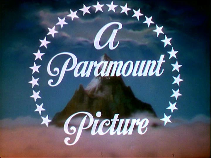
1970–1974[]
1974–1975[]
1975–1986[]
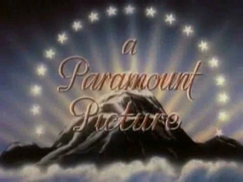
In 1975, the stars and the "Paramount" text were redesigned to match its current print logo since 1967 and the Gulf+Western byline is now stacked up. A transition would also ocurre in which the painted mountain changes into the flat corporate design against a blue background. This debuted on Mahogany, released on October 8, 1975 and was used up until Star Trek IV: The Voyage Home, released on November 26, 1986.
1986–2002[]
1986–1987 (75th anniversary logo)[]
| Designer:
|
Dario Campanile
Flip Your Lid Animation (animation)
Omnibus Computer Graphics (for the stars)
Apogee, Inc. (for the mountain model)
|
|
| Typography:
|
Custom
Helvetica (modified) (Gulf+Western byline)
|
|
| Launched:
|
December 12, 1986
|
|
In 1986, for the studio's 75th anniversary, Dario Campanile repainted the mountain, which debuted on-film in 1986. The artist added the trees, the lake and the clouds to make it realistic and the sky was changed to a red/blue sunset. It was designed and composited by Studio Productions (now known as Flip Your Lid Animation), with the stars animation done by Omnibus Computer Graphics and the mountain scenery model physically created by Apogee, Inc. The "Paramount" text and the Gulf+Western byline from the previous logo would both fade in first after the stars encircle the mountain before the 75th Anniversary wordmark fades in last. This logo debuted in The Golden Child, released on December 12, 1986 while the 75th Anniversary variant was last used on Eddie Murphy Raw released on December 18, 1987.
1988–1989[]
It's the same as before, but the 75th Anniversary wordmark is removed and the Gulf+Western byline is shifted up. This debuted on She's Having A Baby, released on February 5, 1988 and was last used on Shirley Valentine, released on August 30th, 1989. It later made a surprise appearance on Paranormal Activity 3, but with the 2010 Viacom byline.
1989–1990[]
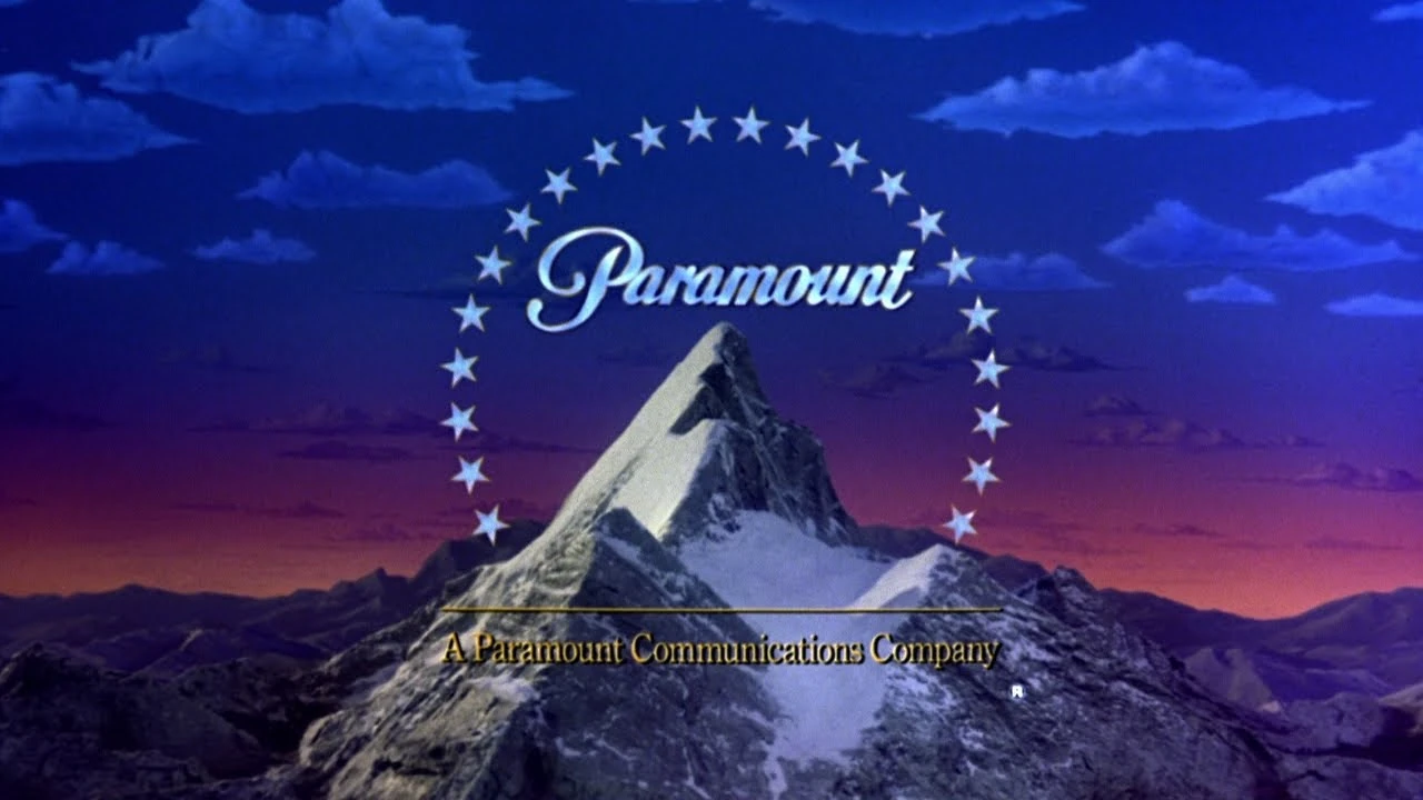
In 1989, the former byline was changed to A Paramount Communications Company. In addition, the "Paramount" text fades in first before the byline fades in. This debuted on Black Rain, released on September 22nd, 1989 and ended 1 year later. The byline faded in with the Paramount script like the Gulf+Western version and the 1975 logo and was colored gold.
1990–1994[]
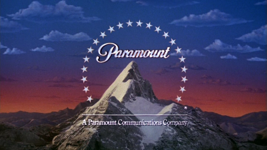
In 1989, the gold byline was changed to white. This debuted in 1990 and was last used on Nobody's Fool, released on December 23, 1994. For its first year, the byline faded in with the Paramount script like the Gulf+Western version and the 1975 logo and was colored gold.
1995–2002[]
1995–1999[]
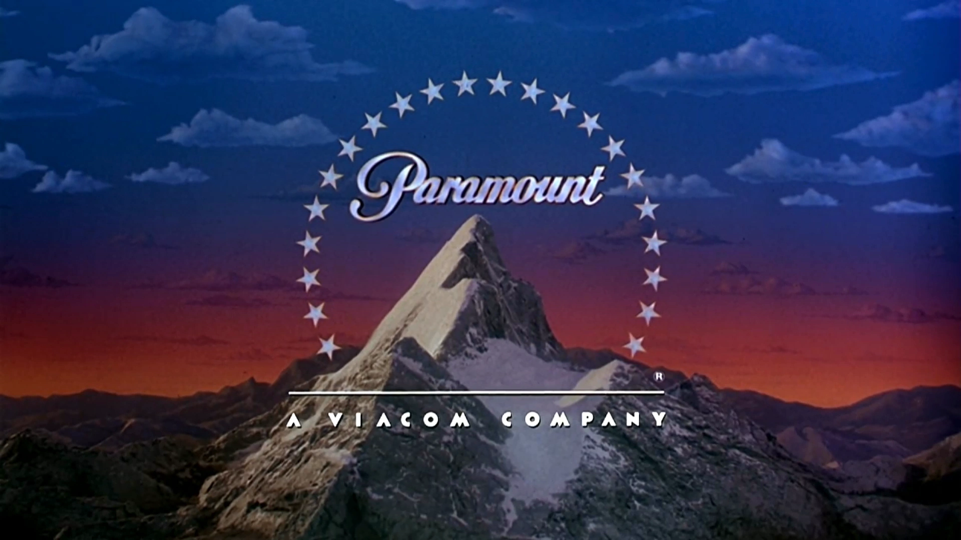
In 1995, the former byline was changed to A Viacom Company. This debuted on The Brady Bunch Movie, released on February 17, 1995 and was last used on the VHS of Jimmy Neutron: Sea of Trouble on October 7, 2003.
1999–2002[]
|
|
| Typography:
|
Custom
Futura Extra Bold (modified) (Viacom byline)
|
|
|
It's the same logo but added more textures to have it more detailed. The lake also has a reflection when the stars show up to encircle the mountain. This logo was animated at Pittard Sullivan. It debuted on South Park: Bigger, Longer & Uncut and was last used on Crossroads, released on February 15, 2002. It also appeared on trailers of We Were Soldiers, Clockstoppers, Changing Lanes and Hey Arnold: The Movie, although the said actual movies use the next movie logo below.
2002–2011[]
2002–2010[]
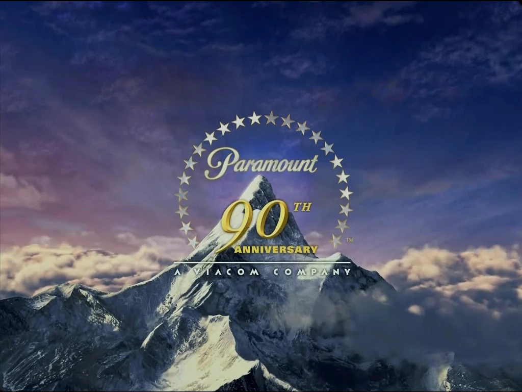
2002–2003 (90th anniversary logo)[]
|
|
| Typography:
|
Custom
Futura Extra Bold (modified) (Viacom byline)
|
|
| Launched:
|
February 25, 2002
|
|
In 2002, the new logo was given a CG-animated version, for the studio's 90th anniversary. It pans down from a starry sky to a background of clouds with comets appearing from the top and turning into stars and it reveals to be reflected on the "Paramount" text (similar to the 1998–2022 Warner Bros. Pictures logo) before it zooms onto the center of the mountain with the stars encircling the mountain. It debuted on We Were Soldiers while the 90th Anniversary wordmark was last used in the DVD release of "Rugrats: Mysteries", "Blue's Clues: Blue's Big Band", and "Dora the Explorer: Map Adventures" released in early 2003.
2003–2010[]
The logo was slightly modified in late-2002, but without the 90th Anniversary wordmark. It debuted in How to Lose a Guy in 10 Days and was last used at the end of DreamWorks Animation's Kung Fu Panda 2. This logo also made its surprise appearance in Capture the Flag, released in 2015. Despite the original Viacom company dissolved in 2005, Paramount kept using its font in the byline until 2010.
2010–2011[]
In 2010, the logo was modified, with sleeker stars and text while the byline adopted the font from the 2005 Viacom logo. However, this version only lasted a few years. debuting in Marvel Studios' Iron Man 2 and last appearing in The Adventures of Tintin: Secret of the Unicorn, as well as the home video trailers for Flight, The Guilt Trip, DreamWorks' Rise of the Guardians, Jack Reacher, Cirque Du Soliel: Worlds Away and Hansel & Gretel: Witch Hunters, although the said actual movies use the next logo below.
2011–present[]
2011, 2012–2013 (100th Years logo)[]
| Designer:
|
DevaStudios
Terragen (from Planetside Software; animation)
|
|
| Typography:
|
Custom
Handel Gothic (modified)
September Heavy (modified) (Viacom byline)
|
|
| Launched:
|
December 7, 2011
|
|
In 2012, the new logo was given another CG-animated version but it was given a more realistic look, with a new orchestral fanfare composed by Michael Giacchino. It was designed by DevaStudios and animated using Terragen from Planetside Software, for the studio's 100th anniversary. It basically combines elements of the previous two logos, including the landscape of the 1986 logo with the stars creating ripples in the lake (similar to the DreamWorks Pictures logo). This debuted in Mission: Impossible - Ghost Protocol, released in December 21, 2011, and was last used in the 2012/13 IMAX 3D re-release of Top Gun. A version of the aforementioned variant also exists for the 100 Years version of this logo, where the Viacom byline is shifted upwards.
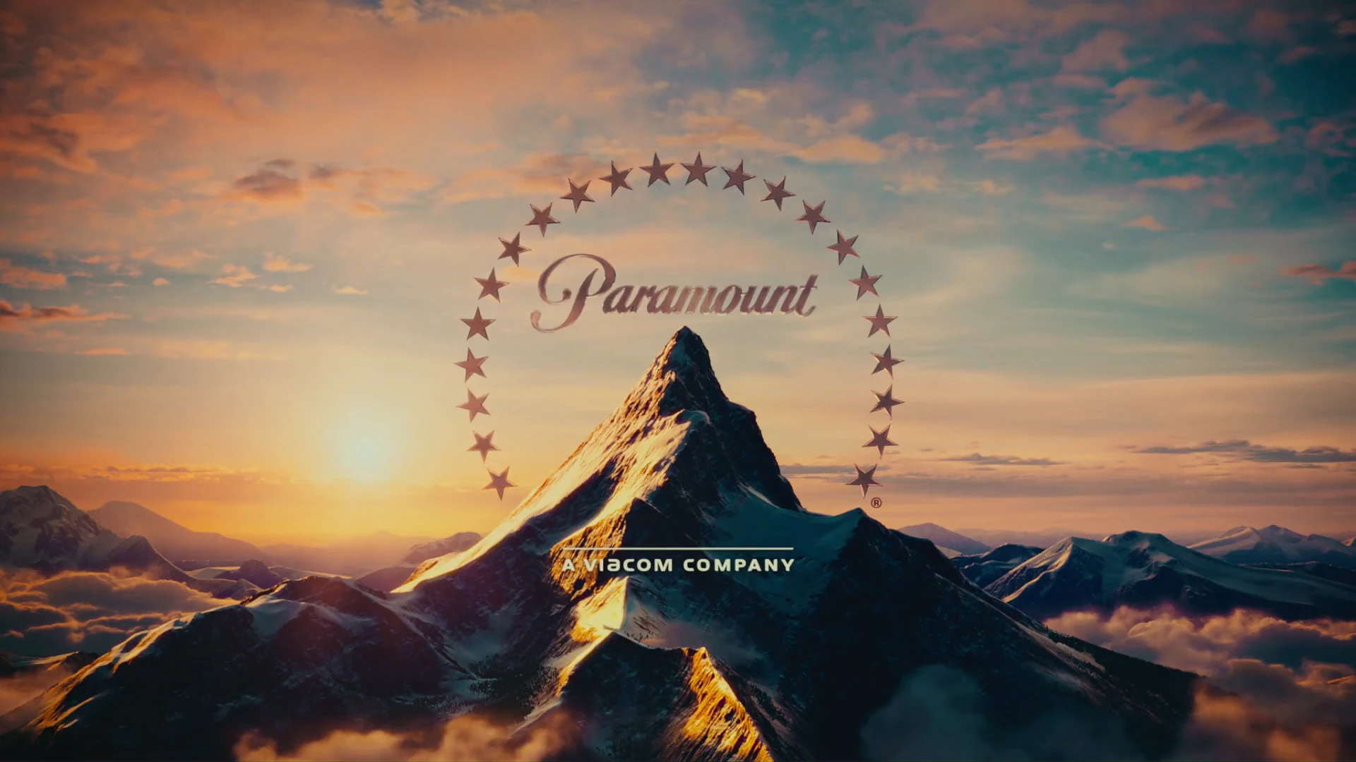
2013–2019[]
| Designer:
|
DevaStudios
Terragen (from Planetside Software; animation)
|
|
| Typography:
|
Custom
Handel Gothic (modified)
September Heavy (modified) (Viacom byline)
|
|
|
The current logo is modified, but the Viacom byline is slightly larger and without the "100 Years" wordmark. It debuted in Hansel & Gretel: Witch Hunters, released in 2013, and was last used in Blue Story, which follows the re-merger of Viacom and CBS. A videotaped version of this logo exists where the camera angle is slightly different, the mountain has slightly less light reflection, the stars have a lighter color, the "Paramount" script is darker, and some of the clouds above the mountain are not visible. This became the new main opening variant of the logo since March 25, 2022 (ableit having no byline). It is also used as a de-facto home entertainment logo in 4K UHD releases, while Blu-ray and DVD releases begin using this logo in 2019 starting with the home media release of Bumblebee, though not on CBS Home Entertainment or Paramount Media Networks releases.
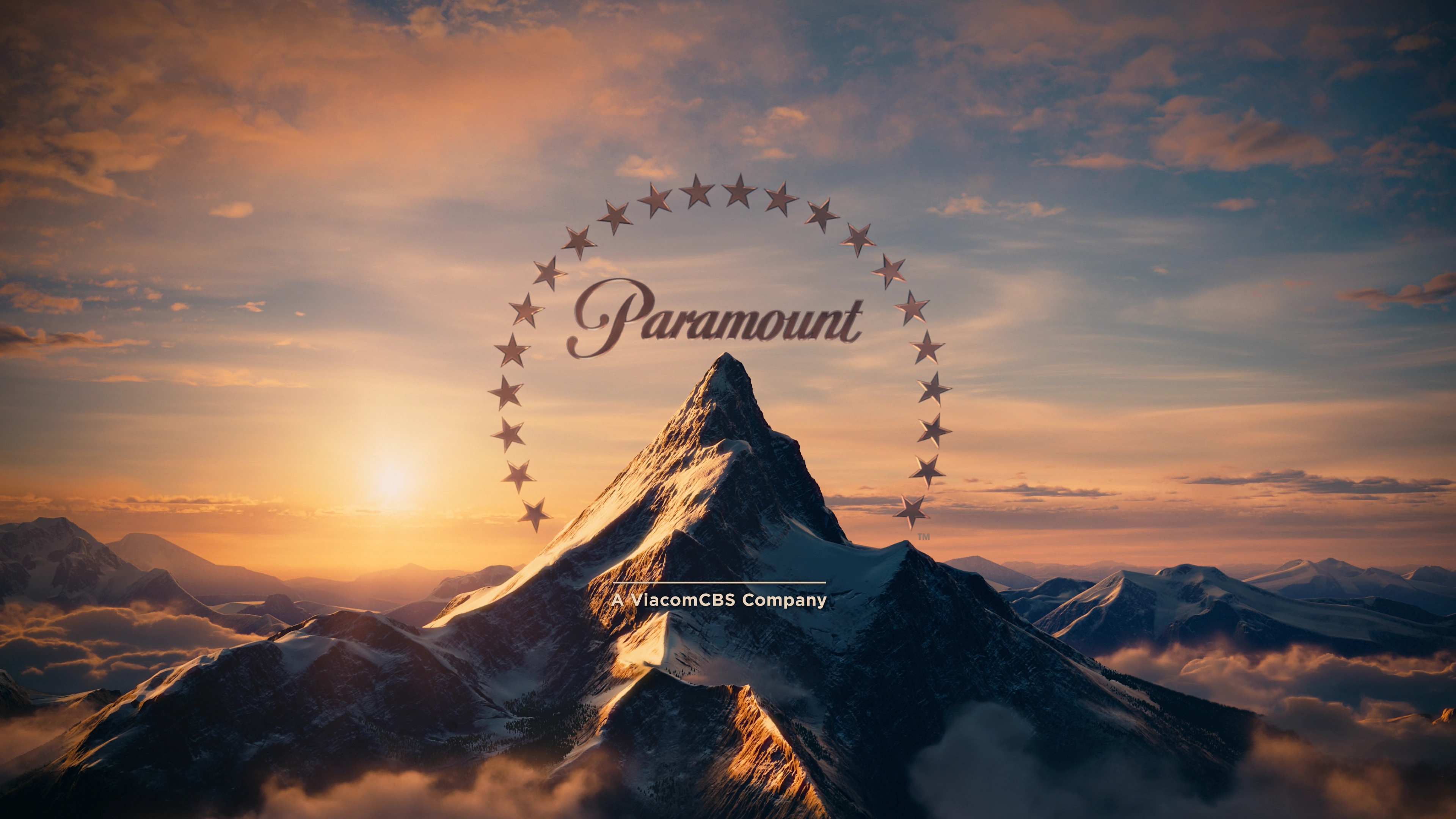
2019–2022[]
| Designer:
|
DevaStudios
Terragen (from Planetside Software; animation)
|
|
| Typography:
|
Custom (wordmark)
Gotham Semibold (for the byline)
|
|
| Launched:
|
January 10, 2020
|
|
After the second merger between Viacom and CBS Corporation to form ViacomCBS, the byline was once again changed to A ViacomCBS Company in 2019. In 2021, trailers and TV spots use the same logo, but the byline is in a different typeface (ViacomCBS Raissone). It debuted in Like a Boss in 2020 and was last used in O Palestrante, which follows the rebranding of ViacomCBS to Paramount Global in February 2022.
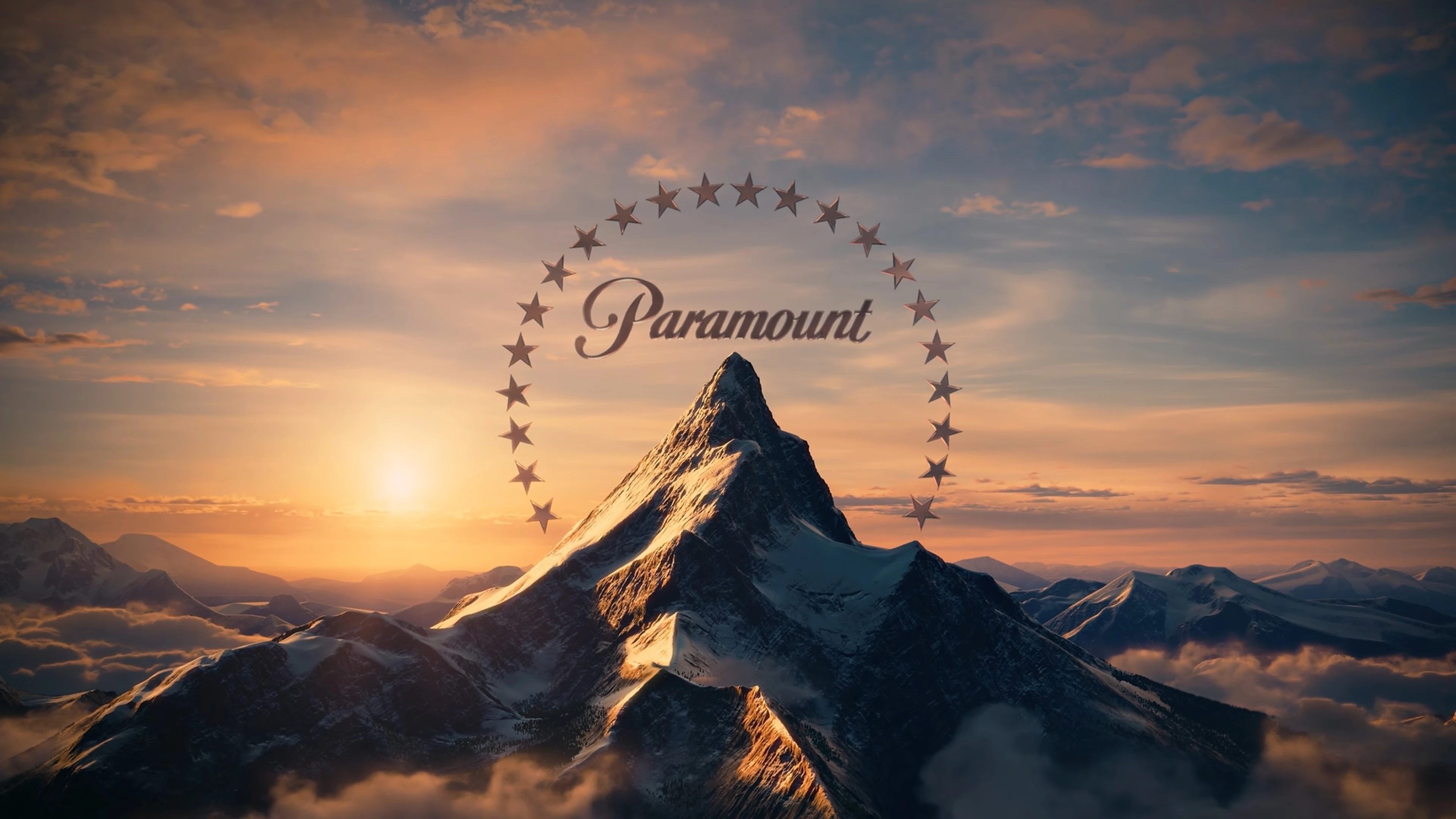
2022–present[]
| Designer:
|
DevaStudios
Terragen (from Planetside Software; animation)
|
|
|
|
In 2022, after ViacomCBS was rebranded as Paramount Global, the byline was permanently removed from the logo. It also marks the first time since 1967 that the logo is bylineless. The first film to showcase the bylineless logo was The Lost City, released on March 25, 2022.
")
.jpg "Paramount Pictures Release (1955).jpg (256 KB)")
_a.jpg "Paramount Pictures (1961) a.jpg (39 KB)")
")
")
")
")
")
")
")
")
")
.jpg "Paramount1974 (1).jpg (48 KB)")
_(4x3)_(1).png "Paramount Pictures (Bon Voyage Charlie Brown variant) (4x3) (1).png (662 KB)")
_(4x3)_(2).png "Paramount Pictures (Bon Voyage Charlie Brown variant) (4x3) (2).png (349 KB)")