This page only shows primary logo variants. For other related logos and images, see:
|
| 2015–2016 | 2016–2019 | 2019–2024 |
2015–2016
| SVG NEEDED |
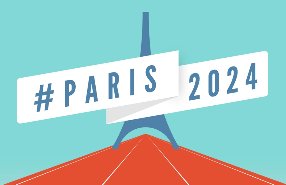
The applicant city logo is the Eiffel Tower on an athletics track flanked by a ribbon reading "#PARIS 2024".
2016–2019
2016–2017 Candidate
The candidacy logo; designed by the Parisian branch of Dragon Rouge was unveiled on the 9th February 2016 at the Arc de Triomphe. The logo itself is a stylisation of the Eiffel Tower that forms the numerals '2' and '4'. The logo is coloured with the colours of the Olympic rings.
")
")
")
2017–2019 Interim

On the 13th September 2017, the International Olympic Committee simultaneously awarded the 2024 and 2028 Olympic Games to Paris and Los Angeles respectively. Both candidates will become the second and third cities to have hosted the Olympics three times, after London. As such, the Paris Organising Committee adjusted the logo accordingly.
")
")
2019–2024

The Olympic emblem was unveiled at an event on the 21th October 2019 at Le Grand Rex[1]; a cinema and concert venue on Boulevard Poissonnière. Etienne Thobois; the chief executive of the Organising Committee stated beforehand that the new emblem wouldn't contain any references to the Eiffel Tower, but rather the "wider vision of the Olympic Games".[2]
.svg "Paris 2024 (Olympics).svg (7 KB)")
.svg "Paris 2024 (Paralympics).svg (5 KB)")
The emblem of Paris 2024 was created by Paris-based Royalties Ecobranding and is a minimalist interpretation of the Olympic spirit imbued with unmistakably French eccentricities. It takes heavy influence from the Art Deco period, which was in style around the time of the previous Parisian games in 1924. For the first time, the Olympic and Paralympic games share the exact same emblem.
The symbol is inspired by three concepts:
- The round shape of the emblem denotes the look of a gold medal; the highest honour that can be bestowed on an athlete at the games.
- Within the negative space of the medal is the shape of a flame, a common symbol in Olympic graphic design and an allusion to the Olympic Flame.
- The two previous elements merge with the lips to create an image of Marianne, the national personification of France in the era of the French Revolution.
The symbol is accompanied by a bespoke typeface with a variable thickness. Like the symbol itself, the font has its roots in the Art Deco heritage of the city and specifically typefaces such as Excelsior FTF and Banjo. The Paralympic variant uses the newly-refreshed Paralympic Agitos designed by North and dropped the text "Paralympic Games" present in previous games' logos.
")
")
See also
Parisian Olympic Bids
Parisian Olympic Games
References
External links
|
|

