PizzaHutfan14 (talk | contribs) No edit summary |
m (Minor spelling/grammar edits.) Tag: Visual edit |
||
| (44 intermediate revisions by 24 users not shown) | |||
| Line 1: | Line 1: | ||
{{Primary Logos}} |
{{Primary Logos}} |
||
{{ImageTOC |
{{ImageTOC |
||
| − | |Pizza Hut (1958).svg| |
+ | |Pizza Hut (1958).svg|1958–1973 |
| + | |Pizzahut1973.png|1973–1974 |
||
| − | |Pizza Hut (Old).svg| |
+ | |Pizza Hut (Old).svg|1974–1999, 2019–present |
|Pizza Hut.svg|1999–2014 |
|Pizza Hut.svg|1999–2014 |
||
|Pizza hut logo.svg|2008–2017 (International) |
|Pizza hut logo.svg|2008–2017 (International) |
||
| Line 9: | Line 10: | ||
|Pizza Hut (February 2014).svg|2014 (North America) |
|Pizza Hut (February 2014).svg|2014 (North America) |
||
|Pizza Hut logo.svg|2014–2019}} |
|Pizza Hut logo.svg|2014–2019}} |
||
| − | == |
+ | ==1958–1973== |
[[File:Pizza Hut (1958).svg|250px|center]] |
[[File:Pizza Hut (1958).svg|250px|center]] |
||
| − | The first '''Pizza Hut''' restaurant opened in 1958. |
+ | The first '''Pizza Hut''' restaurant opened in 1958 in Wichita, Kansas. |
| + | ==1973–1974== |
||
| ⚫ | |||
| + | [[File:Pizzahut1973.png|200px|center]] |
||
| + | This logo was only in use for a few years and, in print ads and television commercials, was usually accompanied by an image of a hand-drawn '''Pizza Hut''' restaurant. |
||
| + | |||
| ⚫ | |||
[[File:Pizza Hut (Old).svg|center|200px]] |
[[File:Pizza Hut (Old).svg|center|200px]] |
||
| − | Introduced in |
+ | Introduced in 1974, and designed in collaboration between [[Lippincott]] and '''Pizza Hut''' marketing executive ''Sam Moyers'', this was the first logo to fully incorporate the iconic red roof. On June 17, 2019, the logo was revived by the company, initially to promote the third season of [[Netflix]]'s series ''[[Stranger Things]]'' (which fittingly takes place in the 1980s), but it soon became their main logo alongside the 2014 logo. |
| − | == |
+ | ==1999–2014== |
| − | ===1999–2014=== |
||
[[File:Pizza Hut.svg|center|200px]] |
[[File:Pizza Hut.svg|center|200px]] |
||
| − | In 1999, the chain launched a new logo, designed by Landor Associates, |
+ | In 1999, the chain launched a new logo, designed by [[Landor Associates]], with a new script font and the dot on the "i" in "Pizza" was colored green (possibly representing margherita). Also, a yellow line was placed underneath the script. From 2010 to 2014, it was used as a secondary logo. |
| − | + | ==2008–2017 (International)== |
|
[[File:Pizza hut logo.svg|center|200px]] |
[[File:Pizza hut logo.svg|center|200px]] |
||
This logo was used in countries in South America and was also used in Hong Kong, Israel, and Southeast Asia. It was introduced in 2008 and is used internationally until 2017. |
This logo was used in countries in South America and was also used in Hong Kong, Israel, and Southeast Asia. It was introduced in 2008 and is used internationally until 2017. |
||
| − | + | ==2010 (North American prototype)== |
|
[[File:Pizza Hut logo 2010 North America.svg|center|250px]] |
[[File:Pizza Hut logo 2010 North America.svg|center|250px]] |
||
| − | This logo was only used at a series of prototype locations in Peoria and Peoria Heights in Illinois. This was used during a proposed reformatting which explored the concept of the restaurant chain changing to being exclusively a carry-out chain. This logo was eventually removed from said locations, and its branding was |
+ | This logo was only used at a series of prototype locations in Peoria and Peoria Heights in Illinois. This was used during a proposed reformatting which explored the concept of the restaurant chain changing to being exclusively a carry-out chain. This logo was eventually removed from said locations, and its branding was replaced by the next logo. |
| − | + | ==2010–2014== |
|
[[File:Pizza Hut (2010).svg|center|200px]] |
[[File:Pizza Hut (2010).svg|center|200px]] |
||
| − | In February 2010, the "red |
+ | In February 2010, the "red roof" design was given a glossy look, and the script was modified. This logo was still used at some locations until the end of 2015. |
| − | + | ==2014 (North America)== |
|
[[File:Pizza Hut (February 2014).svg|center|200px]] |
[[File:Pizza Hut (February 2014).svg|center|200px]] |
||
| − | In February 2014, the yellow stripe at the bottom of the wordmark and the green |
+ | In February 2014, the yellow stripe at the bottom of the wordmark and the green dot on the "i" in "Pizza" were dropped from the logo, the wordmark was tilted and moved down further from the "red roof" design. This logo is still used in some countries. |
| − | + | ==2014–2019, 2017-present (international)== |
|
[[File:Pizza Hut logo.svg|center|200px]] |
[[File:Pizza Hut logo.svg|center|200px]] |
||
| − | In November 2014, Pizza Hut announced a major change to their menu and the look of their restaurants. They also announced a new logo and box design, which were launched on November 19. The logo consists of the short-lived logo in white, placed on a red circle drawn much akin to a brush stroke. The red circle also, |
+ | In November 2014, Pizza Hut announced a major change to their menu and the look of their restaurants. They also announced a new logo and box design, which were launched on November 19. The logo consists of the short-lived logo in white, placed on a red circle drawn much akin to a brush stroke. The red circle also, appropriately, looks like tomato sauce being spread around on a pizza. On boxes, a variant which has only the roof inside the circle is used. Despite being replaced with the 1975 logo on advertising, this logo is also still being used on most locations, as well as the website and app. |
{{Yum! Brands}} |
{{Yum! Brands}} |
||
| Line 76: | Line 80: | ||
[[Category:Former PepsiCo brands]] |
[[Category:Former PepsiCo brands]] |
||
[[Category:Restaurant chains in Colombia]] |
[[Category:Restaurant chains in Colombia]] |
||
| + | [[Category:Restaurant chains in South Korea]] |
||
| + | [[Category:Long Beach, California]] |
||
| + | [[Category:Food delivery]] |
||
| + | [[Category:Restaurant chains in Taiwan]] |
||
| + | [[Category:Restaurant chains in China]] |
||
Revision as of 21:45, 4 June 2020
This page only shows primary logo variants. For other related logos and images, see:
|
| 1958–1973 | 1973–1974 | 1974–1999, 2019–present | 1999–2014 | 2008–2017 (International) |
| 2010 (North American prototype) | 2010–2014 | 2014 (North America) | 2014–2019 | |
1958–1973

The first Pizza Hut restaurant opened in 1958 in Wichita, Kansas.
1973–1974
This logo was only in use for a few years and, in print ads and television commercials, was usually accompanied by an image of a hand-drawn Pizza Hut restaurant.
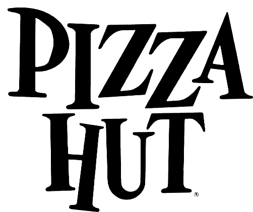
1974–1999, 2019–present (USA)

Introduced in 1974, and designed in collaboration between Lippincott and Pizza Hut marketing executive Sam Moyers, this was the first logo to fully incorporate the iconic red roof. On June 17, 2019, the logo was revived by the company, initially to promote the third season of Netflix's series Stranger Things (which fittingly takes place in the 1980s), but it soon became their main logo alongside the 2014 logo.
1999–2014

In 1999, the chain launched a new logo, designed by Landor Associates, with a new script font and the dot on the "i" in "Pizza" was colored green (possibly representing margherita). Also, a yellow line was placed underneath the script. From 2010 to 2014, it was used as a secondary logo.
2008–2017 (International)
This logo was used in countries in South America and was also used in Hong Kong, Israel, and Southeast Asia. It was introduced in 2008 and is used internationally until 2017.
2010 (North American prototype)
This logo was only used at a series of prototype locations in Peoria and Peoria Heights in Illinois. This was used during a proposed reformatting which explored the concept of the restaurant chain changing to being exclusively a carry-out chain. This logo was eventually removed from said locations, and its branding was replaced by the next logo.
2010–2014

In February 2010, the "red roof" design was given a glossy look, and the script was modified. This logo was still used at some locations until the end of 2015.
2014 (North America)

In February 2014, the yellow stripe at the bottom of the wordmark and the green dot on the "i" in "Pizza" were dropped from the logo, the wordmark was tilted and moved down further from the "red roof" design. This logo is still used in some countries.
2014–2019, 2017-present (international)
In November 2014, Pizza Hut announced a major change to their menu and the look of their restaurants. They also announced a new logo and box design, which were launched on November 19. The logo consists of the short-lived logo in white, placed on a red circle drawn much akin to a brush stroke. The red circle also, appropriately, looks like tomato sauce being spread around on a pizza. On boxes, a variant which has only the roof inside the circle is used. Despite being replaced with the 1975 logo on advertising, this logo is also still being used on most locations, as well as the website and app.
| U.S. restaurant chains: Banh Shop | KFC (SoCal) | Pizza Hut (Express | WingStreet) | Taco Bell (Express) | The Habit Burger Grill International chains: Former chains: |