This page only shows primary logo variants. For other related logos and images, see:
|
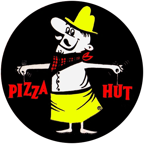
| 1967–1999 | February–November 2014 | ||||
| 1958–1967 | 1967–1999 | 1999–2014 | 2010–2014 | February–November 2014 | 2014–present |
1958–1967
.svg "Pizza Hut (1958).svg (7 KB)")
In 1958, the Pizza Hut restaurant was first commenced. Its first logo featured its only mascot Pete holding the words "Pizza" and "Hut".
1967–1999 (United States), 1969–1999 (International)

In 1967, the chain began using a new and simplified logo featuring the now-famous "red roof" design (which is still used albeit in a modified form today). Also, the roof color for new restaurants at the time was changed from brown to red. It is still used at a few scant locations.
1999–present
1999–2014 (United States), 1999–2008 (International)

In 1999, the chain launched a new logo similar to the previous one, but with a script font being used rather than the previous serif font. Also, the dot on the "i" in "Pizza" was colored green, and a yellow line was placed underneath the script. New and renovated restaurants that no longer use the "red roof" design instead use new branding (also known as WingStreet since 2003), with larger square feet, larger seating capacity, modern interior features, pick-up window for carry-out orders and free Wi-Fi. However, some renovated restaurants still retain the shape of the previous design, but with newer exterior paneling and modernized interior features. Some unrenovated "red roof" restaurants only updated to this logo. During 2010-2014 it was still being used as a secondary logo.
2008–2016 (International)
This logo is used in countries in South America and is also used in Hong Kong, Israel and Southeast Asia. It was introduced in 2008 and is used internationally until 2016.
2010 (North American prototype)
This logo was only used at a series of prototype locations in Peoria and Peoria Heights in Illinois. This was used during a proposed reformatting which explored the concept of the restaurant chain changing to being exclusively a carry-out chain. This logo was eventually removed from said locations, and its branding was reverted to the previous logo.
2010–2014 (United States and International)
In February 2010, the "red roof" design was given a glossy look, and the script was modified. This logo was still used at some locations until the end of 2015.
February–November 2014 (North American)
In February 2014, the yellow stripe at the bottom of the wordmark and the green dot on the "i" in "Pizza" were dropped from the logo, and the wordmark was tilted and moved down further from the "red roof" design. This logo is still used in some countries.
2014–present (United States), 2016-present (International)
In November 2014, Pizza Hut announced a major change to their menu and the look of their restaurants. They also announced a new logo and box design, which were launched on November 19, 2014. The logo consists of the February 2014 logo in white, placed on a red circle drawn much akin to a brush stroke. On boxes, a variant which has only the roof inside the circle is used. This logo later debuted in Asia in 2016 and in South America in 2017.
| U.S. restaurant chains: Banh Shop | KFC (SoCal) | Pizza Hut (Express | WingStreet) | Taco Bell (Express) | The Habit Burger Grill International chains: Former chains: |