1994–1997[]
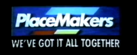
1997–October 2001[]
The PlaceMakers title card used in their television advertisements from around 1997 until 2001. This logo is reminiscent from the previous version used until the time this logo was created. The classic PlaceMakers font these days is still in use. The red and yellow lines swapped positions and had been flattened, spread out across the words, and improved in the making of the design for the current logo. In late 2001, there became a newer, smaller version of this logo, and the words were changed to an Italic-styled font, and the slogan was typeset in blue instead of white. This logo, however, tends to be a fraction larger than it's predecessor.
2001–2004[]
")
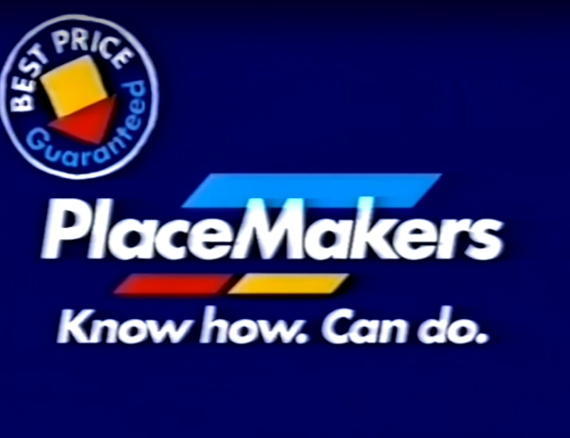
The card for the PlaceMakers television advertisements as seen from June-ish in 2002 until at least 2005. The previous logo card, on a blue background, featured an introduction to the slogan "Know how. Can do," along with the jingle used from somewhere around 1996-1997 until the period between 2002 and 2005. This is a smaller version of the logo used until 2002, but instead of a blue background, it features a yellow timber wall.
2004–present[]
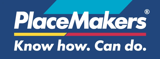
There were lots of changes in this logo, the lines had been swapped, flattened, extended, joined together and improved, and the font was taken back to a similar size of its 1997-2002 variant. The jingle for the new advertisements was changed to a heavier, rock instrumental with an updated version of the older jingle at the end in around 2007. The jingle from that time has still been used in some recent PlaceMakers radio advertisements, but was discontinued from TV in 2009, and changed to a faster instrumental. A lighter, similar-sounding version of the 2007-08 variant of the current jingle was recorded for the advertisements and other promotional purposes, specifically, and is still heard along with the current logo on the TV and radio advertisements from around late 2009 until the present day.