Until 1988, Pringles was spelt with an apostrophe before the "s". The mascot Mr. Pringle was designed in 1967, with this logo design.
1981–1986[]
SVG NEEDED
Designer:
Unknown
Typography:
Unknown
Launched:
April 1981
Print version
1986–1988[]
Designer:
Unknown
Typography:
Custom
Launched:
January 1986
In 1986, Mr. Pringle's face became rounder, his eyes were more apparent and his mustache was slightly changed.
Print version
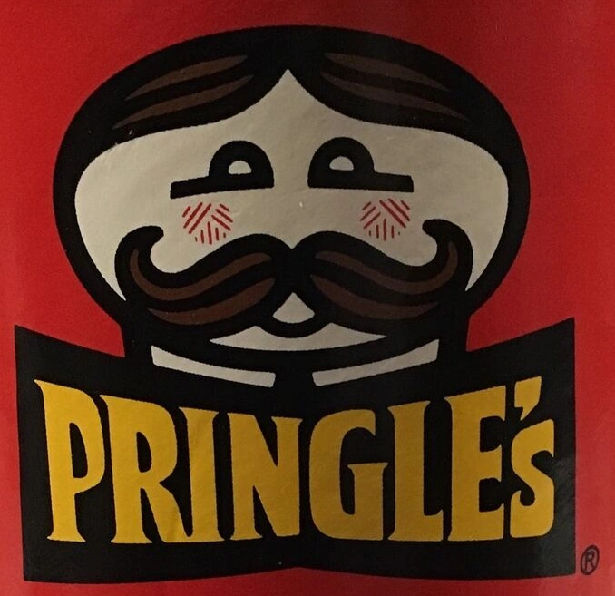
Pringles[]
1988–1996[]
Designer:
Unknown
Typography:
Custom
Launched:
1988
Minor changes were made to the logo in 1988; the shirt collar of Mr. Pringle is no longer visible and the apostrophe in "PRINGLE'S" was also dropped. This logo was brought back in 2011 for a series of "Rewind Edition" Pringles cans.
1996–2001[]
Designer:
Unknown
Typography:
Custom
Launched:
October 9, 1996
Print version
Mr. Pringles' rosy cheeks and visible mouth disappeared in October 1996.
1999 (prototype)[]
Designer:
Unknown
Typography:
CCZoinks
Launched:
1999
Print version
On a trademarking website, there was an early version of the 2002 logo, not much is different from the final version, the mustache, eyes, and the bowtie are there in the final version. (The trademark for this was filed in 1999.)
2001–2009[]
Designer:
Unknown
Typography:
Bodega Sans Medium (modified)
Launched:
September 19, 2001
Print version
Alternate version
Alternate print version
Print wordmark
In September 2001, the eyebrows were dropped, and a red bow tie was added, plus a new lowercase wordmark was introduced. Mr. Pringles' hairstyle was also changed. This logo is still used on Snack Stacks containers.
2009–2020 (United States), 2009–2021 (Europe, Philippines, and parts of Asia), 2009–present (international)[]
Designer:
Unknown
Typography:
Bodega Sans Medium (modified)
Launched:
2009
In 2009, a more jazzed up version of Mr. Pringles was launched with an updated wordmark and the "i" now dotted with a chip/crisp. The logo got replaced in the United States, Oceania and parts of Asia in 2020; in Europe in 2021 and in Latin America and Canada in 2022. However, it is still used in Certain parts of Asia.[1]
2020–2021 (United States)[]
Designer:
Unknown
Typography:
Bodega Sans Medium (modified)
Launched:
December 31, 2020
In December 2020, Pringles unveiled a simplified logo in the United States. Mr. Pringles' design was simplified with his hair removed, his eyebrows were brought back, the white shine was removed from the eyes, and also the outline was removed, and the bow-tie was minimized and made sharper. The 2009 wordmark remains, but the proportion has been slightly tweaked. The logo was often seen on a non-white background. This logo received generally negative feedback from critics and fans. This was also used in Latin America as a test logo.
An alternate variant of the US 2020 logo with a wordmark instead based on the first three Pringles logos from 1967, 1986 and 1996 with his bow-tie removed was revealed on December 31 via social media by Pringles Taiwan.[2] It began rolling out in early 2021. On September 21 2021, it was announced that the logo would also start rolling out across Europe.[3]
This logo is currently used in Europe, Asia, America and Africa. It is often seen on a red background.
In late 2021, this logo started appearing on packages of Pringles in the US.
")

")


")

")

")
")
")
")

")
")
")
")