This page only shows primary logo variants. For other related logos and images, see:
|
| 2010 | 2010–2011 | 2011–2013 | 2013–2018 | 2014–2018 |
Bidding & Interim
2010
The logo for PyeongChang's 2018 Olympic application was revealed on January 14, 2010 in Seoul by Yang-ho Cho and Jin-sun Kim, chairmen of the bid committee.
- "The logo shows the spectacular winter scenery of PyeongChang with snowing on the mountains. The dynamics of Olympics and the challenge spirit to victory was represented by the gushing curve. It implies the strong will to win the bid with the curve symbolizing a snowboard and slope of winter sports."
- - PyeongChang 2018 news article
2010–2011
In June 2010, the IOC declared that all three applicants had become candidate cities. The logos were updated, and the Olympic rings were added.
2011–2013
Olympics
2013–2018
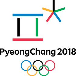
In May 2013, the official logo of the 2018 PyeongChang Winter Olympics was revealed.
The logo is an abstract motif inspired by Hangul, the alphabet of the phonetic Korean language. It is composed of the first consonants of the name of the host city, PyeongChang.
- The 'ㅍ'(P) is the first consonant of the first syllable, Pyeong. It also symbolises the open square where the celebration of athletes and winter sports will take place.
- The 'ㅊ'(Ch) is the first consonant of the second syllable, Chang. It symbolises the natural environment of snow and ice, and the stellar achievements of the athletes - the stars of the Games.
- The colours reflect the Olympic Flag, and they also represent the five traditional colours of Korea.
Paralympics
2014–2018


