(Adding categories) |
|||
| Line 76: | Line 76: | ||
[[Category:Brazil]] |
[[Category:Brazil]] |
||
[[Category:1953]] |
[[Category:1953]] |
||
| + | [[Category:São Paulo city]] |
||
| + | [[Category:São Paulo]] |
||
Revision as of 01:59, 22 May 2014
TV Record
1953-1970

The first Rede Record logo is a compass with the letters T and V on it, and the name Record below it.
1970-1971
The logo features a square with a number 7 symbol and the name "TV Record".
1971-1972

The logo features the name Record with a circle 7 logo as the "O" of the wordmark.
1972-1973

The 1971 logo is adjoined by an insignia resembling Rede Record's transmitter tower used during that time.
1973-1975

Upon shifting to color, Rede Record's logo was modified, now having the RGB colors on the C, O, and R letters.
1975-1976

The 1973 logo is adjoined by a tiger that is drawn by crayons.
1976-1980

The logo features a sun with the name TV Record below it.
1980-1986

The logo features the Record word mark with a rainbow placed above it.
1986-1990
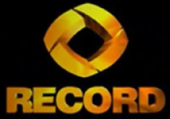
The rainbow was discarded in 1986 in favor of an all-gold colored logo with a four-sided rhombus as its symbol.
Rede Record
1990-1992
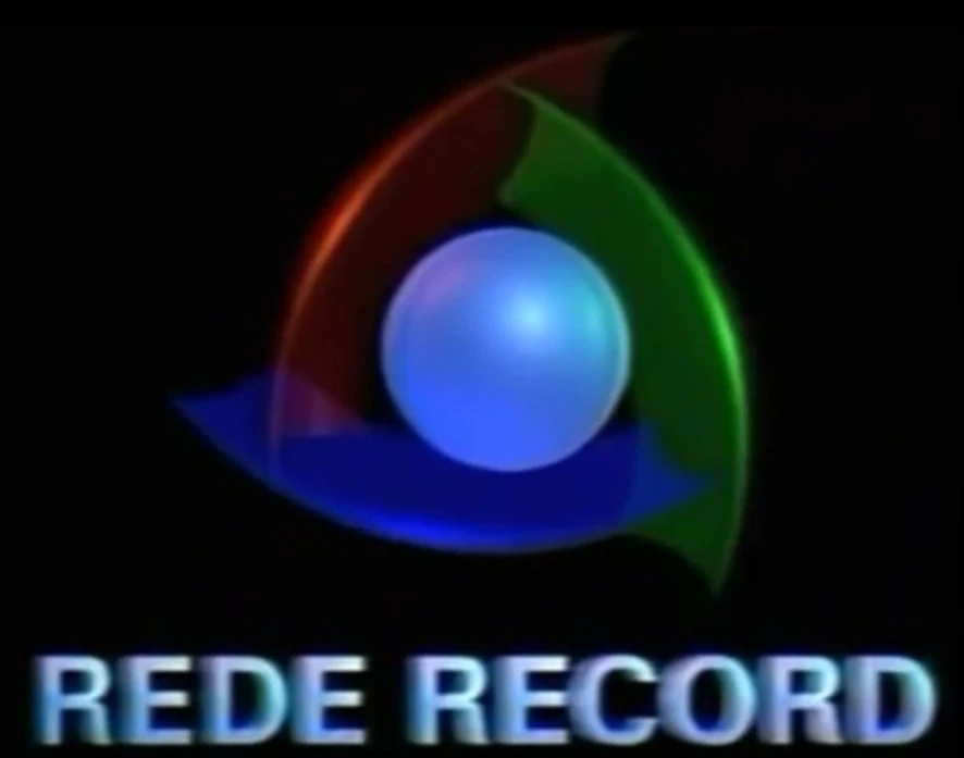
The first design of the present logo appeared in 1990: It then featured a light blue sphere surrounded by curved RGB metal plates. When it was released, the symbol originally resembled a cyclone.
At the same time, TV Record changed its name to Rede Record, and the wordmark was changed from just "TV Record" to its new name, "Rede Record", which would last until 2003.
1992-1995
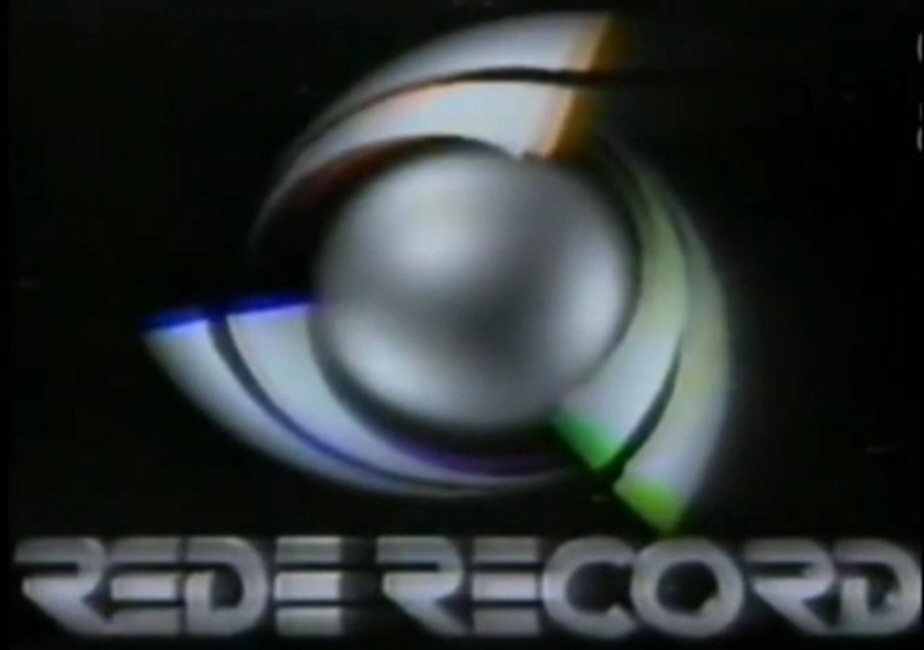
The symbol was given a shade of silver, the plates became tsunami waves and split into six, and the Rede Record word mark shifted to a more futuristic theme, a theme that would be used for the next two decades.
1995-2001
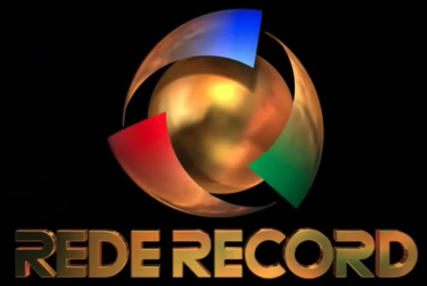
The symbol featured the six waves merging to form just 3 waves. It retained the shade of silver until 1997, when it was replaced by a shade of gold.
1999-2002

The logo is just the same, except that the Rede Record word mark was moved to the center of the symbol.
2002-2005

The waves gained a slight tweak, the sphere started to bear the texture of planet Earth (indicating their international expansion thru Record Internacional) and the Rede Record wordmark was moved back to the bottom, and was reverted back to simply appearing as "Record". Despite the name change on the logo, Rede Record remains as the network's legal name.
2005-2007

The logo featured the symbol gaining a glossy texture.
2007-2012
The symbol was given a revamp in 2007. In this logo, the gold shade on the waves was completely eliminated (allowing each wave to appear in their color), the globe was given a simplified texture highlighting the Earth's continents, and the Record wordmark was slightly modified.
2012-present

The logo was given another revamp in 2012. In this logo, the globe is stuck and integrated with the waves (which were revamped into new versions of curved RGB plates, the former state of the waves when the symbol was first used) making it more "polished". As for the wordmark, it was given a minor tweak and now resembles its 1992 and 1995 predecessors, this time without the "Rede" part of the wordmark.
")
")