|
|
| (18 intermediate revisions by 12 users not shown) |
| Line 1: |
Line 1: |
| − |
{{Primary Logos|Logo Variations|Anniversary|On-Screen Watermarks|Unused|Genres and Slogan|Plim Plim}} |
+ |
{{Primary Logos|Logo Variations|Anniversary|Genres and Slogan|On-Screen Watermarks|Unused|Plim Plim}} |
| |
{{ImageTOC |
|
{{ImageTOC |
| |
|Globo Logo 1965.svg|1965–1966 |
|
|Globo Logo 1965.svg|1965–1966 |
| |
|Globo Logo 1966.svg|1966–1976 |
|
|Globo Logo 1966.svg|1966–1976 |
| |
|Globo logo 1975.svg|1976–1985 |
|
|Globo logo 1975.svg|1976–1985 |
| − |
|Rede Globo logo 1986.svg|1985–1989 |
+ |
|27676170267_493e9b0e1c_b.jpg|1985–1989 |
| |
|Rede_Globo_1989.png|1989–1991 |
|
|Rede_Globo_1989.png|1989–1991 |
| |
|Rede_Globo_1991.png|1991-1992 |
|
|Rede_Globo_1991.png|1991-1992 |
| Line 17: |
Line 17: |
| |
'''Rede Globo''', or simply '''Globo''', is a Brazilian free-to-air television network. Globo is the largest commercial TV network in Latin America and the second-largest commercial TV network of the world just behind [[ABC (United States)|ABC]] and the largest producer of telenovelas. |
|
'''Rede Globo''', or simply '''Globo''', is a Brazilian free-to-air television network. Globo is the largest commercial TV network in Latin America and the second-largest commercial TV network of the world just behind [[ABC (United States)|ABC]] and the largest producer of telenovelas. |
| |
==1965–1966== |
|
==1965–1966== |
| − |
[[File:Globo Logo 1965.svg|center|250px]] |
+ |
[[File:Globo Logo 1965.svg|center|200px]] |
| − |
Globo's first logo was a 4-pointed star based on it's station in Rio de Janeiro (Channel 4). This logo was created by''' Aloísio Magalhães'''. It is based in the shape of a pinwheel. |
+ |
Globo's first logo was a 4-pointed star based on its station in Rio de Janeiro (Channel 4). This logo was created by''' Aloísio Magalhães'''. It is based off the shape of a pinwheel. |
| |
|
|
|
| |
==1966–1976== |
|
==1966–1976== |
| − |
[[File:Globo Logo 1966.svg|center|220px]] |
+ |
[[File:Globo Logo 1966.svg|center|200px]] |
| − |
This is the first logo to symbolize a globe, which the current logo still symbolizes today. It was created by Borjalo. |
+ |
This is the first logo to symbolize a globe, which the current logo still symbolizes today. It was created by Mauro Borja Lopes. |
| |
|
|
|
| |
===1970–1972=== |
|
===1970–1972=== |
| − |
[[File:Rm OCafona watermark.png|center|250px]] |
+ |
[[File:RedeGlobo-1970.png|center|250px]] |
| |
|
|
|
| |
{{Better logo needed}} |
|
{{Better logo needed}} |
| |
⚫ |
Globo introduced an extention to their logo in 1970. The 7 rings represented the 7 original affiliates of Globo. |
| |
|
|
|
| − |
===1972–1976=== |
+ |
===1972–1975=== |
| |
[[File:Globo Logo 1974.svg|center|250px]] |
|
[[File:Globo Logo 1974.svg|center|250px]] |
| |
+ |
Version without the "De Televisiao" text. |
| ⚫ |
Globo introduced a new logo in 1969. The 7 circles represented the 7 stations during that time period. |
|
| |
|
|
|
| |
==1976–2008== |
|
==1976–2008== |
| Line 46: |
Line 47: |
| |
===1983–1985=== |
|
===1983–1985=== |
| |
[[File:Rede Globo Logo Fim De Ano 1984.png|center|200px]] |
|
[[File:Rede Globo Logo Fim De Ano 1984.png|center|200px]] |
| |
+ |
In 1983, the globo appeared for the first time in full 3D, in the "Abre-Alas" and "Prédio" IDs. |
| |
|
|
|
| |
===1985–1992=== |
|
===1985–1992=== |
| |
====1985-1989==== |
|
====1985-1989==== |
| − |
[[File:Rede Globo logo 1986.svg|center|200px]] |
|
| |
|
|
|
| |
|
|
|
| |
⚫ |
[[File:Untitled_2.png|thumb|200px|center]]The Globo logo was given another major facelift in 1986, in which the screen has been filled with rainbow-colored gradients. |
| − |
|
|
| − |
{{Better logo needed|Does not represent the real logo}} |
|
| ⚫ |
The Globo logo was given another major facelift in 1986, in which the screen has been filled with rainbow-colored gradients. |
|
| |
|
|
|
| |
====1989-1991==== |
|
====1989-1991==== |
| |
[[File:Rede_Globo_1989.png|center|200px]] |
|
[[File:Rede_Globo_1989.png|center|200px]] |
| − |
In 1989, the inner sphere lost a white reflection. |
+ |
In 1989, the inner sphere no longer has a white reflection, and the metal is now darker. |
| |
|
|
|
| |
====1991-1992==== |
|
====1991-1992==== |
| |
[[File:Rede_Globo_1991.png|center|200px]] |
|
[[File:Rede_Globo_1991.png|center|200px]] |
| − |
The rainbow gradient inside the logo is now formed by triangles (which is that way up until 2008). |
+ |
The rainbow gradient inside the logo is now formed by triangles (which is mainstay up until 2008). |
| |
|
|
|
| |
===1992–2008=== |
|
===1992–2008=== |
| |
====1992–1996==== |
|
====1992–1996==== |
| |
[[File:Rede Globo Logo 1992.png|center|200px]] |
|
[[File:Rede Globo Logo 1992.png|center|200px]] |
| − |
On April 8, 1992, the logo is revised, with the three-dimensional spheres being ray-traced, an innovation at that time. Reflections and glows are also added to the logo. |
+ |
On April 8, 1992, the logo has taken an overhaul, with the three-dimensional spheres being ray-traced, an innovation at that time. Reflections and glows are also added to the logo, as well as the edges of the "screen" being more rounded and bent. |
| |
|
|
|
| |
====1996–2000==== |
|
====1996–2000==== |
| Line 79: |
Line 78: |
| |
====2005–2008==== |
|
====2005–2008==== |
| |
[[File:RedeGlobo2005.png|center|200px]] |
|
[[File:RedeGlobo2005.png|center|200px]] |
| − |
In 2005, the previous logo become lighter and has its texture color "inverted" in a way. |
+ |
In 2005, the previous logo become lighter, shinier and has its texture color "inverted" in a way. |
| |
|
|
|
| |
==2008–present== |
|
==2008–present== |
| Line 86: |
Line 85: |
| |
===2008–2014=== |
|
===2008–2014=== |
| |
[[File:Globo logotipo 2008.png|center|200px]] |
|
[[File:Globo logotipo 2008.png|center|200px]] |
| − |
In 2008, the Globo logo received its biggest refresh during that time (until 2014), in time for the launch of digital television in Brazil. The "screen" in the center of the symbol was modified to 16:9 aspect ratio, and the colors are now made out of scan lines. The spheres' metallic texture have also been more simplified. This is also the last logo to use the metallic texture, albeit with a more simplified feel to it. An [[Rede Globo/Unused|unused version of this logo]] features the 4:3 screen. |
+ |
In 2008, the Globo logo received its biggest refresh during that time (until 2014), in time for the launch of digital television in Brazil. The "screen" in the center of the symbol was modified to 16:9 aspect ratio, and the colors are now made out of scan lines. The spheres' metallic texture have also been more simplified, looking more like chrome. This is also the last logo to use the metallic texture, albeit with a more simplified feel to it. An [[Rede Globo/Unused|unused version of this logo]] features the 4:3 screen. |
| |
|
|
|
| |
===2014–present=== |
|
===2014–present=== |
| |
====2014–2015==== |
|
====2014–2015==== |
| |
[[File:Rede Globo logo 2014 2.png|center|200px]] |
|
[[File:Rede Globo logo 2014 2.png|center|200px]] |
| − |
On April 6, 2014, Rede Globo began using a newly redesigned version of their iconic logo, which was worked on since April 2013 and has been officially revealed three days prior to the launch. The current symbol, created by Hans Donner and in-house, now drops the highly stylized metallic look in favor of a simplified gloss/gradient texture, along with a new gentle wave motion effect for the colors of the "screen". |
+ |
On April 6, 2014, Rede Globo began using a newly redesigned version of their iconic logo, which was worked on since April 2013 and has been officially revealed three days prior to the launch. The new logo, created by Hans Donner and in-house, now drops the highly stylized metallic look in favor of a simplified gloss/gradient texture, along with a new gentle wave motion effect for the colors of the "screen". |
| |
|
|
|
| |
The new logo approaches the trend of two-dimensional design, often being used by the broadcaster since 2013. Its continuous onscreen movements lead the commercial broadcaster with a new message: "Globo is moving to follow the life, the world, and the viewer." |
|
The new logo approaches the trend of two-dimensional design, often being used by the broadcaster since 2013. Its continuous onscreen movements lead the commercial broadcaster with a new message: "Globo is moving to follow the life, the world, and the viewer." |
| Line 101: |
Line 100: |
| |
====2015–present==== |
|
====2015–present==== |
| |
[[File:Logo-tv-globo-2015.png|center|200px]] |
|
[[File:Logo-tv-globo-2015.png|center|200px]] |
| − |
On March 15, 2015, Rede Globo slightly modified their logo, with the gloss effect being lighter, and the colors of the "screen" more vivid. |
+ |
On March 15, 2015, Rede Globo modified their logo, making it more flat-shaded. |
| |
|
|
|
| |
==External links== |
|
==External links== |
| Line 107: |
Line 106: |
| |
*[https://livrodamarcaglobo.com/ Livro da Marca Globo (''Globo Brand Book'')] (in Portuguese) |
|
*[https://livrodamarcaglobo.com/ Livro da Marca Globo (''Globo Brand Book'')] (in Portuguese) |
| |
|
|
|
| |
+ |
{{Television Networks BR}} |
| |
{{Rede Globo}} |
|
{{Rede Globo}} |
| |
{{Grupo Globo}} |
|
{{Grupo Globo}} |
This page only shows primary logo variants. For other related logos and images, see:
|
Rede Globo, or simply Globo, is a Brazilian free-to-air television network. Globo is the largest commercial TV network in Latin America and the second-largest commercial TV network of the world just behind ABC and the largest producer of telenovelas.
1965–1966
Globo's first logo was a 4-pointed star based on its station in Rio de Janeiro (Channel 4). This logo was created by Aloísio Magalhães. It is based off the shape of a pinwheel.
1966–1976
This is the first logo to symbolize a globe, which the current logo still symbolizes today. It was created by Mauro Borja Lopes.
1970–1972

|
BETTER LOGO NEEDED
|
Globo introduced an extention to their logo in 1970. The 7 rings represented the 7 original affiliates of Globo.
1972–1975
Version without the "De Televisiao" text.
1976–2008
1976–1981
In 1976, German/Austrian designer Hans Donner was hired to redesign Globo's symbol. The result consists of a sphere representing the Earth (hence, globo), a rounded rectangular cutout representing a television screen, and a second sphere within the "screen". This design would later be the basis for the logos that follow.
1981–1983
In April 1981, the logo was given a 3D metal texture. The idents shown during the period were animated by Pacific Data Images.
1983–1985
In 1983, the globo appeared for the first time in full 3D, in the "Abre-Alas" and "Prédio" IDs.
1985–1992
1985-1989
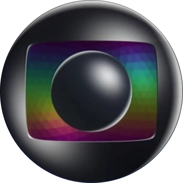
The Globo logo was given another major facelift in 1986, in which the screen has been filled with rainbow-colored gradients.
1989-1991
In 1989, the inner sphere no longer has a white reflection, and the metal is now darker.
1991-1992
The rainbow gradient inside the logo is now formed by triangles (which is mainstay up until 2008).
1992–2008
1992–1996
On April 8, 1992, the logo has taken an overhaul, with the three-dimensional spheres being ray-traced, an innovation at that time. Reflections and glows are also added to the logo, as well as the edges of the "screen" being more rounded and bent.
1996–2000
In 1996, the previous logo receives minor enhancements, becoming darker and earning bolder lines. The brightness is also emphasized in the new symbol.
2000–2005
In 2000, the previous logo receives a simplified metallic texture. It was launched on April 1, 2000, along with the "Globo Glass" series of idents, in which the logo was rendered on transparent glass, reflecting the scenery of various locations in Brazil.
2005–2008
In 2005, the previous logo become lighter, shinier and has its texture color "inverted" in a way.
2008–present
2008–2014
In 2008, the Globo logo received its biggest refresh during that time (until 2014), in time for the launch of digital television in Brazil. The "screen" in the center of the symbol was modified to 16:9 aspect ratio, and the colors are now made out of scan lines. The spheres' metallic texture have also been more simplified, looking more like chrome. This is also the last logo to use the metallic texture, albeit with a more simplified feel to it. An unused version of this logo features the 4:3 screen.
2014–present
2014–2015
On April 6, 2014, Rede Globo began using a newly redesigned version of their iconic logo, which was worked on since April 2013 and has been officially revealed three days prior to the launch. The new logo, created by Hans Donner and in-house, now drops the highly stylized metallic look in favor of a simplified gloss/gradient texture, along with a new gentle wave motion effect for the colors of the "screen".
The new logo approaches the trend of two-dimensional design, often being used by the broadcaster since 2013. Its continuous onscreen movements lead the commercial broadcaster with a new message: "Globo is moving to follow the life, the world, and the viewer."
2015–present
On March 15, 2015, Rede Globo modified their logo, making it more flat-shaded.
External links
Template:Television Networks BR
TV Globo
|
TV Globo original telenovelas
|
Malhação
Malhação.com | ID | Cidade Partida | Conectados | Intensa Como a Vida | Casa Cheia | Sonhos | Seu Lugar no Mundo • Pro Dia Nascer Feliz | Viva a Diferença | Vidas Brasileiras | Toda Forma de Amar
6pm
1970s: Meu Pedacinho de Chão (1971) | Bicho do Mato (1972) | A Patota | Helena | O Noviço | Senhora | A Moreninha (1975) | Vejo a Lua no Céu | O Feijão e o Sonho | Escrava Isaura | À Sombra dos Laranjais | Dona Xepa (1977) | Sinhazinha Flô | Maria, Maria | Gina | A Sucessora | Memórias de Amor | Cabocla (1979)
1980s: Olhai os Lírios do Campo | Marina (1980) | As Três Marias | Ciranda de Pedra (1981) | Terras do Sem-Fim | O Homem Proibido (1982) | Paraíso (1982) | Pão Pão, Beijo Beijo | Voltei pra Você | Amor com Amor Se Paga | Livre para Voar | A Gata Comeu | De Quina pra Lua | Sinhá Moça (1986) | Direito de Amar | Bambolê | Fera Radical | Vida Nova | Pacto de Sangue | O Sexo dos Anjos
1990s: Gente Fina | Barriga de Aluguel | Salomé | Felicidade | Despedida de Solteiro | Mulheres de Areia (1993) | Sonho Meu | Tropicaliente | Irmãos Coragem (1995) | História de Amor | Quem É Você? | Anjo de Mim | O Amor Está no Ar | Anjo Mau (1997) | Era uma Vez... | Pecado Capital (1998) | Força de um Desejo
2000s: Esplendor | O Cravo e a Rosa | Estrela-Guia | A Padroeira | Coração de Estudante | Sabor da Paixão | Agora É que São Elas | Chocolate com Pimenta | Cabocla (2004) | Como uma Onda | Alma Gêmea | Sinhá Moça (2006) | O Profeta (2006) | Eterna Magia | Desejo Proibido | Ciranda de Pedra (2008) | Negócio da China | Paraíso (2009) | Cama de Gato
2010s: Escrito nas Estrelas | Araguaia | Cordel Encantado | A Vida da Gente | Amor Eterno Amor | Lado a Lado | Flor do Caribe | Joia Rara | Meu Pedacinho do Chão (2014) | Boogie Oogie | Sete Vidas | Além do Tempo | Êta Mundo Bom! | Sol Nascente | Novo Mundo | Tempo de Amar | Orgulho e Paixão | Espelho da Vida | Órfãos da Terra | Éramos Seis (2019)
2020s: Nos Tempos do Imperador | Além da Ilusão | Mar do Sertão | Amor Perfeito | Elas por Elas (2023) | No Rancho Fundo
7pm
1960s: Rosinha do Sobrado | A Moreninha (1965) | Padre Tião | O Santo Mestiço | A Grande Mentira | A Cabana do Pai Tomás
1970s: Pigmalião 70 | A Próxima Atração | Minha Doce Namorada | O Primeiro Amor | Uma Rosa Com Amor (1972) | Carinhoso | Supermanoela | Corrida do Ouro | Cuca Legal | Bravo! | Anjo Mau (1976) | Estúpido Cupido | Locomotivas | Sem Lenço, sem Documento | Te Contei? | Pecado Rasgado | Feijão Maravilha | Marron Glacé
1980s: Chega Mais | Plumas e Paetês | O Amor É Nosso | Jogo da Vida | Elas por Elas (1982) | Final Feliz | Guerra dos Sexos (1983) | Transas e Caretas | Vereda Tropical | Um Sonho a Mais | Ti Ti Ti (1985) | Cambalacho | Hipertensão | Brega & Chique | Sassaricando | Bebê a Bordo | Que Rei Sou Eu? | Top Model
1990s: Mico Preto | Lua Cheia de Amor | Vamp | Perigosas Peruas | Deus Nos Acuda | O Mapa da Mina | Olho no Olho | A Viagem (1994) | Quatro por Quatro | Cara & Coroa | Vira Lata | Salsa e Merengue | Zazá | Corpo Dourado | Meu Bem Querer | Andando nas Nuvens | Vila Madalena
2000s: Uga Uga | Um Anjo Caiu do Céu | Desejos de Mulher | O Beijo do Vampiro | Kubanacan | Da Cor do Pecado | Começar de Novo | A Lua Me Disse | Bang Bang | Cobras & Lagartos | Pé na Jaca | Sete Pecados | Beleza Pura | Três Irmãs | Caras & Bocas
2010s: Tempos Modernos | Ti Ti Ti (2010) | Morde & Assopra | Aquele Beijo | Cheias de Charme | Guerra dos Sexos (2012) | Sangue Bom | Além do Horizonte | Geração Brasil | Alto Astral | I Love Paraisópolis | Totalmente Demais | Haja Coração | Rock Story | Pega Pega | Deus Salve o Rei | O Tempo Não Para | Verão 90 | Bom Sucesso
2020s: Salve-se Quem Puder | Quanto Mais Vida Melhor! | Cara e Coragem | Vai na Fé | Fuzuê | Família é Tudo
8pm/9pm
1960s: O Ébrio | O Rei dos Ciganos | A Sombra de Rebecca | Anastácia, A Mulher sem Destino | Sangue e Areia | Passo dos Ventos | Rosa Rebelde | Véu de Noiva
1970s: Irmãos Coragem (1970) | O Homem que Deve Morrer | Selva de Pedra (1972) | Cavalo de Aço | O Semideus | Fogo sobre Terra | Escalada | Pecado Capital (1975) | O Casarão | Duas Vidas | Espelho Mágico | O Astro (1977) | Dancin' Days | Pai Herói | Os Gigantes
1980s: Água Viva | Coração Alado | Baila Comigo | Brilhante | Sétimo Sentido | Sol de Verão | Louco Amor | Champagne | Partido Alto | Corpo a Corpo | Roque Santeiro | Selva de Pedra (1986) | Roda de Fogo | O Outro | Mandala | Vale Tudo | O Salvador da Pátria | Tieta
1990s: Rainha da Sucata | Meu Bem, Meu Mal | O Dono do Mundo | Pedra sobre Pedra | De Corpo e Alma | Renascer (1993) | Fera Ferida | Pátria Minha | A Próxima Vítima | Explode Coração | O Fim do Mundo | O Rei do Gado | A Indomada | Por Amor | Torre de Babel | Suave Veneno | Terra Nostra
2000s: Laços de Família | Porto dos Milagres | O Clone | Esperança | Mulheres Apaixonadas | Celebridade | Senhora do Destino | América | Belíssima | Páginas da Vida | Paraíso Tropical | Duas Caras | A Favorita | Caminho das Índias | Viver a Vida
2010s: Passione | Insensato Coração | Fina Estampa | Avenida Brasil | Salve Jorge | Amor à Vida | Em Família | Império | Babilônia | A Regra do Jogo | Velho Chico | A Lei do Amor | A Força do Querer | O Outro Lado do Paraíso | Segundo Sol | O Sétimo Guardião | A Dona do Pedaço | Amor de Mãe
2020s: Um Lugar ao Sol | Pantanal (2022) | Travessia | Terra e Paixão | Renascer (2024)
10pm/11pm/Superseries
Ilusões Perdidas | Marina (1965) | Paixão de Outono | Um Rosto de Mulher | Eu Compro esta Mulher | O Sheik de Agadir | A Rainha Louca | O Homem Proibido (1967) | A Gata de Vison | A Última Valsa | A Ponte dos Suspiros | Verão Vermelho | Assim na Terra como no Céu | O Cafona | Bandeira 2 | O Bofe | O Bem-Amado (1972) | Os Ossos do Barão | O Espigão | O Rebu (1974) | Gabriela (1975) | O Grito | Saramandaia (1976) | Nina | O Pulo do Gato | Sinal de Alerta | Eu Prometo | Araponga | O Astro (2011) | Gabriela (2012) | Saramandaia (2013) | O Rebu (2014) | Verdades Secretas | Liberdade, Liberdade | Os Dias Eram Assim | Onde Nascem os Fortes
Minisseries
1980s: Lampião e Maria Bonita | Avenida Paulista | Quem Ama Não Mata | Moinhos de Vento | Bandidos da Falange | Parabéns pra Você | Padre Cícero | Anarquistas, Graças a Deus | Meu Destino É Pecar | A Máfia no Brasil | Rabo de Saia | O Tempo e o Vento | Tenda dos Milagres | Grande Sertão: Veredas | Anos Dourados | Memórias de um Gigolô | O Pagador de Promessas | O Primo Basílio | Abolição | Sampa | República
1990s: Desejo | A, E, I, O... Urca | Boca do Lixo | Riacho Doce | La Mamma | Meu Marido | O Sorriso do Lagarto | O Portador | Tereza Batista | As Noivas de Copacabana | Anos Rebeldes | Contos de Verão | Sex Appeal | Agosto | A Madona de Cedro | Memorial de Maria Moura | Incidente em Antares | Engraçadinha... Seus Amores e Seus Pecados | Decadência | Guerra de Canudos | Dona Flor e Seus Dois Maridos | Hilda Furacão | Labirinto | O Auto da Compadecida | Chiquinha Gonzaga | Luna Caliente
2000s: A Muralha | A Invenção do Brasil | Aquarela do Brasil | Os Maias | Presença de Anita | O Quinto dos Infernos | Pastores da Noite | A Casa das Sete Mulheres | Um Só Coração | Hoje é Dia de Maria | Mad Maria | JK | Amazônia - De Galvez a Chico Mendes | A Pedra do Reino | Queridos Amigos | Capitu | Maysa - Quando Fala o Coração | Som & Fúria | Cinquentinha
2010s: Dalva e Herivelto - Uma canção de amor | Afinal, o Que Querem as Mulheres? | Amor em 4 Atos | Lara com Z | Dercy de Verdade | O Brado Retumbante | O Canto da Sereia | Amores Roubados | Felizes para Sempre? | Amorteamo | Ligações Perigosas | Justiça | Nada Será Como Antes | Dois Irmãos | Treze Dias Longe do Sol | Se Eu Fechar os Olhos Agora
Upcoming:
6pm:
7pm:
9pm: Mania de Você | Vale Tudo (2025)
|
Current programming:
National newscasts: Hora Um | Bom Dia Brasil | Jornal Hoje | Jornal Nacional | Jornal da Globo | G1 em 1 Minuto (bulletin) | Bem Estar (health bulletin, on Encontro and É de Casa) | Plantão Globo (breaking news)
Local newscasts: Bom Dia Praça | Radar Praça (bulletin) | Praça TV | Bom Dia Sábado
News programming: Linha Direta | Profissão Repórter | Globo Repórter | Pequenas Empresas & Grandes Negócios (entrepreneurship) | Globo Rural (agribusiness) | Fantástico (electronic magazine) | Retrospectiva (end of year) | Eleições (Brazilian elections coverage)
Local news programming: Globo Comunidade (RJ, DF and PE only) | Antena Paulista (SP only)
Telenovelas: No Rancho Fundo | Família é Tudo | Renascer (2024) | Paraíso Tropical (Vale a Pena Ver de Novo, rerun) | Cheias de Charme (rerun)
Varieties: Encontro com Patrícia Poeta | Mais Você | É de Casa | Caldeirão com Mion | Altas Horas | Domingão com Huck
Series: Vai que Cola1 (Sessão Comédia na Madruga) | The Good Doctor2
Talk-shows: Conversa com Bial | Lady Night1 | Que História é Essa, Porchat?3
Movie blocks: Sessão da Tarde | Tela Quente | Sessão de Sábado | Supercine | Corujão | Temperatura Máxima | Domingo Maior | Cinemaço | Cinema Especial (Primetime stop-gap) | Campeões de Bilheteria | Cine BBB (throughout the BBB season)
Sports programming: Globo Esporte | Esporte Espetacular | Segue o Jogo | Auto Esporte (automobiles)
Sports broadcasting: Futebol na Globo (Brasileirão · Copa do Brasil · CONMEBOL Copa América · CONMEBOL Libertadores · FIFA World Cup (Women's) · UEFA Euro) | Vôlei na Globo | Verão Espetacular | Corrida de São Silvestre (last day of the year) | Olympics
Reality shows: Big Brother Brasil (w/ Banijay)
Talent shows: The Masked Singer Brasil (w/ MBC) | Dança dos Famosos4 (w/ Banijay) | Show dos Famosos4 (w/ Banijay) | Batalha do Lip Sync4 (w/ Paramount)
Game shows: Quem Quer Ser Um Milionário?4 (w/ Sony) | The Wall4 (w/ Banijay) | Tem ou Não Tem5 (w/ Fremantle)
Music events broadcasting6: Carnaval Globeleza | Lollapalooza Brazil | Rock in Rio | The Town
Specials: Som Brasil | Criança Esperança | Roberto Carlos Especial | Show da Virada (New Years Eve) | Melhores do Ano4
Special blocks: Sessão Globoplay | Sessão de Natal (Christmas dawn) | Sessão Plim Plim
Religious programming: Santa Missa com Padre Marcelo | Midnight Mass (Christmas day)
1A Multishow original production
2Foreign TV series
3A GNT original production
4Segment from Domingão com Huck
5Segment from Caldeirão com Mion
6Co-broadcasted with Multishow and Globoplay
Defunct programming
National newscasts: Globo Economia | Jornal da Semana | Globo Notícia (bulletin) | Última Edição | Ultranotícias | Jornal Nacional - Segunda Edição | Show das Eleições (elections)
Local newscasts: Globo Cidade (bulletin) | Jornal das Sete | Jornalismo Eletrônico (bulletin)
News programing: Globo Mar | Brasileiros | Linha Direta (Justiça | Mistério) | Globo Notícia (Américas | Europa)
Movie blocks: Sessão Aventura | Cine Fã-Clube | Intercine (Brasil) | Sessão Brasil | Sessão Western | Première Nacional | Corujão (Natal | Ano Novo) | Festival de Verão | Festival de Férias | Festival de Inverno | Festival Primavera | Casa do Terror | Cineclube | Classe A | Código Penal | Cine Radical | Primeira Exibição | Cinema Nacional | Festival de Sucessos | Festival Nacional | Sessão de Gala | Festival Ano Novo (New Year's first week)
Game shows: Zig Zag Arena | Tá Brincando | Os Melhores Anos das Nossas Vidas (w/ Endemol Shine) | Vídeo Game | Ponto a Ponto | Bobeou, Dançou! | Oito ou Oitocentos? | Batalha dos Astros | Guerra dos Sexos
Entertainment/variety: Caldeirão do Huck | Se Joga | Domingão do Faustão | Tamanho Família | Vídeo Show | Amor & Sexo | Lazinho com Você | Estrelas | Adnight Show | Esquenta! | TV Xuxa | Central da Periferia | Planeta Xuxa | Megatom | Gente Inocente | Muvuca | Brasil Legal | Pipoca da Ivete
Talk-shows: Programa do Jô | Na Moral
Kids programming: Turma da Mônica | TV Globinho | Xuxa no Mundo da Imaginação | Bambuluá | Angélica · Angel Mix | Xuxa Park | TV Colosso | Festival de Desenhos | Desenho Especial | Xou da Xuxa | Balão Mágico | Globinho | Sítio do Picapau Amarelo (1977 | 2001 | Animated Series (moved to Cartoon Network)) | Globo Cor Especial
Reality shows: No Limite (w/ Banijay) | Minha Mãe Cozinha Melhor Que a Sua (w/ Fremantle) | Mestre do Sabor | Hipertensão (w/ Endemol) | Jogo Duro (w/ Endemol) | O Jogo
Talent shows: The Voice Brasil (Kids | +) (w/ ITV Studios) | PopStar | SuperStar (w/ Keshet) | Fama (w/ Endemol)
Programming blocks: Terça Nobre | Sexta Super
Sports programming: Corujão do Esporte | Planeta Extremo | Placar da Rodada | FIFA World Cup related shows: Rumo à Copa · Central da Copa | Olympics-related shows: Rumo ao Pódio · Balada Olímpica | The Ultimate Fighter Brasil | Plantão Esportivo da Globo (sports-related breaking news) | Placar Eletrônico | Gols do Fantástico
Sports broadcasting: Formula One | UFC Combate | Futebol na Globo (Paulistão | Cariocão | CONMEBOL Sudamericana) | PanAm Games
Musical programming: Globo de Ouro | Sai do Chão! | Festival Promessas | Cem Anos de Música | Sintonize | Festeja Brasil | Presente de Natal (Christmas Eve)
Religious programming: Sagrado1
Educational programming1: Globo Cidadania: Educação · Ciência · Ecologia · Universidade · Ação | Telecurso2 (Tec2) | Como Será?
Specials: Oscars (free-to-air broadcasting) | Vem aí na Globo | Brasil 500
1Co-broadcasted with Canal Futura.
2Also co-broadcasted with TV Cultura and TV Brasil.
|


