Rede Globo, or simply Globo, is a Brazilian free-to-air television network. Globo is the largest commercial TV network in Latin America and the second-largest commercial TV network of the world just behind ABC and the largest producer of telenovelas.
1965–1966
Designer:
Aloisio Magalhães
Typography:
Trajan
Launched:
Unknown
Rede Globo's first logo, designed by Aloisio Magalhães, is based on a Pinwheel. It's a 4-point star whose lines resemble the number 4, which is a reference to Globo Rio de Janeiro (first and main channel, which is in Channel 4). This logo is short-lived.
1966–1975
Designer:
Mauro Borja Lopes
Typography:
Microgramma
Launched:
Unknown
When Rede Globo launched its channel in São Paulo, the logo was changed. This is the first logo to symbolize a globe, which the current logo still symbolizes today. It was created by Mauro Borja Lopes.
1970–1975
1970-1972
Designer:
Mauro Borja Lopes
Typography:
Microgramma
Launched:
Unknown
Globo introduced an extension to its logo in 1970. The 7 rings represented the 7 original affiliates of Globo.
1972–1975
Designer:
Mauro Borja Lopes
Typography:
Microgramma
Launched:
Unknown
This is a version without the de televisão text. It was launched when Rede Globo started his experimental color broadcasts.
1975–1980
Designer:
Hans Donner Dolphin Productions
Typography:
ITC Avant Garde
Launched:
Unknown
In 1975, German/Austrian designer Hans Donner was hired to redesign Globo's symbol. The result consists of a sphere representing the Earth (hence, globo), a rounded rectangular cutout representing a television screen, and a second sphere within the "screen". This design would later be the basis for the logos that follow. This first version used cyan-white gradients, but some 1977 IDs use a "green" glass texture for it. The on-screen idents were made by Dolphin Productions.
Black and white secondary logo. It was replaced by the iconic monochrome Globo logo in 1980.
In April 1981, the logo was given a 3D metal texture. The idents shown during the period were animated by the Computer Graphics Lab at NYIT (current Pixar Animation Studios).
The Globo logo was given another major facelift in 1986, in which the screen has been filled with rainbow-colored gradients. This image variant was mostly seen during Sign-ons and Sign-offs between 1986-1992. These idents and the next ones are made by a then-new company that Hans Donner founded, "Globograph". Some idents had a gentle motion where the colors of the "screen" were moving upwards, similar to the effect on the current logo.
In 1989, the inner sphere no longer has a white reflection, and the metal is now darker.
1991-1992
SVG NEEDED
Designer:
Hans Donner Globograph
Typography:
ITC Avant Garde
Launched:
Unknown
The rainbow gradient inside the logo is now formed by triangles (which was mainstayed up until 2008). The gradient was also inverted, so the purple was at the top and the red on the bottom.
1992–2008
1992-1994
SVG NEEDED
Designer:
Hans Donner Globograph
Typography:
ITC Avant Garde
Launched:
Unknown
On April 8, 1992, the logo has taken an overhaul, with the three-dimensional spheres being ray-traced, an innovation at that time. Reflections and glows are also added to the logo, as well as the edges of the "screen" being more rounded and bent.
1994–1996
SVG NEEDED
Designer:
Hans Donner Globograph
Typography:
ITC Avant Garde
Launched:
Unknown
1996-2000
SVG NEEDED
Designer:
Hans Donner Globograph
Typography:
ITC Avant Garde
Launched:
Unknown
In 1995, the previous logo receives minor enhancements, becoming darker and earning bolder lines. The brightness is also emphasized in the new symbol.
2000–2004
SVG NEEDED
Designer:
Hans Donner Globograph
Typography:
ITC Avant Garde
Launched:
Unknown
In 2000, the previous logo receives a simplified metallic texture. It was launched on April 1, 2000, along with the "Globo Glass" series of idents, in which the logo was rendered on transparent glass, reflecting the scenery of various locations in Brazil and the world.
2005–2008
SVG NEEDED
Designer:
Hans Donner Globograph
Typography:
ITC Avant Garde
Launched:
Unknown
In 2005, the previous logo becomes lighter, shinier, and has its texture color "inverted" in a way. It was launched due to Globo's 40th Anniversary.
2008–present
Designer:
Hans Donner
Typography:
ITC Avant Garde (2008-present)
Launched:
Unknown
2008–2014
SVG NEEDED
Designer:
Hans Donner Roberto Shimose
Typography:
ITC Avant Garde
Launched:
Unknown
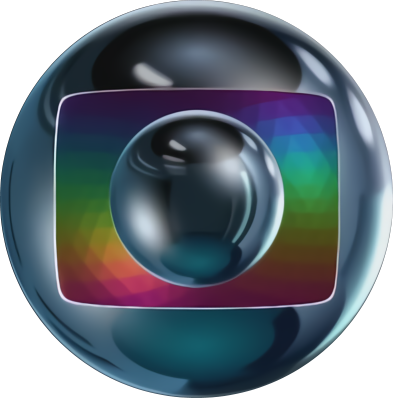
In 2008, the Globo logo received its biggest refresh in 16 years, in time for the launch of digital television in Brazil. The "screen" in the center of the symbol was modified to 16:9 aspect ratio, and the colors are now made out of scan lines. The spheres' chrome texture was totally overhauled and simplified, creating - according to Hans Donner - a smile effect. This version of the logo was originally made around the time the "screen" still used the 4:3 aspect ratio, as seen by the unused version of this logo.
2014–present
2014–2015
SVG NEEDED
Designer:
Hans Donner Roberto Shimose
Typography:
ITC Avant Garde
Launched:
Unknown
On October 2013, it was leaked an 111-second animation video showing Rede Globo logo evolution through its history, ending with a redesigned version of its iconic logo. Months later, this same logo was officially launched on its Vem_aí upfront event - three days prior to the roll-out - in April 2014.
Created by Hans Donner and in-house, the logo dropped the highly stylized metallic look in favor of a simplified gloss/gradient texture, along with a new gentle wave motion effect for the colors of the "screen", leading a new motto of the network: "Globo is moving to follow the life, the world, and the viewer." It also approaches the trend of two-dimensional design by promoting the 2008 monochrome logo as alternate, being often used since 2013.
ITC Avant Garde Futura (2015-2017) Globotipo (2017-)
Launched:
Unknown
On October 2014, a slight update of the logo was launched - initially as a secondary logo - making it more flat-shaded, losing the lilac shadows from the former one. On March 15, 2015, it was promoted to main logo.
2021 (tentative)
Teaser of the upcoming 2021 logo, posted by Hans Donner.
Template:Missing upcoming logo
Designer:
Hans Donner
Typography:
ITC Avant Garde Globobrand
Launched:
Unknown
On September 15, 2020, Rede Globo merged with Globosat and created Canais Globo ("Globo Channels"), serving both free-to-air and pay-TV channels; as part of Grupo Globo's "Uma Só Globo" ("One Globo") restructuring, in works since 2018. However, all the Rede Globo channels owned by them retain their names, but now as part of the newly created subsidiary.
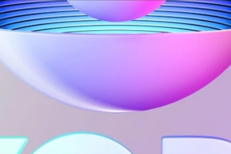
In October 16, 2020, Hans Donner - who had left its design team some years ago - announced on its private Instagram account he was working on an update of the current Rede Globo logo, teasing some colorful lighting over the white symbol[1], contrary to speculation from days before, when flat logos with gradients and an all-new wordmark (named Globobrand) were leaked - which should be used by its parent company.
In the teaser, the bottom scan lines are cyan to blue instead of pink to red, which makes this similar to the 1986-1991 logos (just the order of the cyan and blue colors is inverted). The wordmark also uses the ITC Avant Garde font, instead of the new Globobrand font.
Parent companies of affiliated stations: Grupo Rede Amazônica | Grupo Liberal | Sistema Tapajós de Comunicação | Grupo Jaime Câmara | Grupo Mirante | Sistema Clube de Comunicação | Sistema Verdes Mares | Rede InterTV | Rede Paraíba de Comunicação | Grupo Asa Branca | Sistema Grande Rio de Comunicação | Organização Arnon de Mello | Rádio Televisão de Sergipe | Rede Bahia | Rede Matogrossense de Comunicação | Rede Gazeta de Comunicações | Rabbit Participação e Administrações | Rede Integração | Grupo EP | Grupo Diário | TV Fronteira Paulista Ltda. | Traffic | Grupo Tribuna | Rede Vanguarda | GRPCOM | NSC Comunicação | Grupo RBS | Sistema Tribuna de Comunicação | Grupo Folha de Comunicação | Grupo Modesto Cerqueira
Former stations: Moved to RecordTV: TV Serra Sul(now named Canaã TV) (Canaã dos Carajás, Pará) | TV Pericumã (Pinheiro, Maranhão) | TV Rio Turiaçu (Santa Helena, Maranhão) | TV Leste (Governador Valadares, Minas Gerais) Moved to SBT: TV Difusora (São Luís, Maranhão) | TV Borborema (Campina Grande, Paraíba) | TV Tibagi(currently a Rede Massa station) (Apucarana, Paraná) | TV Iguaçu(currently a Rede Massa station) (Curitiba, Paraná) Moved to Band: TV Norte Fluminense(now RecordTV Interior RJ, an owned and operated station of RecordTV) (Campos dos Goytacazes, Rio de Janeiro) | TV Tropical (now CNT Tropical, an owned & operated station of CNT) (Londrina, Paraná) | TV Guajará (now Boas Novas Belém, an owned & operated station of Boas Novas) (Belém, Pará) Moved to TV Cultura: TV Altamira (Altamira, Pará) | TV Golfinho(shares affiliation with TV Nova) (Fernando de Noronha, Pernambuco) | TV Nacional(now TV Brasil Capital, an owned and operated station of TV Brasil) (Brasília, Federal District) | TV Maranhão Central(bought by Grupo Estado and renamed TV Eldorado, now an independent TV station) (Santa Inês, Maranhão) Moved to Rede Manchete: TV Ajuricaba (Manaus, Amazonas) (now Boas Novas Manaus, feeder station of Boas Novas) | TV Aratu (now a SBT affiliated station) (Salvador, Bahia)
Defunct stations: TV Mirante (Açailândia, Maranhão | Santa Inês, Maranhão) | TV Caxias (Caxias, Maranhão) | TV Paulista (São Paulo, São Paulo) | Rede Amazônica (Guajará-Mirim, Rondônia) | TV Liberal (Itaituba, Pará | Tucuruí, Pará)
ATA | ARPA | ABERT | ANATEL (Chile) | ARCHI | ASOMEDIOS | CANARA (Costa Rica) | ACTVE | AER | ASDER | NAB | Cámara de Radiodifusión de Guatemala | Cámara de la Industria de la Radio y Televisión | Unión Nicaragüense de Radiodifusores | Asociación Panameña de Radiodifusión | Asociación Paraguaya de Radiodifusión Privada | Cámara Paraguaya de Estaciones de Radio y Televisión | Sociedad Nacional de Radio y Televisión (Perú) | Asociación Nacional de Broadcasters Uruguayos | Cámara Venezolana de Televisión | Cámara Venezolana de la Industria de la Radiodifusión | Unión de Asociaciones de Radiodifusión de Centro América


