(Adding categories) |
Migotheyeti (talk | contribs) Tag: Visual edit |
||
| Line 89: | Line 89: | ||
|} |
|} |
||
{{SVG needed}} |
{{SVG needed}} |
||
| + | {{Card/Mascot|name=[[File:Olympics (Print).svg|22px|link=]] Vinicius <br>[[File:Paralympics 2019print.svg|22px|link=]] Tom|species=A mix between feline and monkey (Vinicius)<br>Unknown (Tom)|designer=[[Birdo Studio]]}} |
||
| − | {{Card/Mascot}} |
||
The mascots were revealed to the public without names on 23 November 2014. The Olympic mascot represents Brazilian wildlife, while the Paralympic mascot represents Brazilian plant life. On 14th December 2014, the mascots' final names were decided: '''Vinicius''' (named after Vinicius de Moraes) and '''Tom''' (named after Tom Jobim). After the Paralympic Games, Tom became the mascot of the [[Comitê Paralímpico Brasileiro|Brazilian Paralympic Committee]]. |
The mascots were revealed to the public without names on 23 November 2014. The Olympic mascot represents Brazilian wildlife, while the Paralympic mascot represents Brazilian plant life. On 14th December 2014, the mascots' final names were decided: '''Vinicius''' (named after Vinicius de Moraes) and '''Tom''' (named after Tom Jobim). After the Paralympic Games, Tom became the mascot of the [[Comitê Paralímpico Brasileiro|Brazilian Paralympic Committee]]. |
||
Revision as of 00:27, 24 July 2021
| Emblems • Assets • Pictograms • Torch Relays • Other |
| 2007–2008 | 2008–2009 | 2009–2010 | 2010–2016 | 2011–2016 |
Bidding & Interim
2007–2008
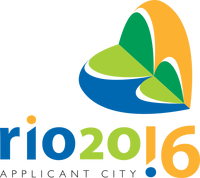
Rio's applicant bid logo for the 2016 Summer Olympics was unveiled on 17 December 2007. The logo depicts the Sugarloaf Mountain in the front of Rio in the shape of a heart, made of multiple crescent-shaped elements representing the ocean, the sun and the natural landscape, which are defining elements of Rio's culture and image. The emblem is painted in yellow, green and blue, the national colours of Brazil.
- Globo.com - Logo da candidatura 2016 é apresentada (Portuguese)
2008–2009
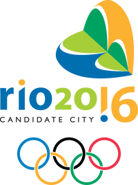
Rio was declared a candidate city in June 2008, and was allowed to add the Olympic rings and the words "Candidate City" to its logo.
2009–2010
Rio de Janeiro was awarded the games at the 121st IOC Session in Copenhagen, Denmark in October 2009.
Olympics
2010–2016
|
|
|
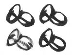
The contest to create the official logo for the Olympics was launched in April 2010. The selection was exhaustive, with 139 agencies involved before eight finalists were chosen. On September 2, 2010, it was reported that a logo had been chosen out of eight finalists. It would then be sent to the International Olympic Committee for approval and be revealed to the world in ceremony on New Year's Eve.
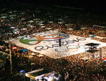
The emblem to be used by the 2016 Olympics was revealed at a ceremony during Rio de Janeiro's new years' celebrations on 31 December 2010, reportedly in front of two million people. The agency behind the final logo was Tatíl Design, who shared several values they wanted the identity to communicate:
- Like the preceding logo, the logo exhibits the three national colours and features the Sugarloaf mountains, albeit in a more abstract rendition formed by the figure's arms. The color scheme was taken from nature, with yellow for the sun, blue for water and green for forests and hope.
- The main subjects of the logo are three humanised, multi-coloured figures in embrace, a literal interpretation of the Olympic Games' goal of unifying world citizens in harmony regardless of ethnicity or beliefs.
- The curves of the logo allude to the city's natural formations: architecture and culture. The designers looked at shapes in nature and around Rio for the design of the logo.
- The unusually-curvy form is able to convey many messages to the viewer; infinity, love, passion, celebration, the Olympic Rings, energy, even the word 'Rio' can be spelt out by the logo.
- The wordmark and pictograms were created to suite Rio's animated atmosphere, with letter forms being taken from Rio's surroundings and the human form.
- The Rio 2016 symbol is the first truly three-dimensional Olympic logo; it can take a three dimensional form both virtually as well as physically in the form of sculptures.
“The brand translates the Olympic spirit and the nature, feelings, and aspirations of the athletes, Rio and the cariocas. Different countries, athletes and peoples are joined in a warm embrace – in an individual and collective move, which at a second glance, reveals one of Rio's most beautiful icons, a vibrant Sugar Loaf, radiating joy, unity, celebration, and friendship”
|
— Rio 2016 Organising Committee Press Release
|
- Tátil Design de idéas - Paixão e Transformação
- Creative Review - Rio 2016 Olympics logo: a closer look
- Globo Sporte - Rio 2016 shows its face and throws in Copacabana logo Games
- Revista Design - Rio 2016
Paralympics
2011–2016
|
|
|
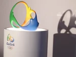
The Paralympics logo was also designed by Tátil, and was unveiled on 26 November 2011. Like its Olympic counterpart, it alludes to the symbolism of a heart and energy through an abstract heart shape. It appears to also create an infinity loop, representing boundless power. The colour palette of the Paralympic emblem is also warmer than the Olympic, continuing the link to the heart.
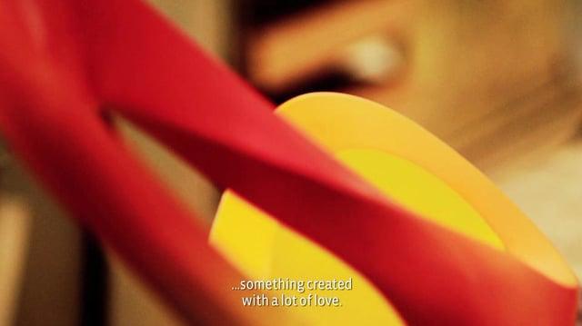
For the Paralympic emblem launch, Tátil created a sculpture of the logo with a light bar built into the top strip and a speaker playing a heartbeat sound effect to add to the metaphor of a heart.
Mascots
| SVG NEEDED |
|
|
|
The mascots were revealed to the public without names on 23 November 2014. The Olympic mascot represents Brazilian wildlife, while the Paralympic mascot represents Brazilian plant life. On 14th December 2014, the mascots' final names were decided: Vinicius (named after Vinicius de Moraes) and Tom (named after Tom Jobim). After the Paralympic Games, Tom became the mascot of the Brazilian Paralympic Committee.
|
|

